Satellite measurements of the troposphere confirm warming trend, data shows
Roz Pidcock
02.04.15Roz Pidcock
04.02.2015 | 2:55pmHot on the heels of the news that 2014 was likely the warmest year on record at Earth’s surface, scientists have confirmed the lower part of Earth’s atmosphere is warming too.
Since 1979, the troposphere has warmed by 0.14 degrees per decade, scientists at the University of Huntsville (UAH) Alabama conclude.
Whether you choose to look at temperatures at Earth’s surface or higher up in the atmosphere, nine of the 10 hottest years on record have now occurred in the 21st century.
A tropospheric record
Earlier this week, the World Meteorological Organisation (WMO) confirmed Earth’s surface in 2014 – that’s the air above land and the top of the ocean – was most likely the warmest it’s been during the modern temperature record, stretching back to at least the late 19th century.
It’s natural that we would be interested in Earth’s surface as that’s where humans live. But there’s another way scientists keep tabs on warming. Satellites monitor air temperature up to 10 kilometres above our heads in a part of the atmosphere known as the troposphere.
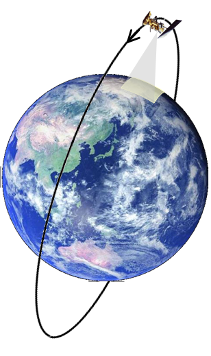
Path of a polar orbiting satellite. Source: US National Oceanic and Atmospheric Administration ( NOAA)
Several satellites have been circling Earth since the late 1970’s, courtesy of the US National Oceanic and Atmospheric Administration (NOAA). These satellites circle the Earth at the poles, carrying microwave instruments that measure how much heat is given off by oxygen in the troposphere. From this, scientists can work out the air temperature.
These polar-orbiting satellites send more than 16,000 measurements daily, achieving 100 per cent coverage of the globe every 3 to 4 days.
A close comparison
Two groups of scientists work on the data the satellites relay back to Earth. The University of Alabama in Huntsville (UAH ) and Remote Sensing Systems (RSS ), a group of scientists based in California. Both use the same data, but have different approaches to analysing it.
Yesterday, UAH released its final figures for December 2014, as an update to its Global Temperature Report released earlier this month. RSS released its data a few weeks ago.
We’ve plotted both datasets below. UAH is the dashed orange line, RSS is the dashed red one. We’ve also plotted the major surface temperature records from the Met Office/University of East Anglia Climatic Research Unit (blue), NASA (purple) and NOAA (green).

Global average temperature anomalies for the major global surface temperature datasets (Met Office/CRU, NASA and NOAA) and the tropospheric temperatures (RSS and UAH). All temperatures are relative to 1981-2010 average. Source: Rosamund Pearce, Carbon Brief
Click here for an interactive version of the graph.
All values are expressed as the difference between the temperature in a given year and the long term average between 1981 and 2010. The differences are called an ‘anomalies’ and they help scientists evaluate how temperature is changing over time.
A different set of satellites measurements contribute to estimates of global surface records by measuring the temperature of the top few millimetres of the ocean. You can read more about the different global surface temperature datasets in our detailed briefing on how scientists take earth’s temperature, here.
A consistent picture
It’s notable how similar all the various temperature records look. Both types of temperature measurement – tropospheric and surface – show a consistent warming trend.
Over the satellite period, the lower troposphere warmed by 0.14 degrees Celsius per decade, according to UAH data. RSS puts the figure slightly lower at 0.13 degrees Celsius per decade.
But there are some important year-to-year differences between the surface and tropospheric records. The influence of El Niño is much larger in the latter, for example. Dr Geert Jan van Oldenborgh, climate scientist at the Royal Netherlands Metoerological Institute, explains in a guest post for Climate Lab Book:
“Because the effects of El Niño are stronger in the temperature of the lower troposphere than in the near-surface temperature, the year 1998, following the strongest El Niño on record, is indeed still the warmest year in the [tropospheric] series.”
In 1998, the peak in global temperature on the graph above is about 0.2 degrees Celsius higher in the tropospheric record than at the surface. Oldenborgh explains this year-to-year variability means short term trends might not reflect the bigger picture. He says:
“Trends starting on this exceptional year naturally are lower than the long-term trend, but not zero at 0.05 degrees per decade.”
A much-anticipated El Niño failed to develop in 2014. While 2014 nominally took the top spot in the surface temperature record, this meant it was pushed down to third place in the tropospheric record by the strong El Niño years of 1998 and 2010, according to the UAH.
A global view
There are also differences between the tropospheric and surface records in how they deal with cold air in the high latitudes of the Arctic and Antarctic, and low-lying clouds in the subtropics.
This means the tropospheric record doesn’t capture faster warming in the Arctic, explains Oldenborgh. Temperatures there are rising at least twice as fast as the global average.
These two opposing effects cancel each other out in the tropospheric record, however. So apart from the more pronounced peaks and troughs associated of El Niño, the tropospheric time series very closely resembles the surface temperature record, he says.

Global tropospheric temperature anomalies in 2014, relative to 1981-2010 average. Source: Global temperature report: December 2014, University of Alabama in Huntsville (UAH)
A potted history
Compared to on-the-ground measurements, the advantage of the tropospheric temperature record is that it provides near complete global coverage. On the other hand, the surface temperature record has notable data gaps, in remote and inaccessible regions like the poles. But there’s a downside, which is that the tropospheric record is only 35 years old.
Satellite-drived lower tropospheric temperatures are now considered reliable. But combining sensors from different satellites into a single record is complicated. Back in the early 1990s, scientists had to rectify a few issues, as this Skeptical Science article explains.
In 1990, Prof John Christy and Dr Roy Spencer, both UAH scientists, analysed the 11-year tropospheric temperature record and found it showed no clear trend. This was unexpected, given clear signs of warming in other parts of the climate system. So scientists set about investigating, later discovering an issue with the satellites drifting over time. With this now corrected, the data shows a clear warming trend of 0.14 degrees per decade, says UAH.
Lines of evidence
Studying how the climate is changing means taking into account as many different lines of evidence as possible. Similarly, understanding what’s happening from global temperatures means looking not only at the parts of the climate system we’re most familiar with but also those that are out of sight, from the deep oceans to the atmosphere far above our heads.
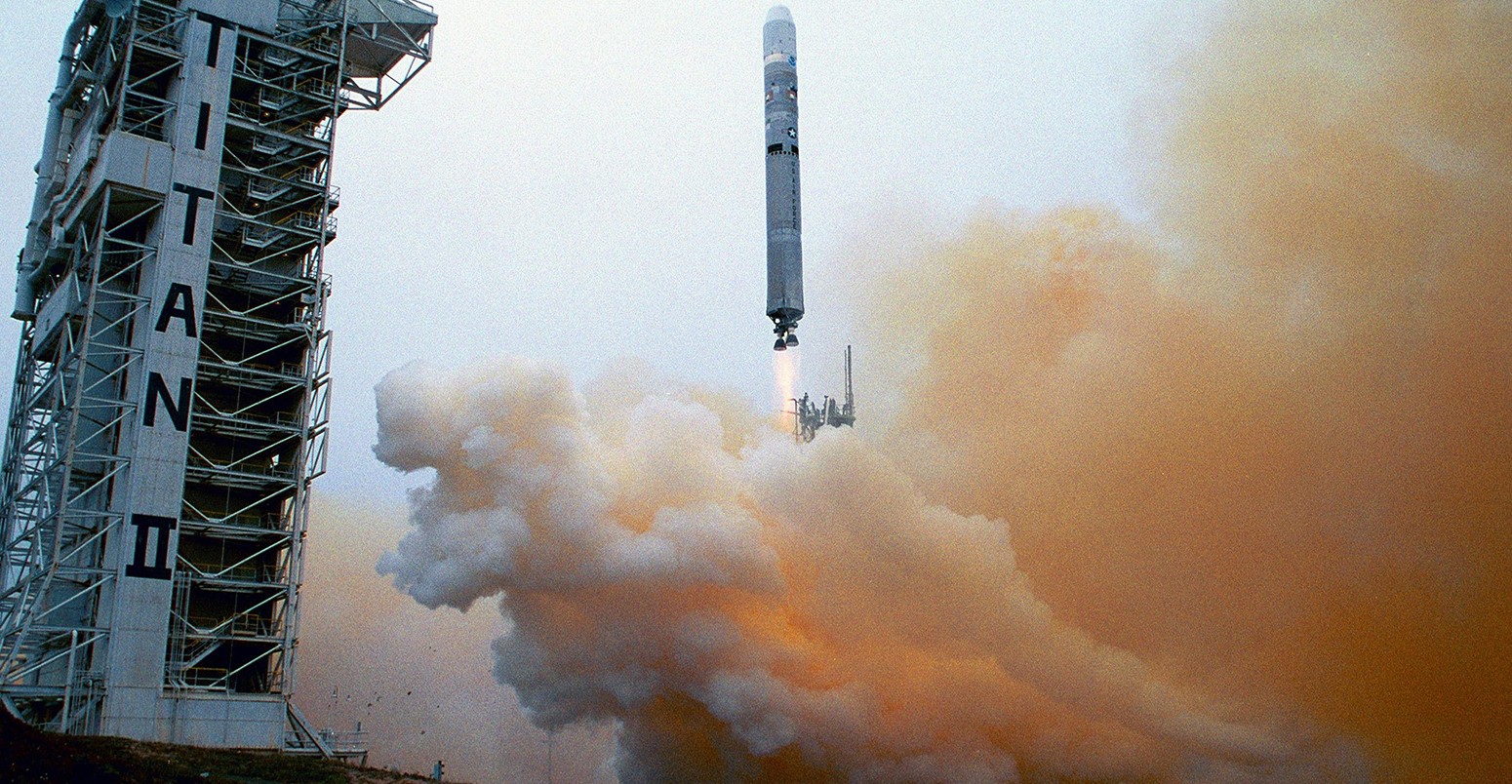
Main image: Launch climate satellite of NOAA-17.
-
Satellite measurements of the troposphere confirm warming trend, data shows