
DeBriefed 28 August 2026: Hottest oceans | Nepal-Tibet ‘glacier collapse’ | Creating graphics for IPCC reports
Welcome to Carbon Brief’s DeBriefed.
An essential guide to the week’s key developments relating to climate change.
Sign up below.
This week
Ocean temperature record
HOT WATER: The world’s oceans reached their hottest temperature on record, reported the Guardian. Average sea surface temperatures hit 21.1C last weekend, according to data from EU Copernicus Climate Change Service, it added. Samantha Burgess, deputy director of Copernicus, told BBC News that, while the current El Niño event is “adding heat to the system”, it is “doing so on top of decades of human-driven warming”.
NOT YET PEAKED: The Associated Press reported that the new record is notable as the world’s sea surface temperature tends to peak in March and April. It added that oceans are likely to keep getting hotter until the current El Niño event reaches its peak, expected sometime between November and January. Scientific American noted that “hotter ocean temperatures can worsen sea level rise, disrupt weather patterns and pose dangers to sea life such as coral reefs”.
Nepal-Tibet ‘glacier collapse’
DEADLY FLOODS: The Associated Press reported that at least 390 people were killed and more than 1,400 people missing in Tibet and Nepal after a glacier collapse sent a huge torrent of water and debris into the valley of the Trishuli River. The Guardian noted that “imagery seemed to show that a large amount of snow had melted in the 24 hours prior to the disaster”.
GLACIER MELT: BBC News reported that climate change is “known to be driving faster glacier melt in the Hindu Kush Himalaya region, but scientists say it is too soon to pinpoint its role”. The New York Times added: “The thawing permafrost is destabilising the foundation underneath glaciers, raising the risks of precisely these kinds of landslides and glacial collapses.” The Nepali Times suggested that the disaster “will bring up the issue of loss and damage [from climate change] that Nepal has been raising in international climate negotiations”.
Around the world
- CHINA OIL PEAK: Bloomberg reported that China’s oil demand probably peaked last year, according to its top refiner Sinopec.
- HEAT DEATH: Excess deaths from this summer’s back-to-back heatwaves across Europe have topped 35,000, the Guardian reported. It added that the true figure is likely to be much higher.
- NORTH SEA COSTS: According to preliminary analysis by Imperial College London covered by the Guardian, the cost of climate damage from new North Sea oil fields would dwarf any economic benefits.
- CIVIL CLAIMS BLOCKED: Climate Home News reported that New Zealand’s parliament has adopted a controversial new law preventing all current and future civil claims for climate loss or harm.
583 million
The number of children globally living through 20 extra heat-stress days per year because of climate change, according to a new attribution study, published in Science Advances and covered by Carbon Brief.
Latest climate research
- A new, high-resolution global climate model projects a “nearly ice-free Arctic” by the year 2040 under a moderate emissions scenario, despite lower overall Arctic warming | Earth System Dynamics
- Research on “climate change and children’s psychological” wellbeing is skewed towards the US, UK and Australia, but “climate-vulnerable regions remained severely underrepresented despite experiencing disproportionate impacts” | Climate and Health
- Analysis of hundreds of years of climate records reveals that El Niño events are getting stronger due to human-caused climate change | Science
(For more, see Carbon Brief’s in-depth daily summaries of the top climate news stories on Monday, Tuesday, Wednesday, Thursday and Friday.)
Captured
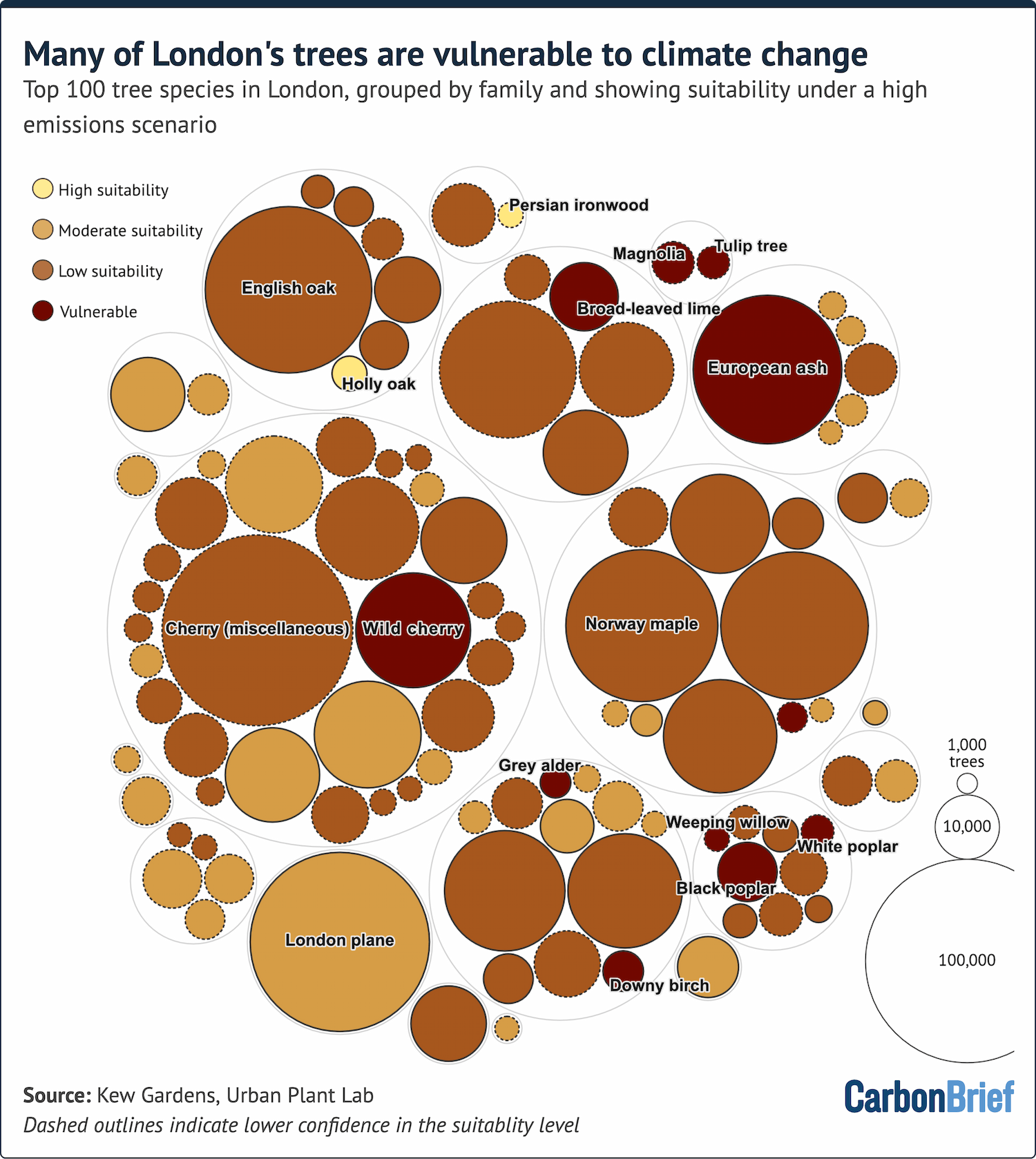
Only two out of the top 100 tree species in London would be “highly suited” to future climate conditions in the city in 2090, under a future scenario of high emissions (known as SSP3). That is according to an analysis of the likely suitability of London’s trees to future climate change, commissioned by the London mayor and the Forestry Commission. More than 60% would be classed as “low suitability” and a further 10% as “vulnerable” in this future scenario, according to the analysis. The “vulnerable” category contains many native species, such as ash, wild cherry and silver birch.
Spotlight
Creating graphics for IPCC reports
This week, Carbon Brief speaks to an expert about how the Intergovernmental Panel on Climate Change (IPCC) uses visualisations to inform people about climate change.
The IPCC has been publishing authoritative summaries of the latest climate science since 1990.
To produce each set of reports, hundreds of scientists work for years to draw together information from thousands of sources.
As well as text on the latest climate science, IPCC reports also include graphics that illustrate some of the key findings.
Arlene Birt, founder of data design agency Background Stories, is a graphics officer visualising data for IPCC reports.
She told Carbon Brief that, for the last round of IPCC reports, her role was to refine existing scientific figures rather than to create visuals from scratch. She added:
“My aim was to try to make things clear to a non-specialist audience. How do we add the right labels and annotations and how do we try to make use of information-design techniques to clarify the content?”
But for the IPCC’s upcoming special report on cities, which Birt estimates will contain roughly 300 figures, her involvement started much earlier in the process.
This allowed her to work with scientists, who volunteer their time to work on IPCC reports, on communication best practices at an earlier stage.
Being involved earlier in the process led to a collaborative “co-design” process, she added:
“We’re trying to level up each time…[scientists] share figures with me through the various review steps we have in the process. Then, I try to provide a little more feedback to step up the clarity of the figures.”
Birt sees this collaborative effort as a negotiation, working out: “How do we balance the needs of science with the need for clear communication?”
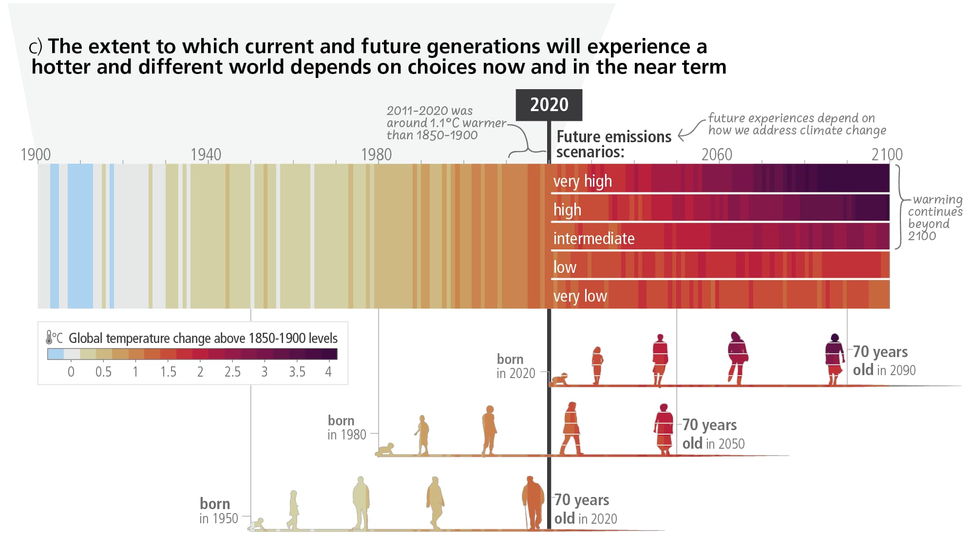
While Birt is celebrated for memorable designs, such as her striking graphic tracking future climate pathways alongside human lifespans (above), she warned against the temptation to invent novel visualisations.
She noted that standard formats – such as simple, well-annotated bar or line graphs – are often more effective for broad audiences, while novelty can be a barrier to understanding, adding:
“If the audience is a group of people that already understand the content, a new form of visualisation can go a long way in bringing new understanding. But if the audience is a group who is not familiar with the content, begin[ning] new visualisation styles can just create a burden.”
Working inside a large, consensus-driven organisation such as the IPCC can be a slow, iterative challenge, she said.
Yet, Birt sees immense value in bridging the gap between rigorous scientific output and public communication, adding:
“A lot of times when I’m faced with some new visualisation to develop, the question I keep asking is: ‘Well, how does this relate to the people who are going to be viewing it?’ And I try to help put the data into context for them.
“While values can differ across regions and different communities, we’re all human and we have similar goals and ideas about life. [Keeping this in mind] puts things into context in a way that helps the seemingly abstract scientific data feel more relevant to our own life.”
Watch, read, listen
INFRASTRUCTURE IMPACTS: The Times explored the scale and impacts of the data centre boom and its impact on power and water resources.
ON THE ROAD: Following her family’s 9,000-mile road trip this summer, Grist editor Katherine Bagley wrote about how the impacts of climate change are being seen across US national parks.
CLIMATE REFUGEES: Deutsche Welle reported on climate-induced displacement in a documentary highlighting how Bangladesh, Colombia and the Pacific Islands are dealing with the crisis.
Coming up
- 4-5 September: Istanbul Climate Finance Summit, Turkey
- 1 September: UK parliament returns from summer recess
Pick of the jobs
- Mighty Earth, senior associate: climate and environment | Salary: Unknown Location: Brazil (remote)
- The Financial Times, senior reporter, Sustainable Views | Salary: Unknown. Location: London
- Flinders University, research associate in hydrogeology/hydrology | Salary: AUS$90,930-$110,197. Location: Adelaide, Australia