Guest post: The state of the Greenland ice sheet in 2015
Multiple Authors
09.04.15Multiple Authors
04.09.2015 | 2:20pmA guest post from climate scientists Dr Ruth Mottram and Dr Peter Langen from the Danish Meteorological Institute.
Dramatic decline in Arctic sea ice has become an eye-catching barometer of our warming climate. But the Greenland ice sheet, which is often confused with sea ice, has exhibited no less dramatic – but less talked about – changes in the past few years.
Stretching out over 1.7m square kilometres, the Greenland ice sheet is the second largest land ice mass on the planet, after Antarctica. It’s an area of solid ice and snow about the size of Libya.
The end of August heralds the completion of the summer melt season for another year and is an opportune time for an annual checkup. So is the Greenland ice sheet in rude health, or looking under the weather?
Give and take
An ice sheet is a vast, slow-moving mass of fresh water. It differs from a glacier or an ice cap because it isn’t confined by the land it sits on. But, like all glaciers, it gains ice by the accumulation of snowfall in the winter and loses it from surface melting during summer and the ‘calving’ of icebergs that break off into the sea at its edges.
The melting and calving of ice is collectively called “ablation”. If more snow accumulates than is ablated away, the ice sheet will grow and advance. Conversely, if more ice melts and calves than is replenished, it will retreat and shrink.
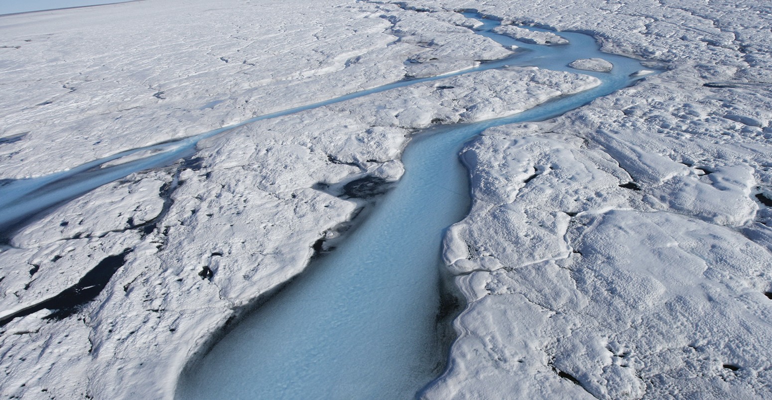
It’s worth noting that melting at the surface doesn’t necessarily mean that an ice sheet will lose mass. The meltwater percolates through to the lower layers of the sheet and often refreezes. But when snow and ice melts and refreezes, it gives off heat, which warms up its surroundings making subsequent melting more likely.
Surface melting also affects how much of the Sun’s energy the ice sheet reflects – known as the albedo effect. Bright white fresh snow reflects sunlight more efficiently than the much darker bare glacier ice underneath. So, if the snow melts, the ice sheet surface absorbs more energy and warms up more quickly.
Melt can occur at surprisingly high elevations on Greenland ice sheet. For example, observation stations operated by PROMICE regularly record melting at an altitude of 1,800m near Kangerlussuaq in western Greenland – even during cool summers.
In 2012, which was a record year for melting on Greenland, about 97% of the ice sheet was observed to be melting at some point – even at the summit at an altitude of 3,200m.
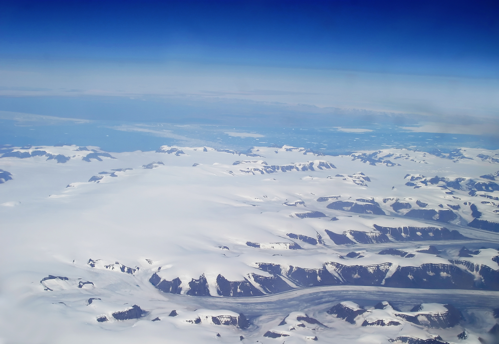
Aerial shot of eastern Greenland. Credit: Shutterstock.
Balancing act
Comparing the total snowfall and surface melt against each other gives you the “surface mass balance”. At the Danish Meteorological Institute (DMI), we use output from a numerical weather forecasting model combined with data from observation stations on Greenland to estimate the surface mass balance for the whole ice sheet for every single day.
The modelling is an important element of these estimates, because the station data is relatively sparse and often unreliable due to the extreme conditions. The model fills in the gaps in the data and gives us a more complete record to work with.
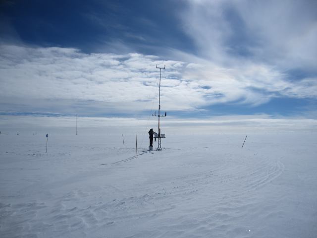
Weather station operated by the DMI at summit of the Greenland ice sheet, undergoing maintenance last summer. Credit: DMI.
However, the surface mass balance only includes loss of ice from surface melt, which is estimated to make up around two-thirds of all the losses from the ice sheet. The remaining third is lost through calving or melting at the ice sheet edges by the ocean. To measure this we need satellite data.
The GRACE satellites, launched in 2002, detect changes in gravity as the amount of ice changes in Greenland, allowing us to distinguish the season cycle of snowfall and melt, as well as the mass loss from calving. The raw GRACE satellite data is carefully processed and validated before it is released, so the results are usually delayed by two or three months.
Combining calving losses with surface mass changes gives us the “total mass balance”. A positive balance indicates that the total mass of the ice sheet is growing, while a negative balance shows it is shrinking.
Average but unusual
Annual mass balances are calculated from 1 September to 31 August. We use a cutoff point at the end of August because this is roughly when snow starts to accumulate again after the summer melt season finishes.
As we’ve just crossed over into September, we can now look back over another year. Though without the satellite data, we can only consider changes to the surface mass balance for the moment.
So how has the ice sheet fared in the last 12 months? Well, overall it has been close to average – but with some slightly unusual features.
As we ticked off another year at the end of 2014, snow was accumulating on the ice sheet at a faster rate than average. The spring that followed turned out to be very cold, allowing the snow to persist that bit longer.
The chilly start to the year also meant that the summer melt season started remarkably late – in fact, the latest since our records began in 1990.
After the slow start, melting accelerated very quickly in late June. By early July the ice sheet was losing more than 10bn tonnes of water per day from surface melt alone, and a melt peak of 12bn tonnes on the 6th July was followed by another later in the month. You can spot these peaks by the blue line in upper graph of the figure below, which dips down twice during July.
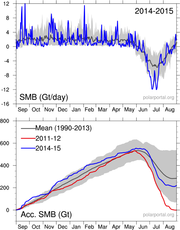
Daily (top) and accumulated (bottom) surface mass balance from 1st September 2014 to 31st August 2015 in gigatonnes (billion tonnes). The grey line shows the average SMB from the HIRHAM5 regional climate model for the period 1990-2013, and the shaded area shows the range. The blue line is the calculated surface mass balance (SMB) for 2014-15 and the extreme 2011-12 year is shown as a red line. Source: polarportal.dk/polarportal.org.
By the start of August, the surface mass balance of the ice sheet was now well below average. You can see this by comparing the blue (2014-15) and grey (average) lines in the lower graph in the figure above.
For much of Greenland, melting was then stopped in its tracks by a cold snap and fresh assault of snow during August. However, western and northern parts of the ice sheet continued to see intense melt throughout most of the month.
Losses outweighing the gains
Given that it doesn’t include ice losses by calving icebergs and ocean melting, the surface mass budget is usually strongly positive at the end of the year. 2015 was no exception – gaining around 220bn tonnes of new ice – but this is below the average of about 290bn tonnes. In the record year in 2012, the surface mass balance at the end of the year was approximately zero.
The surface mass balance isn’t the full story, of course. To calculate the total mass balance, we will need to wait for the satellite results to gauge how much ice has been lost through calving icebergs and ocean melt.
Satellite observations over the past decade show that the calving loss is greater than the gain from surface mass balance – and Greenland is losing mass at about 250bn tonnes per year.
You can see what this means for the total ice mass balance on Greenland in the graph below. The red dots are monthly changes in ice mass, representing the ups and downs of the seasonal cycle in each individual year. The overall trend shows a continued year-on-year decline.
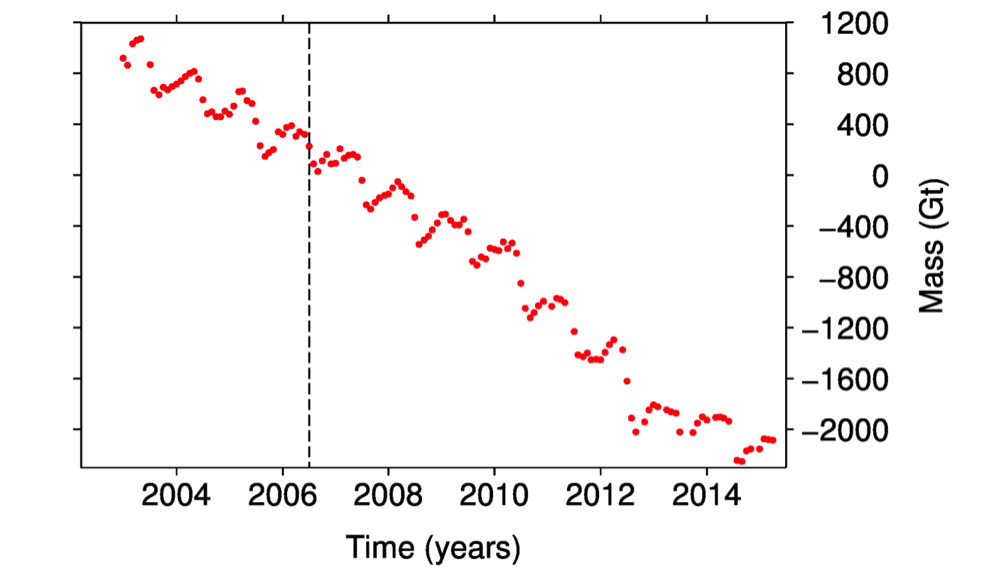
The accumulated monthly total mass balance of the Greenland ice sheet measured from satellites, relative to June 2006 (dotted line). This curve ends in April 2015 at the end of the accumulation season. Source: Barletta et al. 2013.
As the Greenland ice sheet sits on land, meltwater that flows into the oceans will contribute to sea level rise. This is currently adding around 0.7mm a year to global sea levels, but as the ice loss continues from Greenland, this is likely to increase through the 21st century.
So at the end of another year, 2014-15 doesn’t look like it will buck the downward trend we’ve seen for Greenland ice. And as global temperatures continue to rise, the chances of a recovery look increasingly unlikely.