Could global carbon dioxide emissions be about to peak? That was the suggestion from some parts of the media yesterday after a new report revealed the increase in global carbon dioxide emissions had slowed in 2012.
The study, by the Netherlands Environmental Assessment Agency and the European Commission’s Joint Research Centre, showed carbon dioxide emissions rose 1.1 per cent last year – considerably less than the average rise over the last decade of nearly three per cent.
This lead many, including the study’s authors, to consider whether 2012 marked the start of a “permanent slowdown” in emissions. But is that really the big picture?
We explain what’s going on with five simple graphs.
1. Carbon emissions rose
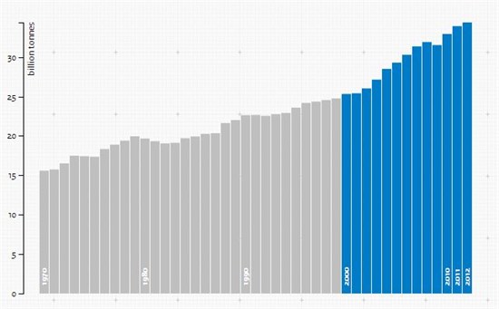
Global carbon dioxide emissions continued to increase in 2012. Emissions were up 1.1 per cent on 2011 levels, which is a smaller increase than the average over the last decade (2.9 per cent). It’s important to note that this is still a rise, however. Overall, a record 34 billion tonnes of carbon dioxide were emitted last year.
Note too that the rise in emissions hasn’t been uniform, so a slower year isn’t really that unusual.
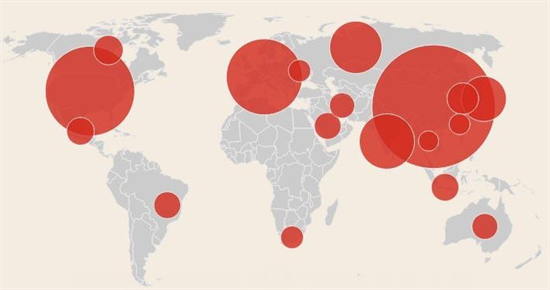
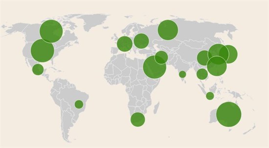
2. Renewable energy grew, but fossil fuels still dominated
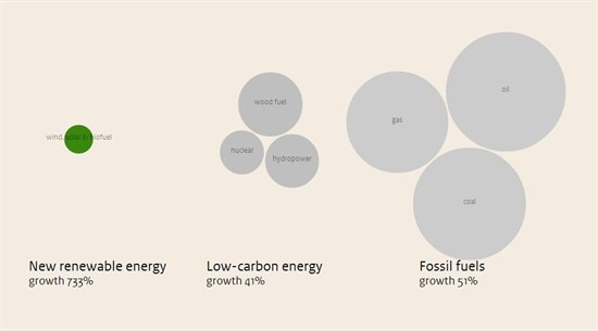
The amount of energy from carbon-free or low-carbon sources continued to grow in 2012. Compared to 1990 levels, renewable energy was up by 733 per cent in 2012. The amount of power which came from low carbon sources was up 41 per cent on 1990 levels.
But as a share of the total amount of energy we use (indicated by the size of each circle), renewables and low carbon are still way behind carbon-rich fossil fuels like coal, oil and gas.
3. Developing countries produced more emissions
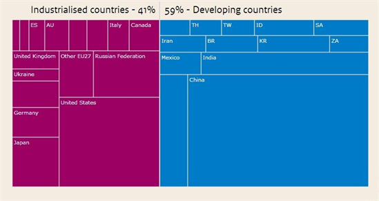
In 2012, developing countries like China, India and Mexico produced 59 per cent of the world’s carbon dioxide emissions, while industrialised countries and regions like the EU, US and Russia emitted 41 per cent.
Overall, developed countries managed to cut back their carbon emissions. The US, for example, cut its carbon dioxide emissions by 200 million tonnes from 2011 levels, as shale gas continued to replace coal. But Japan bucked the trend – emissions there rose in 2012 after the country shut its nuclear power plants following the Fukushima accident.
Carbon cuts in the industrialised world weren’t enough to offset rising emissions in fast-growing economies like China, however.
4. The highest emissions came from China, the US, and the EU
In absolute terms, China emitted the most carbon dioxide in 2012 – releasing 9860 megatonnes into the atmosphere. One megatonne is equivalent to one million tonnes – so we’re talking really big figures here. The US emitted 5190 megatonnes of carbon dioxide, and the EU emitted 3740 megatonnes.
How does that compare to the previous year? China’s emissions in 2012 were three per cent higher than in 2011. Emissions in the US were down four per cent on 2011 levels, and in the EU they fell 1.6 per cent.
5. Per person, Australia emitted the most carbon
Divided up per person, each country’s share of the world’s emissions looks a little different. Australia had the highest per capita emissions in 2012 at 18.8 tonnes. In the US, emissions per capita were 16.4 tonnes, and just behind came oil-rich Saudi Arabia with per capita emissions of 16.2 tonnes.
The EU and China – both major emitters in absolute terms – had much smaller per capita emissions, at 7.4 and 7.1 tonnes respectively.
The big picture
This report offers a mixed picture in the context of climate change. Renewables and low carbon sources provided more energy, and a bigger share of the world’s total energy demand in 2012. In addition, emissions rose slightly more slowly than the average over the last decade.
But a slow rise is still a rise. It doesn’t matter whether it’s coming from developed or developing countries ultimately – 2012 still saw the highest carbon dioxide emissions on record.
All images in this blog were reproduced with kind permission of the PBL Netherlands Environmental Assessment Agency. They are actually interactive graphics - you can play around with them here.