
Factcheck: No, global warming has not ‘paused’ over the past eight years
Zeke Hausfather
07.14.22Zeke Hausfather
14.07.2022 | 4:41pmA decade ago, many in the climate community were fixated on an apparent “pause” in rising global surface temperatures. So many studies were published on the so-called “hiatus” that scientists joked that the journal Nature Climate Change should be renamed Nature Hiatus.
However, after a decade or so of slower-than-average warming, rapid temperature rise returned in 2015-16 and global temperatures have since remained quite warm. The last eight years are the warmest eight years since records began in the mid-1800s.
While the hiatus debate generated a lot of useful research on short-term temperature variability, it is clear now that it was a small variation on a relentlessly upward trend in temperatures.
But nearly a decade later, talk of a “pause” has re-emerged among climate sceptics, with columnist Melanie Phillips claiming in the Times this week that, “contrary to the dogma which holds that a rise in carbon dioxide inescapably heats up the atmosphere, global temperature has embarrassingly flatlined for more than seven years even as CO2 levels have risen”.
This falsehood appears to be sourced from a blog post by long-time climate sceptic Christopher Monckton, which claims to highlight the lack of a trend in global temperatures over the past eight years.
In a rebuttal letter to the Times, Prof Richard Betts – head of climate impacts research at the Met Office Hadley Centre and University of Exeter – points out that it is “fully expected that there will be peaks of particularly high temperatures followed by a few less hot years before the next new record year”.
In fact, the last eight years have been unusually warm – even warmer than expected given the long-term rate of temperature increases – with global temperatures exceeding 1.2C above pre-industrial levels. The temperature record is replete with short-term periods of slower or more rapid warming than average, driven by natural variability on top of the warming from human emissions of CO2 and other greenhouse gases.
There is no evidence that the past eight years were in any way unusual and the hype around – and obvious end of – the prior “pause” should provide a cautionary tale about overinterpreting year-to-year variability today.
Consistent long-term warming
As with the previous hiatus, drawing the conclusion that warming has “flatlined” relies heavily on looking at data over a short period in isolation.
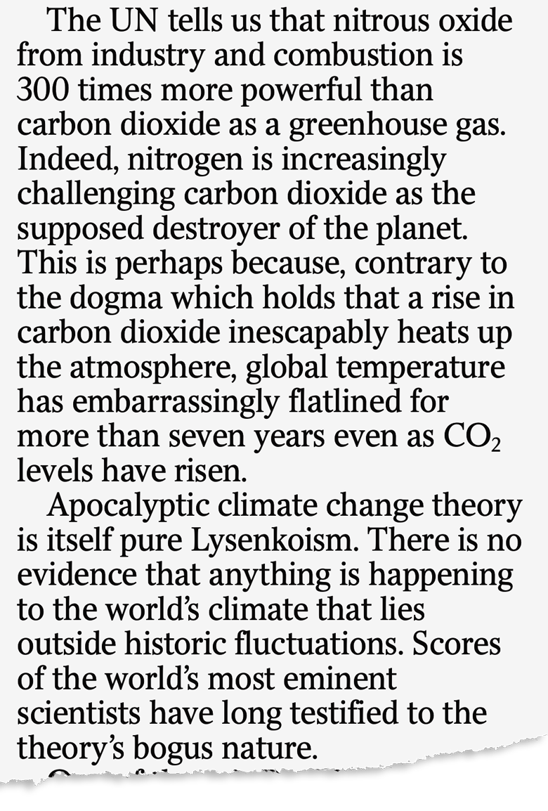
The figure below shows the annual global surface temperature since 2015 from the Copernicus/ERA5 dataset, along with Carbon Brief’s estimate of likely 2022 temperatures based on data from the first six months of the year (central estimate in red, with an uncertainty range shown by the black bar). The blue dashed line shows the linear trend – the rate of change – over the 2015 to 2022 period, which is effectively flat.
However, looking at these eight years in isolation ignores the larger context and provides a misleading impression that global warming has “stopped”.
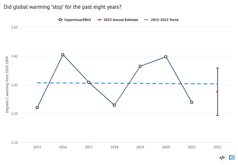
Indeed, looking at a slightly different eight-year period – 2011 to 2018 rather than 2015 to 2022 – would offer the opposite conclusion, namely that global warming had massively accelerated to a rate of 5.6C per century, as shown by the red dashed line in the figure below.
In reality, both of these are acts of “cherry-picking” – namely,overemphasising short-term variability. Temperatures were a little cooler than would be predicted by the long-term warming trend prior to the 2015-16 super El Niño event, while much of the eight years since that event have been warmer than the trend.
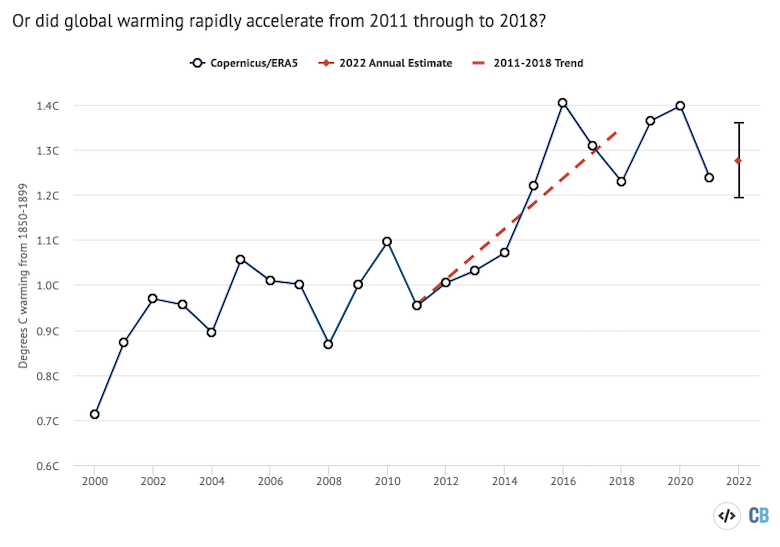
The figure below puts both the apparent warming acceleration and warming “pause” into context, making it clear that they are simply short-term variability surrounding a long-term increase in temperatures driven by human activity.
Seen from this higher vantage point, it is pretty clear that both the acceleration and pause were not particularly unusual. Rather, the acceleration started from below the trendline and brought temperatures well above it, while the pause started above the trendline and brought temperatures back down to around what would be expected for 2021 and 2022.

Expected variability
Scientists can estimate the degree of year-to-year natural variability in global temperatures to estimate what would be needed to actually prove significant accelerations or slowdowns in temperature compared to the past rate of warming.
In both cases, the fluctuations in recent years are well within the range of expected variability, and do not indicate any departure from the long-term warming trend in surface temperatures the world has experienced over the past 50 years.
This is even more obvious from the full record back to 1850, as shown in the figure below. This shows both the Copernicus/ERA5 dataset (blue line) – which extends back to 1979 (reflecting the start of the satellite era) – and the Berkeley Earth dataset (black line) – which extends further back in time, but only uses surface temperature stations for its record.
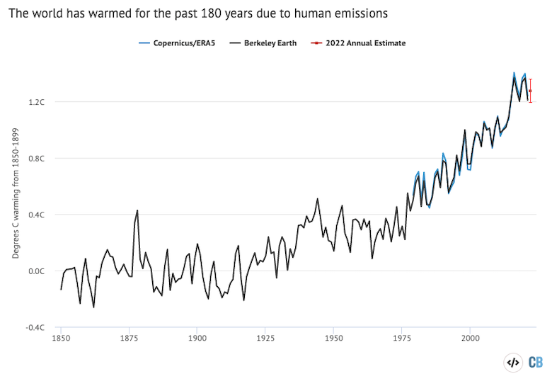
This chart highlights a distinct acceleration in the rate of surface temperature change after the 1970s, but a quite linear rate of warming over the period from 1970 to present. This may well change in the future as global emissions of greenhouse gases increase or decrease, or if limits are placed on emissions of planet-cooling aerosols that are masking some of the warming.
Scientists can also show that climate models generally do a good job of simulating observed temperatures.
The figure below shows global surface temperatures from CMIP5 models, which were produced for the Intergovernmental Panel on Climate Change’s (IPCC) fifth assessment report. The chart shows observed temperatures from five different groups (coloured lines) – NASA GISTEMP, NOAA GlobalTemp, Hadley/UEA HadCRUT5, Berkeley Earth, and Copernicus ERA5 – as well as the average of CMIP5 climate models (black line) and the range across the climate models (grey band).

The chart highlights that temperatures prior to 2015 were a little below the expectation of climate models, while temperatures since 2015 have been pretty close to the average of model projections and well-within the model range. This indicates that the short-term variability in temperatures in both periods is not necessarily that unusual, as it does not fall above or below the global temperatures expected by climate models run using data on emissions of CO2 and other greenhouse gases.
Natural variations on top of a warming trend
One common complaint from climate sceptics is that while CO2 concentrations increase every year, surface temperatures do not. However, the climate system has never been solely driven by CO2 and other greenhouse gases. Year-to-year variability in temperature records is mostly due to the influence of El Niño and La Niña events, which have a short-term warming or cooling impact on the climate, while other dips are associated with large volcanic eruptions, such as Pinatubo in 1992.
At the same time, natural variability only moves heat around between the oceans and atmosphere – in the case of El Niño and La Niña – or temporarily cools the planet – in the case of volcanic eruptions. Natural variability cannot increase the amount of heat trapped in the surface and oceans over the long term; an external “forcing” is needed to do that.
The long-term warming seen since the industrial revolution is clearly attributable to increased concentrations of CO2 and other greenhouse gases in the atmosphere. It cannot be explained by natural forcings, such as volcanoes and changes in solar output.
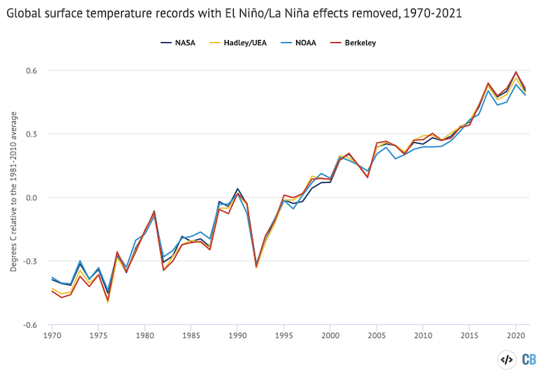
One of the main drivers of the apparent “pause” in warming over the past eight years is the choice to cherry-pick the starting year to coincide with the 2015-16 super El Niño event. Indeed, when El Niño and La Niña are statistically removed from the observed record, the rise in temperatures is much more even, as shown in the figure below.
Human-emitted greenhouse gases trap extra heat in the atmosphere. While some of this heat warms the Earth’s surface, the vast majority – around of 93% – goes into the oceans. Only 1% or so accumulates in the atmosphere and the remainder ends up warming the land and melting ice.
In many ways, ocean heat content represents a much better measure of climate change than global average surface temperatures. It is where most of the extra heat ends up and is much less variable on a year-to-year basis than surface temperatures.
Most years set a new record for ocean heat content, reflecting the continued trapping of heat by greenhouse gases in the atmosphere. The figure below shows that annual OHC estimates between 1950 and present for both the upper 700m (light blue) and 700m-2000m (dark blue) depths of the ocean.
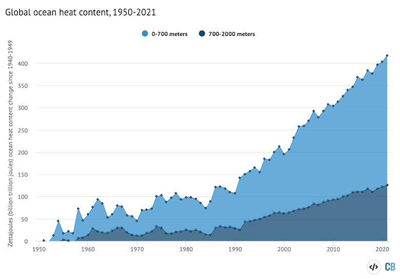
Changes in the amount or rate of warming are much easier to detect in the OHC record than on the surface. For example, OHC shows little evidence of the modest slowdown in warming at the surface in the mid-2000s or over the past eight years. Unlike surface records, OHC does show a distinct acceleration since the early 1990s, matching the increased rate of greenhouse gas emissions over the past few decades.

