Five charts show the historic shifts in UK energy last year
Simon Evans
07.30.15Simon Evans
30.07.2015 | 5:25pmLast year was a historic one for UK energy, with significant consequences for UK emissions.
New data from the Department for Energy Climate Change (DECC) shows energy use fell to its lowest level for at least half a century, while coal use fell to levels not seen since the 19th century and renewable power increased by a fifth.
Along with a record warm year, the combined impact of these changes was a 10% reduction in UK carbon emissions — the largest ever fall to accompany economic growth.
Carbon Brief has five charts that show what happened to the UK’s energy mix in 2014.
Energy low
For decades if not centuries, a growing economy has usually been accompanied by rising energy use. Recessions have been the only sure-fire way to dampen rising demand. Since 2005, however, the UK has been busy breaking that link.
In 2014 the downward trend accelerated, with a 6.6% reduction in energy use, even as the economy grew by a relatively rapid 2.8%. That left energy use last year down 18% since a 2005 peak and at the lowest level for at least half a century.
Within that overall picture, there were large reductions in gas, oil and coal use (light grey, brown and dark grey areas, below). As first estimated by Carbon Brief in January, UK coal use in 2014 fell to levels last seen during the industrial revolution of the late 1800s.
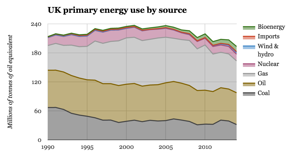
UK primary energy use by source. Source: DUKES table 1.1.1. Chart by Carbon Brief.
Fossil fuel low
Total and fossil energy use were both down last year, making it hard to gauge the bigger picture. If we slice things up more simply, you can see that fossil fuels claimed a record low share of the UK energy mix in 2014, at 85% (grey area, below).
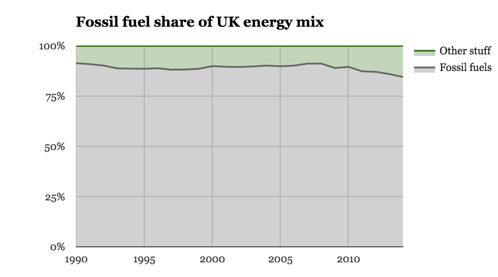
The UK’s energy mix since 1990. Source: DUKES table 1.1.1. Chart by Carbon Brief.
Renewables grabbed a growing share of UK energy use, reaching 7% of the total in 2014. As a result, the UK beat its interim target on the path to a 15% by 2020 goal under the EU Renewable Energy Directive, including heat, power and transport.
Longer-running data from BP shows that fossil fuels supplied 98% of the UK’s energy needs in 1965 and it’s a safe bet that last year’s low of 85% is a record for the modern era. Even so, the UK is a very long way from the decarbonised economy it is aiming for. The Climate Change Act commits the UK to an 80% reduction in emissions by 2050, against a 1990 baseline.
Transport off-trend
Though total energy use is falling, transport is bucking the trend with an increase in 2014 (blue line, below). Transport now accounts for two out of every five units of energy used in the UK. That’s worth remembering during climate and energy policy discussions, which tend to focus on electricity.
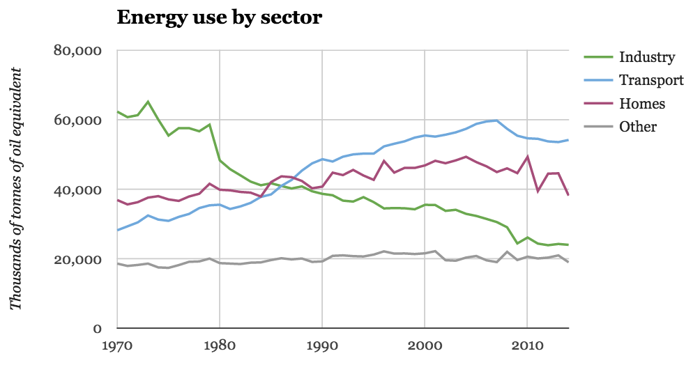
UK energy use by final user. Source: DUKES table 1.1.5. Chart by Carbon Brief.
The recent increase in transport energy use is a combination of a growing economy, the rise of cheap short-haul air travel and falling oil prices, which have plummeted since last summer.
Homes and industry are both trending downwards (purple and green lines), though domestic energy use varies from year to year depending on the weather. Last year was a case in point, as record warm temperatures reduced home heating demand.
Coal down, renewables up
Warm temperatures also filtered through to the power sector in 2014, again reducing demand. But a range of other factors, such as falling gas prices and the continued growth of renewables, had arguably more important impacts on the UK power sector.
The big movers were coal, with generation falling by 23%, and renewables, which grew by 21%. The net result was that gas replaced coal as the number one source of UK electricity last year (light and dark grey areas, below), while renewables passed nuclear to claim third place (purple and green areas). Arguably a more important measure is the low-carbon share of electricity, which reached a record 38% last year.
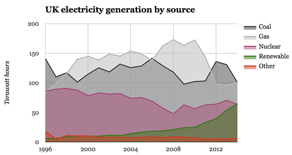
Sources of electricity generation in the UK. Source: DUKES table 5.5. Chart by Carbon Brief.
The decline in coal-fired power generation occurred for a number of reasons, which Carbon Brief explored in more detail earlier this year. The return of UK coal use to historic lows not seen since the late nineteenth century, was behind an unprecedented 10% reduction in UK carbon emissions. This shows why tackling coal use is at the heart of the climate problem.
The 21% growth in renewable generation also had a number of causes. First, the conversion of an additional unit from coal to biomass at Drax, the UK’s largest power station — a move that also contributed to the reduction in coal use.
Second, it was relatively wet year in 2014, boosting output from the country’s hydro stations. Third, there was a large expansion of wind, with onshore capacity growing 13% and offshore by 22%. Finally and most dramatically, UK solar capacity nearly doubled in 2014, reaching 5.4 gigawatts.
This trend accelerated in the first quarter of this year before coming to an abrupt halt after 1 April, when changes to solar subsidies kicked in. The recent announcement of further reductions in renewable energy support means recent rapid growth in the sector is unlikely to continue.
UK power in 2014
With dramatic annual shifts in UK electricity generation it would be easy to lose perspective, so the pie chart below shows a snapshot of the UK power mix in 2014. Despite large shifts in renewable and coal output, the UK mix is still dominated by fossil-fired generation (light and dark grey areas).
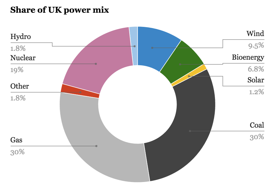
The UK power mix in 2014. Source: DUKES table 5.5. Chart by Carbon Brief.
Moreover, while solar power output doubled compared to 2013, it still provided only 1.2% of the UK power mix. More significant contributions came from wind, with nearly 10%, and bioenergy. These have, and will continue to be the largest sources of green power in the UK.
Conclusion
As ever, the shifting face of UK energy illustrates how much is changing and yet how far there is to go on the path to a climate-compatible economy. Historic lows for energy use and coal, coupled with record highs for clean energy combined to push down emissions by 10%.
However, the UK remains reliant on fossil fuels for 60% of its electricity and 85% of its total energy needs. It’s a long way from here to the decarbonised power sector of 2030 and the near-zero carbon economy of mid-century the UK aspires to.
And finally…
Below is a Sankey energy diagram for the UK. It was created by DECC and the Office for National Statistics.

Energy Flow Chart 2014. Credit: DECC.
The chart attempts to summarise how energy flows through the UK economy, from production and imports through exports, power generation and use. Click on the picture for a larger version — there’s an enormous amount of information in there.
Of note, look at the relatively tiny size of electricity in the overall mix and the huge proportion of energy used for electricity generation that is wasted, due to heat losses from thermal power plants and electricity losses during transmission.
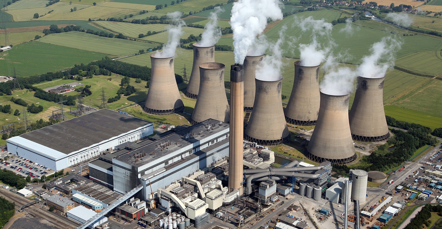
Image: Eggborough coal- fired power station.© Neil Mitchell/Shutterstock.com.
Source: Department of Energy and Climate Change