Guest post: How heatwave images in the media can better represent climate risks

Dr Saffron O'Neill
08.29.19Dr Saffron O'Neill
29.08.2019 | 11:30amDr Saffron O’Neill is an associate professor in geography at the University of Exeter. Between 2012 and 2017 she held an Economic and Social Research Council Future Research Leader Fellowship on “Visualising climate change”.
As the northern hemisphere summer comes to an end, it seems a fitting time to reflect on how the news media has reported on this year’s summer heat and heatwaves.
This has been an exceptionally hot summer: across Europe, there have been two distinct periods of very hot weather. Temperature records were broken in June across many countries, during what became the hottest June ever recorded in Europe.
Another period of intense heat occurred in July, matching – and maybe even exceeding – the record set the previous month. Analysis suggests this event was made up to 100 times more likely because of human-caused climate change.
And just this past weekend has seen more records broken in the UK, with the hottest August bank holiday Monday on record and the hottest August bank holiday weekend as a whole.
This record-breaking heat made headlines across the UK’s media, with many stories illustrated with images focusing on the fun of the summer sun. Yet heatwaves have serious impacts, which are projected to become more potent with rising global temperatures. This prompts the question of what impact using these images has on the wider public? And what images would be more appropriate to illustrate these news stories?
Fountain frolics or train cancellations?
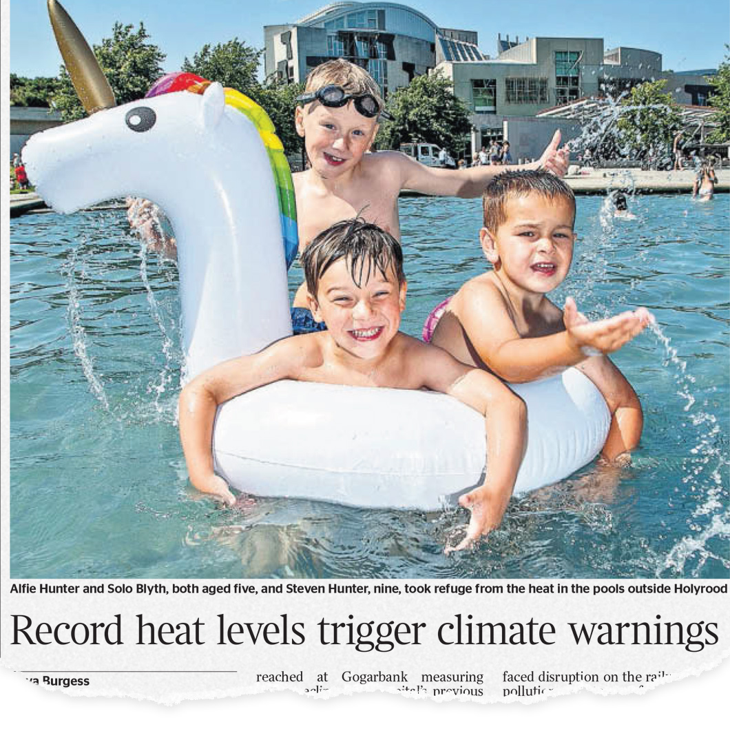
In the early summer heatwaves in the UK, many news outlets chose to represent stories about extreme heat as something to be enjoyed: images of sunbathing on the beach amongst colourful parasols, or splashing around in city fountains.
Many of these articles were juxtaposed with headlines that belied the seriousness of the coming weather. Just two examples of many: “Hell is coming” Mail Online, in a story accompanied by a picture of a woman splashing in a fountain by the Eiffel Tower. A live-text discussion on the Guardian website entitled “Heatwave: Paris suffers 42.6C hottest day ever” was illustrated by people enjoying the hot weather on Brighton Beach.
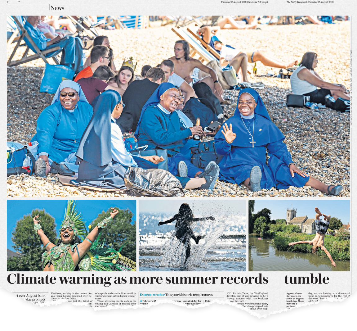
The Daily Telegraph, 27 August 2019
This commitment to headlines of heatwave suffering alongside jolly holiday snaps shows no signs of being a one-off trend. Before, during and after the record-breaking August Bank Holiday, numerous newspapers followed suit.
A Mirror headline from Thursday last week spoke of “Met Office health warnings for 33C bank holiday heatwave”, yet it was illustrated by another holidaymakers-on-busy-beach photograph. A Daily Telegraph article on Tuesday carried the headline “Climate warning as more summer records tumble” in the print edition and was illustrated by nuns on a beach and children playing in water. And a Sunday Telegraph piece in its print edition advising that “Heat could tip A&E units into queues chaos, warn doctors” is accompanied by an image of families canoeing.
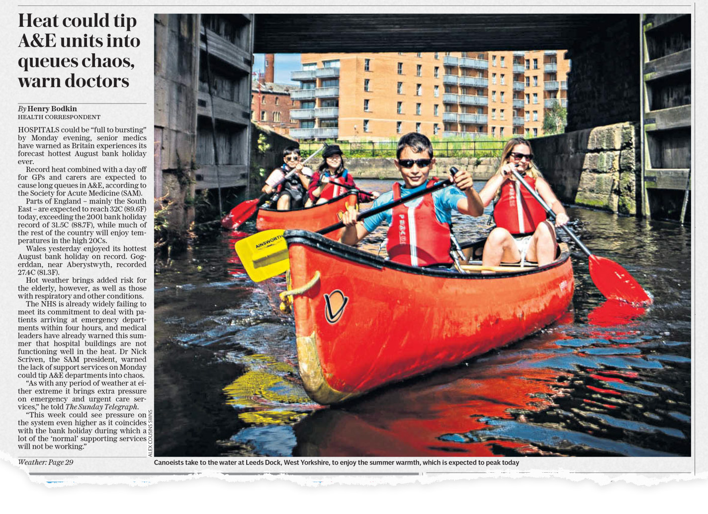
The Sunday Telegraph, 25 August 2019
Of course, summer holidays are meant to be enjoyed – and as anyone who has ever lived in the UK knows, Brits in particular seem to love a good-news weather story (almost as much as a bad-weather story). But where were the images of people struggling in the heat?
Daily lives
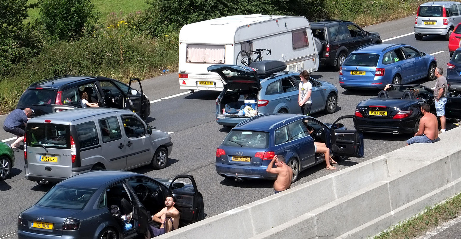
Although there has been a rapid increase in the visual coverage of climate impacts in media stories, often lacking from the visual narrative around heatwaves are the less enjoyable aspects. These might include the significant transportation failures as railway lines buckled, the severe health impacts on older folks and vulnerable people, the effects of extreme heat on animals and food production, and the lack of buildings and infrastructure well-adapted to offer a comfortable environment to their occupants during extreme heat.
For many going about their daily lives during these heatwaves, life was not all fountain frolics and sunbathing.
The most recent assessment report from the Intergovernmental Panel on Climate Change (IPCC) report shows that rising global temperatures is expected to bring more of these sorts of heatwaves in the coming years and decades. In fact, in future years, summers like 2019 may be commonplace rather than seeming exceptionally hot.
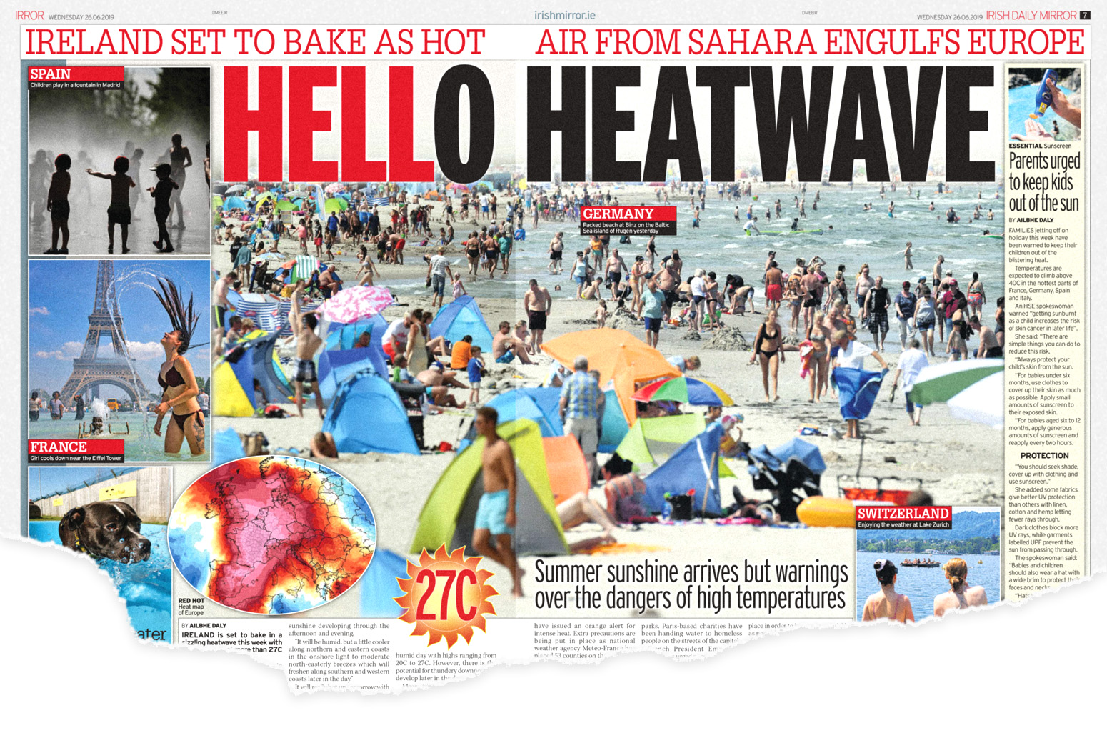
The Irish edition of the Daily Mirror, 26 June 2019
An unbearably hot train commute compounded by delays and cancellations, farmers struggling to keep their animals cool enough for days on end, hospital emergency departments coping with an influx of heat-related illness, struggling to get a baby to sleep in a hot and stuffy bedroom: people struggling to go about their daily lives because of the weather. These could be examples of compelling and relatable visuals with which to illustrate stories of extreme heat.
Therefore, finding – and using – more effective ways to visually communicate about an increasingly hot future is a pressing issue.
Why do visuals matter?
A diversity of evidence points towards how media representations play an important role in how we think, feel and act on climate change.
Much research has focused on analysing how the media represent climate change through text, mainly through work examining the text of newspaper articles. Yet this work fails to take account of the role of visual images.
A growing group of experts working on climate change visuals is showing that the images used to communicate about climate change play a key role in shaping readers’ thoughts and feelings about the issue.
Images are key for setting the context and narratives about climate change. Images shape how important people think climate change is – their “sense of saliency” about the issue; and whether they feel able to act on it – their “sense of self-efficacy”.
Yet, the images of climate change that the media tend to favour are restricted to a fairly narrow range of themes. And many of these fail to increase either a sense of saliency or a sense of self-efficacy. For example, a common way of illustrating climate news is using photographs of politicians, yet these images strongly undermine saliency. Conversely, images which increase a sense of self-efficacy, such as images of energy futures, are rare in the media. This is true across a range of countries, from the US, UK and Australia to Austria, Switzerland and Germany.
Opportunities for change
There has been little work examining how media organisations select and use images for weather and climate news.
What little there is suggests that there is a disconnection between journalists writing news stories and picture editors and others selecting images to go alongside them. As a result, visual and text-based narratives often pull in different directions, and can even advance contradictory claims – much as can be seen in the heatwave news reporting.
But this is not to lay blame at the feet of journalists, editors or media organisations. Climate change is a complex and amorphous issue – so how can we improve how it is represented visually?
We know from empirical evidence that it is often not very helpful to try to “scare” people into action with dread-inducing images, in this case, of extreme heat. But images of ice creams and holidays don’t do much to progress the visual lexicon of heatwave risk either.
The Scottish edition of the Times, 26 July 2019
Rather, researchers and academics need to work with media organisations, image libraries and communication practitioners to craft a more diverse and engaging set of visuals from which to illustrate and imagine climate change.
Earlier this summer, I was involved in a Twitter thread commenting on a BBC News article, “Climate change: UK’s 10 warmest years all occurred since 2002”, which was illustrated with an image of people sunbathing under colourful parasols on a UK beach.
To the credit of the BBC, the image was subsequently changed to one of a train shimmering through heat haze. In a more concerted effort, the communications specialists at Climate Outreach have created the Climate Visuals project, a growing library of evidence-based images for effective climate engagement.
The examples below show some of the images that better represent some of the impacts of heatwaves.
-

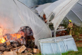
Wildfire in Tuesley Farm, Godalming, UK. 20 August 2018. Credit: james jagger / Alamy Stock Photo
-
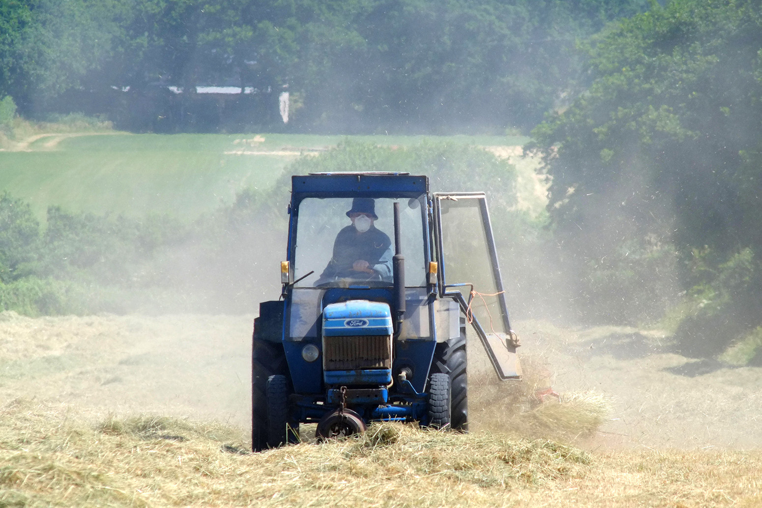
Dust rises from dry fields during heatwave in UK, 28 June 2018. Credit: Peter Cripps / Alamy Stock Photo.
-

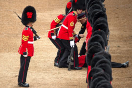
A soldier, overcome with heat, collapses during the Horse Guard Parade on 2 June 2018. Credit: Malcolm Park editorial / Alamy Stock Photo.
-
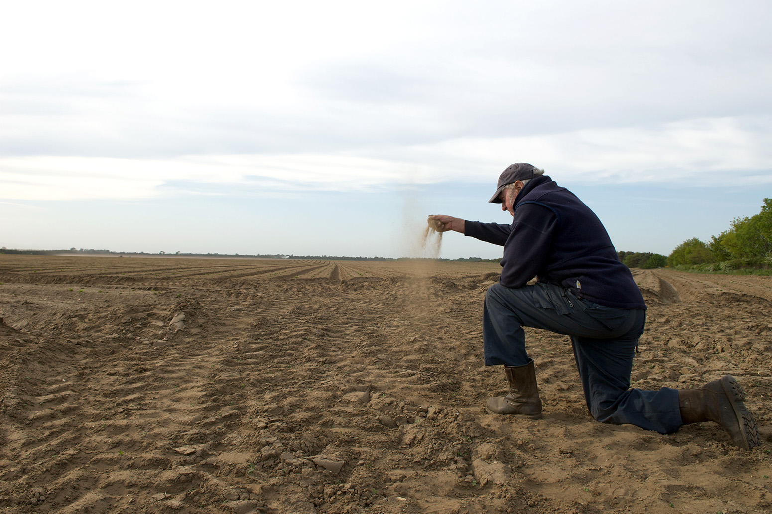
A farmer in a drought-stricken field of crops, Suffolk, UK. Credit: clynt Garnham Agriculture / Alamy Stock Photo.


I hope that this, and other initiatives like this one, will be the start of a conversation to create a more diverse and engaging visual discourse for imagining and adapting to our climate changed future.
-
Guest post: How heatwave images in the media can better represent climate risks
-
Guest post: Using heatwave images in the media that better represent climate risks