Guest Post: How IPCC graphics could be made more accessible

Jordan Harold
10.17.17Jordan Harold
17.10.2017 | 4:06pmJordan Harold is an applied cognitive psychologist at the school of psychology, University of East Anglia, and the Tyndall Centre for Climate Change Research.
The Intergovernmental Panel on Climate Change (IPCC) is currently calling for nominations for authors of its next assessment report. This will be the sixth such report since the IPCC was established in 1988.
While these extensive reports have been criticised as being inaccessible to non-experts, IPCC chair Dr Hoesung Lee recently outlined a commitment (pdf) that the next set will be “clear, accessible and user-friendly…so that non-specialists can understand climate change and its implications”.
This commitment feeds into growing momentum within the IPCC and the broader climate change research community to make scientific knowledge about climate change more accessible to wider audiences.
There have already been positive efforts to improve the communication of the text of IPCC reports, for example, by the use of headline statements and frequently asked questions (pdf). However, it is less clear how the graphics – such as graphs, charts and diagrams – might be made more accessible.
Research suggests that highly educated audiences can sometimes struggle to interpret IPCC figures correctly. Yet merely simplifying the content comes with the risk of losing the scientific rigour that the IPCC’s credibility depends on.
Recognising this issue, the Norwegian Environment Agency invited my colleagues and me at the University of East Anglia and the Tyndall Centre for Climate Change Research to develop practical guidelines for researchers.
In line with current evidence, published by myself and colleagues in Nature Climate Change, our guidelines highlight that the success of a visual depends on the message being communicated, the prior knowledge and expectations of the audience, and the perceptual features of the visual design. In addition, success can only be known if measured and data visuals, therefore, ideally need to be tested with their intended audience to evaluate their effectiveness and identify any difficulties in comprehension.
These elements, encapsulated in the guidelines by the ”MADE” principle – Message, Audience, Design, Evaluation – can be considered as four key pillars in evidence-based communications design.
Using the MADE principle, our report aims to equip researchers, both within the IPCC and researchers more broadly, with a set of guidelines to help make graphics more accessible. In addition, we provide recommendations for consideration by the IPCC Bureau and Technical Support Units that could help make authors’ lives easier.
Below, I look at each pillar of the MADE principle in turn.
Message: Communicate it clearly
Communicating summaries of scientific information is particularly challenging when condensing large amounts of technical information into key insights, while at the same time maintaining accuracy.
Page length limits and layout constraints may also restrict the extent to which visual information can be communicated as well as desired.
It may be tempting to pack a lot of technical information into a single figure. But doing so can result in graphs that are visually and conceptually complex, potentially masking the main message.
For example, to an uninitiated reader, the main message of the figure below (from the synthesis report of the IPCC fifth assessment), is unlikely to be immediately clear. While the lengthy caption provides an explanation of the content, non-specialists may struggle to make sense of it.
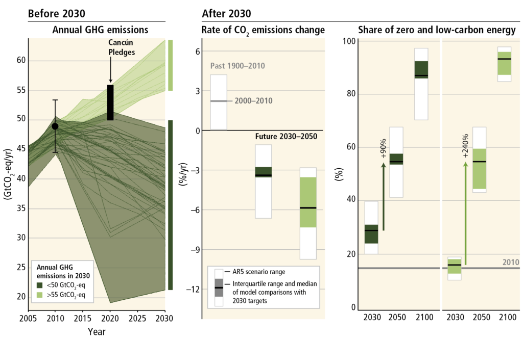
Figure SPM.12 from the IPCC Fifth Assessment, Synthesis Report, 2014. Original figure caption: The implications of different 2030 greenhouse gas (GHG) emissions levels for the rate of carbon dioxide (CO2) emissions reductions and low-carbon energy upscaling in mitigation scenarios that are at least about as likely as not to keep warming throughout the 21st century below 2C relative to pre-industrial levels (2100 CO2-equivalent concentrations of 430 to 530 ppm). The scenarios are grouped according to different emissions levels by 2030 (coloured in different shades of green). The left panel shows the pathways of GHG emissions (gigatonne of CO2-equivalent per year, GtCO2-eq/yr) leading to these 2030 levels. The black dot with whiskers gives historic GHG emission levels and associated uncertainties in 2010 as reported in Figure SPM.2. The black bar shows the estimated uncertainty range of GHG emissions implied by the Cancún Pledges. The middle panel denotes the average annual CO2 emissions reduction rates for the period 2030–2050. It compares the median and interquartile range across scenarios from recent inter-model comparisons with explicit 2030 interim goals to the range of scenarios in the Scenario Database for WGIII AR5. Annual rates of historical emissions change (sustained over a period of 20 years) and the average annual CO2 emission change between 2000 and 2010 are shown as well. The arrows in the right panel show the magnitude of zero and low-carbon energy supply upscaling from 2030 to 2050 subject to different 2030 GHG emissions levels. Zero- and low-carbon energy supply includes renewables, nuclear energy and fossil energy with carbon dioxide capture and storage (CCS) or bioenergy with CCS (BECCS). Note: Only scenarios that apply the full, unconstrained mitigation technology portfolio of the underlying models (default technology assumption) are shown. Scenarios with large net negative global emissions (>20 GtCO2-eq/yr), scenarios with exogenous carbon price assumptions and scenarios with 2010 emissions significantly outside the historical range are excluded. Source: IPCC
While negotiators at international climate change summits and policymakers for national governments may have experts on hand to help explain such graphics, not all readers will have that option.
Articulating the main message at the outset and referring to it throughout the design process is an effective way to inform design choices.
Audience: Understand who you are communicating with
How a message might best be communicated depends on the target audience.
A person’s understanding of a graphic will be influenced by their prior knowledge, their expectations and their information needs.
While IPCC reports are primarily written for policymakers within national governments, they are also relevant to a wide range of other stakeholders in society. And even when only considering them as a group, policymakers have different levels of prior knowledge and varying responsibilities.
Not designing a graphic with your audience in mind will likely result in a visual that fails to do the job.
It is easy to succumb to the “curse of knowledge”, in which we – and that includes psychologists, who should know better – inadvertently make the assumption that others hold similar knowledge to ourselves.
However, having a clear understanding of the audience and tailoring the design of graphics so that they match commonly understood cultural conventions and metaphors can enhance accessibility.
Design: Draw on cognitive science
Research in the cognitive sciences has shown that our visual attention is highly adapted to real-world environments. Our attention is often immediately and effortlessly drawn to items that “stand-out”.
For example, in the photo below, taken at the COP21 Paris summit, the brightly-coloured animals immediately capture our attention by virtue of their size and colour contrast relative to the rest of the busy environment. (In fact, the conspicuousness of the animals resulted in them quickly becoming useful landmarks to help navigate the summit).

What immediately captures your attention in this photo from COP21? Photo by IISD/Kiara Worth (enb.iisd.org/climate/cop21/enb/30nov.html). Reproduced with permission.
As shown in the schematic below, various properties are known to capture visual attention. For example, contrasting size and spatial isolation. These properties can be used in the design and layout of figures to help direct readers’ attention and guide their comprehension.
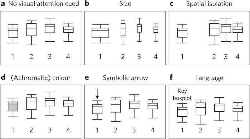
Schematic of properties known to capture visual attention. Source: Harold, et al. (2016)
As well as visual elements, scientific figures are, of course, accompanied by text. However, when text and visual are separated, they require the reader to split their attention. This can reduce how easily they’re understood, as it takes extra effort to match-up the information.
Integrating text more closely with visual elements can improve accessibility. For example, incorporating descriptive headings and subheadings that impart clear messages and integrating text labels within a figure can aid comprehension.
Below are two good examples of graphs that make use of cognitive design principles. In the first, the reader’s attention is directed using contrast in colour and matching colour between text and corresponding data. In the second, the text – i.e. heading, subheading and labelling – is integrated in the graph to help comprehension and communicate a clear message.
A section of a larger infographic about the Global Carbon Budget 2016. Credit: Global Carbon Project.
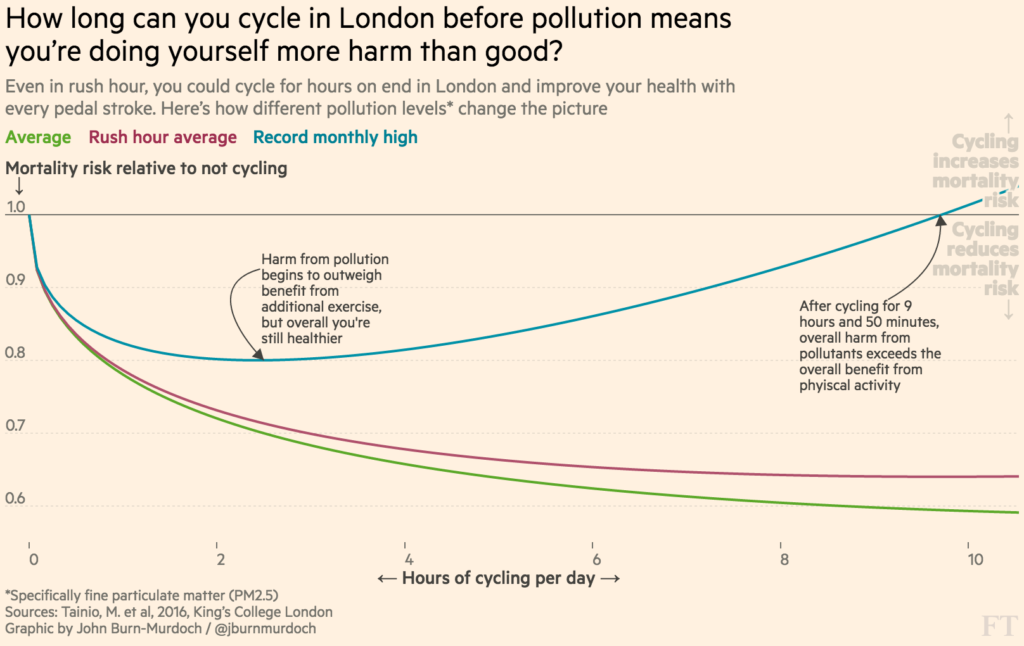
Graph showing the mortality risk associated with the time spent cycling per day in the polluted air of central London. Reproduced with permission from John Burn-Murdoch of the Financial Times.
Accessibility can also be enhanced by using visual formats that your audience is already familiar with; reducing complexity where possible and signposting readers to more detail if they require it; building up information sequentially to avoid overloading your audience; and eliminating jargon and explaining acronyms to avoid alienating your audience.
Evaluation: Test and get feedback
Critically, you can only really know if your communication is effective if it is evaluated. Testing visuals with the target audience during the design process can help identify issues early on.
This might involve asking readers to explain what they understand from the visual to see if it matches the main message you are trying to communicate. More advanced testing – such as eye-tracking, for example – can help to diagnose the reasons for any issues. Informed by audience feedback, designs can then be iterated and improved.
By integrating structured evaluation into the design process, authors can have greater confidence that their visuals will achieve their desired communication goals.
Improving IPCC graphics
In the same way that climate researchers use the best-available evidence to make assessments about climate change, the best-available evidence about how people process complex information should be used to inform communication of the science.
As the IPCC looks ahead to the special report on global warming of 1.5C and the sixth assessment report, there is an opportunity for authors to embed the science of science communication within their work, including their graphics.
Reassuringly, the IPCC is actively engaging with communications experts and exploring ways in which communications can be made more accessible, as seen at the IPCC Expert Meeting on Communication held in Oslo, Norway, in 2016.
Authoring IPCC reports is a demanding process, but the need to communicate ever more complex science is not going away.
Harold, J., Lorenzoni, I., Coventry, K. R., and Minns, A. (2017) Enhancing the accessibility of climate change data visuals: Recommendations to the IPCC and guidance for researchers. Report published by the Tyndall Centre for Climate Change Research, Norwich, UK.
Report website: guidance.climatesciencecognition.com
Report summary: tyndall.ac.uk/datavisuals