Mapped: The climate change conversation on Twitter in 2016
Last year, Carbon Brief asked John Swain from Right Relevance to produce a map which visualised the climate change conversation on Twitter. In April, we published his map which was produced using data gathered over a few weeks. However, we wanted to produce something more substantial and insightful than this initial snapshot which captured just a brief moment in time. So we asked him to continue gathering data throughout the rest of 2016. In total, 13 million tweets were captured. Here, he explains his findings…
Background
In early 2016, we were commissioned by Carbon Brief to produce analysis of the conversation on Twitter about climate change. A map was created using data collected during March 2016. Following the interest and reaction to the first analysis we produced for Carbon Brief last March, we agreed to continue collecting data and produce a much richer analysis of the whole year. But, first, it’s worth restating what the original brief was.
In summary, the object of the project was: “To show, both visually and by ranking, who the key influencers are on Twitter for the term ‘climate change’. To show both how they ‘cluster’ and interconnect. To show the volume of interaction and where the ‘hotspots’ of activity are within the climate change Twitter universe. To use a transparent and bias-free methodology to both harvest and represent the data.”
The search used during this period was for tweets in English including the following keywords: “global warming” OR (global AND warming) OR “climate change” OR (climate AND change) OR globalwarming OR climatechange OR #climate.
Using this collected data, the principle of the analysis methodology we deploy is to examine the connections that users make by communicating with each other on Twitter via retweets, mentions and replies. We measure influence using the page rank and “betweeness centrality” algorithms. More details of the methodology can be found in this article.
We have now updated the analysis to discover the most influential users on Twitter over the course of the whole year. The analysis covers the period of February to the middle of December 2016 during which we collected more than 13m tweets from more than 3m individual users.
For this much bigger graph, which includes tweets collected over a much longer period, it was necessary to filter some of the noise in order to produce an analysis which is consistent with the initial analysis conducted in March 2016 .
Visualisation
The conversations can be visualised as a map, as shown below. Click to zoom and pan around the map, and the icon in the top right to view fullscreen.
Within the map, it is easy to identify groups of users which form communities of interest at a global level. The width of the line between users indicates the quantity of links. Groups of users with large numbers of links (retweets and mentions) between them stand out as thick, dark lines. The “force-directed” algorithm is set up to organise users into groupings of strong mutual interactions, which tends to reflect mutual interests.
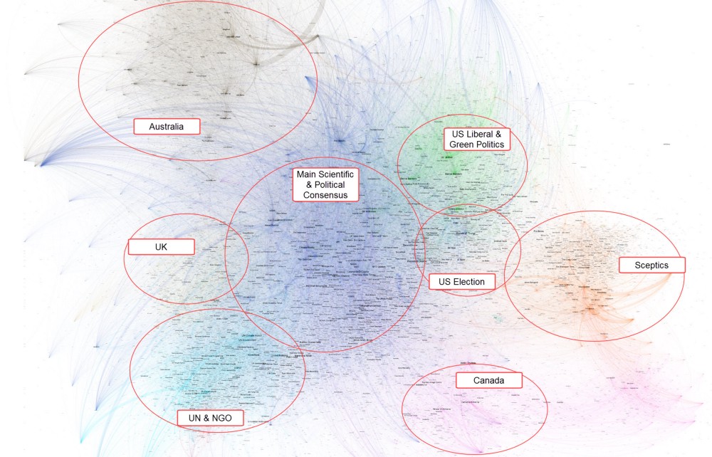
Additionally, you can see who is engaging who by the direction of the “catherine wheel” of lines coming out of a dot. If the lines are suggesting a clockwise motion, that person is being mentioned and retweeted a lot. Conversely those lines suggesting an anti-clockwise motion are just retweeting or mentioning others a lot. These users can be seen round the fringes and may indicate users who produce a lot of spam tweets, but who are not removed by the filter we apply to remove the very obvious bots.
This is a very high level view of the main groups of users and there are many smaller groups which can be seen by closer visual inspection of the zoomable map.
In addition to the visual layout for identification of communities, we used machine learning community detection to identify how communities form within the conversation. The colours in the map, which are chosen randomly by the algorithm, represent the detected “communities”. The colouring helps to illustrate a slightly richer set of communities than identified simply by the positional layout. Additionally, you will notice some communities are more physically separated from the rest, indicating an “echo chamber”. For example, look at the climate sceptic community over on the right of the map. The original analysis last year examined this phenomenon.
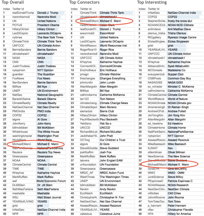
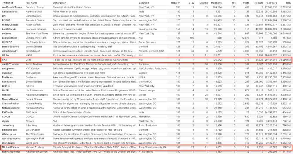
Tables of main influencers
We use other graph algorithms to identify the most ‘influential’ users in the overall conversation. We use several measures to indicate different types of influence.
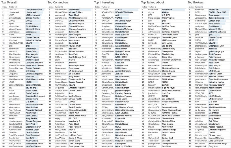
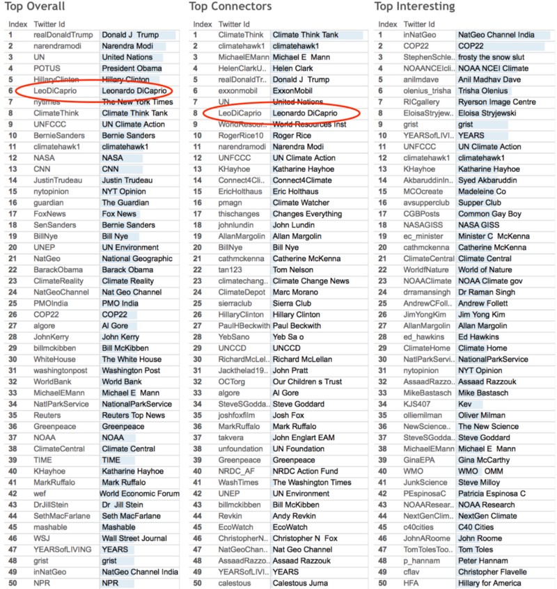
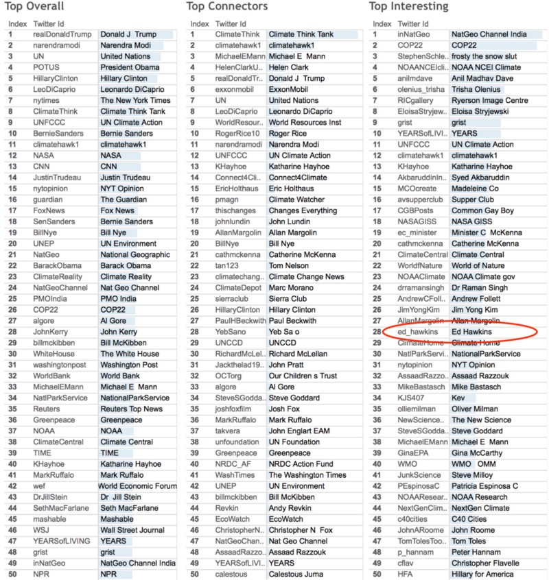
Top overall
Top overall influence is measured by combining the quantity of connections (retweets, mentions, replies), the quality of the connections (measured by page rank) and the reach of the user’s tweets. These are adjusted to discount the skew towards users with very large number of followers.
Top connectors
The value of a user’s connectedness is measured using an algorithm called “Betweenness Centrality“. This measures how well a user is connected on the paths between all other users, compared with everyone else. It was introduced as a measure for quantifying the control of a human on the communication between other humans in social networks.
Most ‘interesting’ users
The “interesting” metric finds smaller users who made a relatively high impact. It compares how well a user does in the overall ranking compared to how well they would be expected to do given the number of followers they have. It is useful for finding niche or local stories in a large network where they are difficult to find.
Top talked about
It measures how much a user is talked about rather than responded to. It measures the ratio of the amount of times a user is mentioned to the number of times a user is retweeted. The ratio is adjusted for the number of tweets the user makes and the number of followers the user has. This can indicate that a user is not active on Twitter, but is being talked about in the wider world which is reflected by other users mentioning the user.
Top brokers
“Brokers” are connectors between communities of users. Connectors (see above) measures how well connected users are between all other users. Brokers are those which connect (either by retweeting/replying themselves or being retweeted/mentioned by others) between different communities.
Dashboard
We show the information in a set of tables which can be seen in a Tableau Dashboard. (Again, as with the zoomable map above, it is easier to view in a separate tab.)
Below, see the Tables in the live dashboard. Click the “Top Tables” tab to see the tables of influential users.
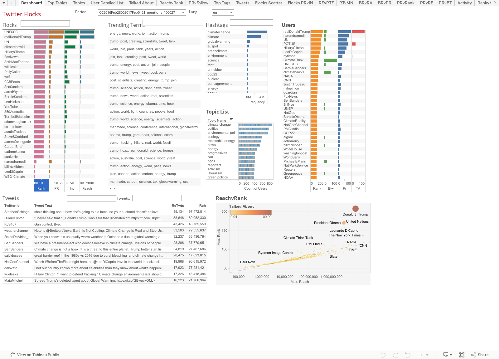

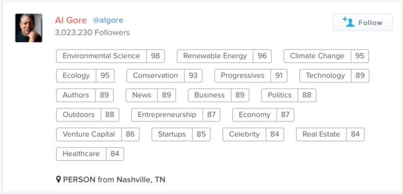
The dashboard also allows you to view “topical influence“. This provides information on how influential Twitter users are across more than 50,000 topics based on their followers/following and links to published articles. The topics scores are generated by an algorithm based on the relationships between influential users rather than any human assessment of influence.
For example, here is the list of topics in which Al Gore is influential. The number after each topic reflects their influence on a 0-100 scale.
With the integration of these influence scores we can filter these tables by particular areas of influence. In the screenshot below there is a list of the topics in the middle section. If a topic is selected it only shows users who have influence in that topic.
For example, if the “renewable energy” topic is selected in the main dashboard page, as shown below, the resulting tables show the most influential users in the renewable energy topic.
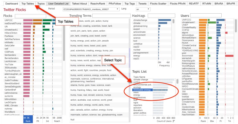
Flocks and tribes
There are two types of communities which we identify in the dashboard above – “flocks” and “tribes”. Both types of communities are identified and named by machine-learning algorithms and not by any human decision-making process. However, they are identified in different ways and have a different quality with regard to time.
Flocks are the main groups you see identified by position and colour in the visual map. The connections between these users reflect the tweeting activity (retweets, mentions, replies) so show how people group within the conversation. This is a temporal phenomenon, for example, the US election. The flocks detected by the algorithm include the “UNFCCC”, “Fox News” and even “Carbon Brief”. Click on the flock’s name in the dashboard to reveal more analysis and data about that detected community.
Tribes are detected by the relationships between users’ followers and who they follow. These are the groups identified by “topical influence”, such as the “renewable energy” topic above. When you select a topic from the list in the dashboard the users are filtered to show the tribe of users for that topic. These relationships tend to reflect a more permanent set of shared interests. Using a football metaphor, tribes are the supporters of teams. Flocks form to discuss a particular game or player transfer.
Leonardo DiCaprio
When the actor Leonardo DiCaprio won an Oscar last February he cited climate change in his acceptance speech. As our analysis published last year showed, the Twitter conversation about climate change was dominated for the following days by Leonardo DiCaprio.
The following image from the original analysis shows this surge in influence during that period.
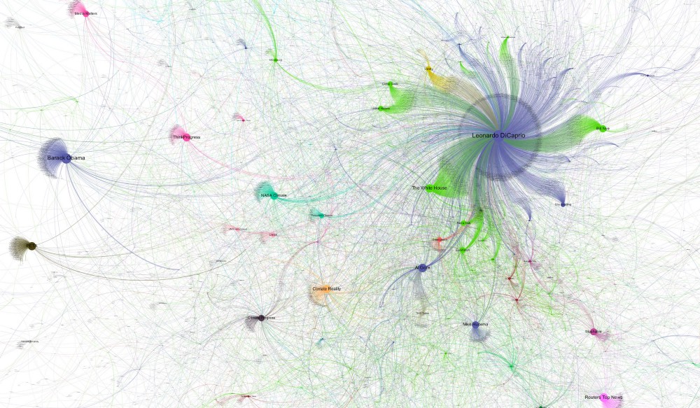
This effect of users with a very large number of followers having an extreme influence is something that is hard to avoid with conventional analysis based on simple metrics, such as retweets. The techniques we use can correct for this effect to gain a better understanding of who is a genuine influencer within a subject. The techniques for overcoming short-term distortions were discussed in the original article.
Since then, Leonardo DiCaprio has continued to be involved in the climate change conversation. In our new analysis covering 2016, Leonardo DiCaprio is identified as a user with a major influence on the subject of climate change.
Over the course of the year, DiCaprio has been a consistent tweeter on the subject of climate change and has been involved in other projects to promote the cause he is advocating including the film Beyond the Flood. What our analysis shows is that DiCaprio is someone who has significant influence due to the number of followers, but that his engagement in the conversation is also significant and that he is a genuinely influential person on the subject of climate change.
Climate scientists
The reverse of the Leonardo DiCaprio effect can be seen when looking at the influence of climate scientists within the Twitter conversation. We have called this the “expert problem” and reflects their relative lack of prominence in the map. This occurs because experts tweet using technical language that is not picked up by the keyword terms we use to collect tweets. One solution would be to track lots of technical terms, but if technical terms are added it is impossible to not introduce significant bias in favour of particular users.
For example, including tweets that contain “carbon dioxide” or “greenhouse” could capture lots of tweets that are not connected to climate change. Similarly, including terms such as “climate science” may introduce a significant skew in favour of the academic community making them seem more influential overall than they actually are.
This conflicts with our objective, namely, identifying those who have the most impact and influence in the general conversation about climate change. What we can see, however, is how scientists can gain influence through their ideas in two specific ways:
- Influencing others who have a big voice within the general conversation.
- Having an idea which gains widespread notice — a scientific meme.
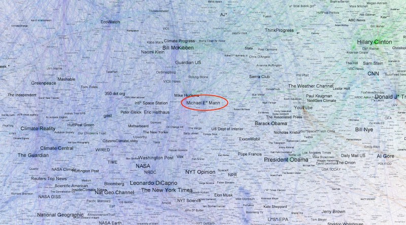
Michael Mann
Prof Michael Mann is an example of the former. Mann, the director of the Earth System Science Center at Penn State University, is one of the world’s most prominent and quoted climate scientists. He is also very active on Twitter. In the main tables, Mann is highly placed in the top tables as a “connector”, “interesting” and “overall”.
Mann does not have a very large number of followers compared to many of the users in the top overall table. However, the position that Mann occupies in the conversation map is a clue to the way in which he achieves influence on Twitter.
Here is the section he occupies. Notice how close this is to many other mainstream influential users.
Below is what we refer to as an “ego network” for Michael Mann. An ego network shows all the other users that are directly connected to a user – in this case, Mann – and all the connections between those users.
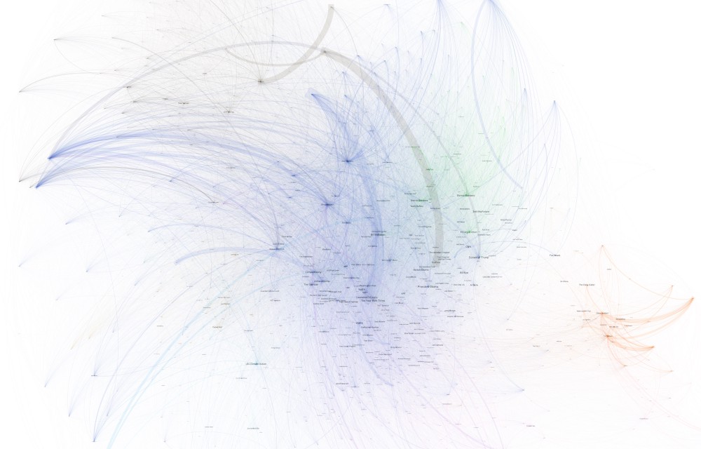
This map illustrates two things: 1) Michael Mann is connected to a large part of the most important users in the overall network; 2) The users in the ego network also communicate with each other.
For comparison, here is the ego network for CNN.
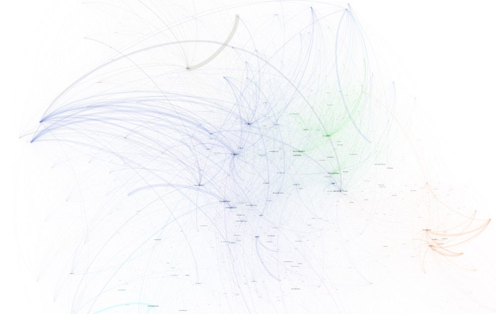
It is clear that Michael Mann is more connected within the conversation amongst influential users who are themselves more engaged with other influential users. To put this in context, CNN has more than 30m followers, compared to Mann’s almost 50,000 followers.
When CNN tweet about climate change the overall reach (the total number of potential displays in users’ timelines), therefore, is very high.
This table below shows the difference of some of the key metrics between these users. Notice the big differences between the total reach and the BTW (Betweenness). (On the dashboard, click “User Detailed List” to view this table.)
This illustrates two very different ways in which influence is created. CNN has a large following of users from the general public whilst Michael Mann is much less well known, generally, but has a high connectivity with important users in the network.
Ed Hawkins
Another example of the “expert problem” is illustrated with a popular tweet from Ed Hawkins, who exerts influence in the second way identified above — the spread of a powerful idea.
Dr Ed Hawkins is a climate scientist based at the University of Reading with a fairly small number of followers (relative to the leading names in the overall table). In May 2016, Hawkins tweeted an animated graphical representation showing the change in global temperatures since 1850. This went viral, but was not directly picked up by our search which looks for explicit phrases, such as “climate change” and “global warming”. However, a human can clearly see that it is about climate change. This is a classic example of the expert problem.
The effect of Ed Hawkins’ viral tweet is picked up in our analysis, however, because many other users tweeted about it using terms which are picked up by our search terms.
Spiralling global temperatures from 1850-2016 (full animation) https://t.co/YETC5HkmTr pic.twitter.com/Ypci717AHq
— Ed Hawkins (@ed_hawkins) May 9, 2016
One way this phenomenon is measured by our analysis is the “Interestingness” measure.
As mentioned above, Interestingness “compares how well a user does in the overall ranking compared to how well they would be expected to do given the number of followers they have”.
So, whilst Ed Hawkins has a small number of followers and a lot of his tweets are aimed at a scientific rather than a general audience, we can still detect his influence overall.
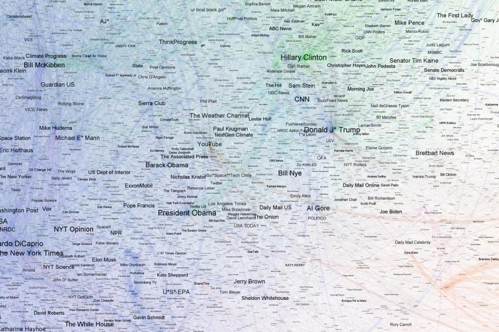
US presidential election
A clearly visible section of the map is the area shown below which is easily identifiable as the main participants in the US presidential election.
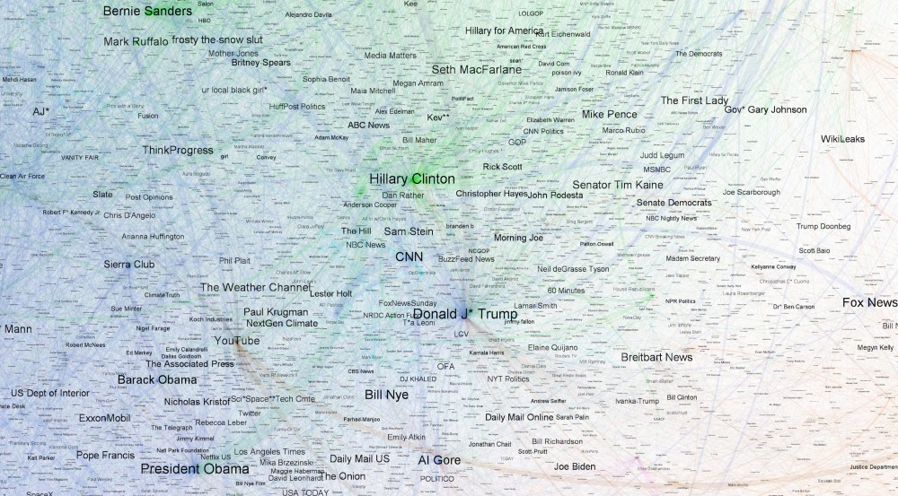
There are two main points to note about the election and the result.
First, it was a significant feature of the election that climate change was not widely discussed within the debate. We separately carried out a significant analysis of the election in which we found very little mention of climate change in the main topics of discussion.
Second, it is worth examining how Donald Trump’s influence is detected within this analysis. Whilst it is certainly the case that Trump is highly influential within any subject of general interest to society as a result of becoming the US president, the way in which this is represented in the conversation illustrates a fundamental shift in the nature of the global discussion of climate change as seen on Twitter.
In the tables Trump is most talked about and most influential overall, a fair reflection of the year’s events. He is also one of the top connectors.
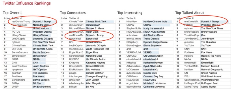
Notice the blue bars in the “Talked About” table. These illustrate the actual score of each user and it is very apparent just how much more highly Trump scores in the “Talked About” measure than other users. (Most names are very familiar, but number five on the list – “Kee” – features strongly due to a single tweet which went viral.)
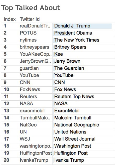
As mentioned above, the “talked about” measure “can indicate that a user is not active on Twitter, but is being talked about in the wider world which is reflected by other users mentioning the user”.
This table shows that Trump did not retweet anyone in the entire 13m set of tweets collected despite the same table showing that Trump tweeted 469 times. In other words, all of Trump’s influence comes from other users mentioning him.

The explanation for this seemingly unlikely fact is that the 469 tweets from Trump were made before the collection started but replied to by users during the period of collection. For example, his now-famous “global warming was created by the Chinese” tweet was posted in November 2012. This shows that Trump himself has not been active in the climate change conversation during our period of analysis.
If we plot the “talked about ratio” against the number of retweets the chart shows how far apart Trump is from other important people.
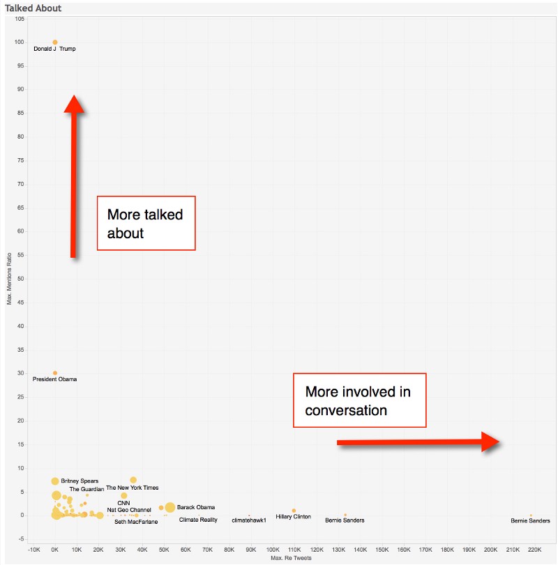
So, across the whole climate change conversation on Twitter in 2016, the single most important person is not engaged at all in the actual conversation. There are other powerful and well-known people who have external power on Twitter, but nowhere near to the same extent as Trump.