Roz Pidcock
18.07.2014 | 12:00amFrom flood barriers to fish stocks, a new super-graphic from the Met Office and the UK Foreign and Commonwealth Office shows how climate change is likely to alter human activity.
Looking at where our food comes from and how countries interact through travel and trade, it makes for a stark visualisation of what different regions can expect as climate change kicks in.
Mega-map
The Human Dynamics of Climate Change project is a huge venture, designed to illustrate the range and complexity of the potential impacts of unmitigated climate change.
It contains a massive amount of information but a good place to start is the map below, which shows how humans interact in today’s world.
The colours, arrows, symbols and shading show shipping routes, population density, crop importers and exporters, areas under water stress, busy ports and airports, fishing regions, tropical cyclone regions and melting glaciers.
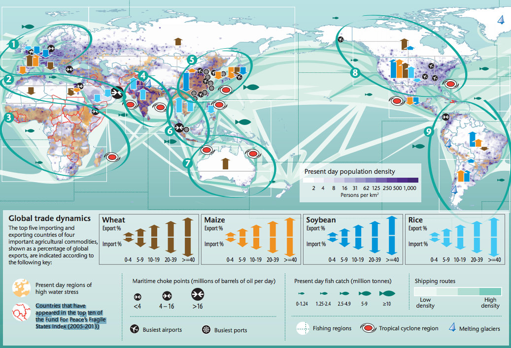
Present day human dynamics (1981-2010). Source: Human Dynamics of Climate Change ( HDCC), a joint project from the Met Office and UK Foreign and Commonwealth Office.
The scientists produced another six separate maps to show how the latest climate models predict climate change will play out across the world by the end of the century.
Each map shows a different type of impact – changes in water demand, crop yields, flooding, sea surface temperature, population and drought. But they should be looked at together to get idea of the full range of impacts expected in a given region, the scientists say.
For that reason, the project puts the main map plus all six impact maps on one super-graphic.
It’s a very comprehensive approach, that risks being a bit overwhelming in terms of the amount of information to take in. So we’ve pulled out some of the key themes below.
Rising flood risk
When it comes to the impact on people’s lives, the project highlights how it’s important to look not only at how climate change alters temperature and rainfall at a global scale, but also how the occurrence of weather extremes is expected to change. Take flooding, for example.
The circular red house symbols shows the expected increase in the risk of river flooding by 2100. The darker the blue background shading, the higher the confidence in the predictions.
By 2100, climate change is expected to increase the occurrence of flooding across large parts of the globe, and by more than 70 per cent in south, east and southeast Asia.
According to the data, around 70 per cent of Europe looks set to see lower flood risk (brown shading and green symbols), though notably this doesn’t include the UK.

Future change in flood frequency (2071-2100). Source: Human Dynamics of Climate Change ( HDCC), a joint project from the Met Office and UK Foreign and Commonwealth Office
(The set of six maps comes with some handy data lookup tables so you can see the data corresponding to each place and how different model projections are combined).
The maps show what you might consider the worst case scenario. They assume no action to curb emissions – the IPCC’s RCP8.5 scenario – and no adaptation to increase resilience.
Food security
Another map shows projected yields of the four main cereal crops – wheat, maize, rice and soybean – for the largest producing regions.
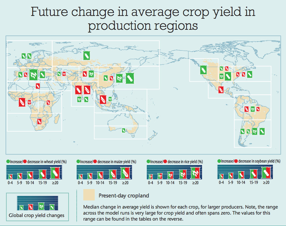
Future change in average crop yields (2071-2100). Source: Human Dynamics of Climate Change ( HDCC), a joint project from the Met Office and UK Foreign and Commonwealth Office
Projections vary hugely between different crops and different parts of the world. But the panel in the bottom left hand corner suggests globally, we can expect an overall increase in wheat, rice and soybean yields. The only crop that suffers is maize, according to the data.
This is a somewhat more optimistic picture than the latest report from the Intergovernmental Panel on Climate Change (IPCC) gave. It concluded:
“Based on many studies covering a wide range of regions and crops, negative impacts of climate change on crop yields have been more common than positive impacts â?¦ For the major crops (wheat, rice, and maize) in tropical and temperate regions, climate change without adaptation is projected to negatively impact production for local temperature increases of 2°C or more above late-20th-century levels, although individual locations may benefit”
For reference, the IPCC’s RCP8.5 scenario – which the Met Office models follow – projects between 2.6 and 4.8 degrees of warming by 2100, on top of 1986-2005 levels.
An important reason for the difference is that the Met Office/FCO projections assume crops have all the water they need. As another maps shows, this would require an increase in water demand by about 15 per cent over Europe, and more than 20 per cent in parts of Asia and North America.
The Met Office says in a Q&A that accompanies the maps:
“[I]n reality, the increase in the amount if water [crops] will need, combined with changes in runoff and greater demand for water from a larger population, may mean that this is not always achieved.”
The Met Office points out that average projections over the century mask the increase in year-to-year variability that comes with increases in drought, high temperatures and flooding.
And when it comes to food security, whether countries can produce their staple crops from one year to the next is more important than what’s happening on a global scale, say the scientists.
An alternative route
The scientists produced two more maps as part of the project. One combines all the impacts for the high emissions scenario (RCP8.5). The other shows the same but under an aggressive mitigation scenario that keeps warming below two degrees above pre-industrial levels (RCP2.6)
Click on the image below to compare the left map (high emissions) and right map (low emissions). See how the size of the symbols changes between them. You can see both maps in their full detail here and here.
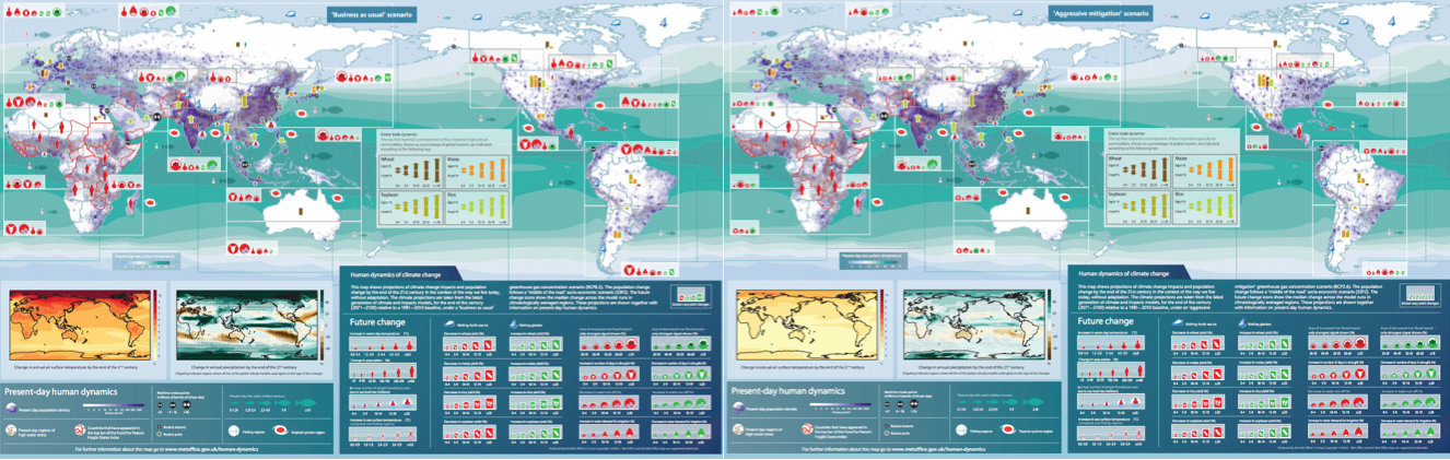
Future climate change impacts (2071-2100) for the IPCC’s high emissions scenario (RCP8.5) and aggressive mitigation scenario (RCP2.6). Source: Human Dynamics of Climate Change ( HDCC).
This is a just snapshot of what you can find on the Met Office pages. You can find the full super-graphic here, with explanations of where the data comes from.
The project aims to show just how complicated, far reaching and interacting climate change’s impacts will be on the world as we know it. And although the infographic is probably the busiest and hardest-to-absorb we’ve seen in a while, it certainly gets that particular message across.