
Dr Adam Corner
16.11.2016 | 4:15pmDr Adam Corner is the research director at Climate Outreach and an honorary research fellow at the school of psychology, Cardiff University.
The COP21 international climate summit in Paris will always be remembered for reaching an agreement to limit the rise of global temperatures. But in years to come – long after the celebrations of campaigners and the interest of journalists has faded away – what images will define the historic moment when the nations of the world finally agreed to take climate change seriously?
As part of an analysis completed ahead of COP22, my colleagues at Climate Outreach and I sifted through nearly 300 images published during that pivotal moment in Paris (on major online news outlets, NGO websites, and in image search engines).
As might be expected, we found plenty of images of politicians and negotiators inside the COP celebrating as they sealed the deal, and lots of photos of protesters outside of the COP.
What was surprising was that this was pretty much all we found. Overwhelmingly, the images we reviewed were either literal documentation of the inside of the COP, or staged protests by demonstrators on the outside.
The problem – as our Climate Visuals research published this month in the journal Global Environmental Change has shown – is that people don’t appear to respond very well to either of these types of photographs.
Visual cues
In a series of discussion groups and an online survey involving more than 3,000 people in the UK, Germany and the US, we found that politicians didn’t make especially compelling visual representatives for climate change. In our survey, we asked a series of questions about 24 images, including whether the image made people want to change their own behaviour in response. An image of David Cameron ‘hugging a husky’ scored the lowest on this measure of all the images we tested.
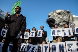
And, perhaps more problematically, we found that overly “staged” protest images were often perceived as gimmicky or even manipulative. People struggled to identify with activists in polar bear and penguin costumes, holding placards with slogans that the participants in our research often didn’t understand.
In our discussion groups, we found that authenticity was a key factor in shaping people’s responses to images of climate change. Neither politicians posing for photo-opportunities, nor western protesters staging a pre-planned demonstration, fared very well in this regard. One discussion group reacted to an image of a protester with blue face paint with the suggestion that he “probably used the same face paint to paint himself at Glastonbury this weekend, and rubbed out climate and put Kanye West”.
-
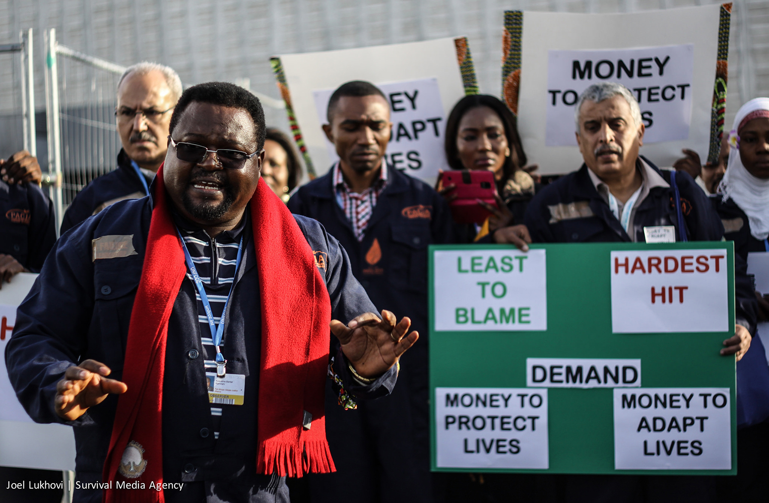
Various African and the small islands civil society groups make an action at the UN climate talks, in Paris to demand for a binding agreement that will see the temperatures reduce by 1.5 degrees celsius. © Joel Lukhovi/Survival Media Agency .
-
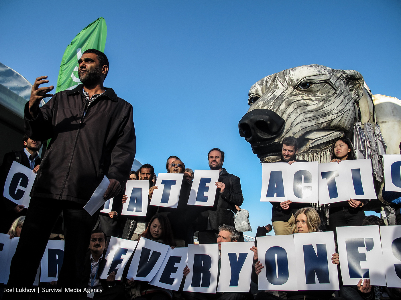
Kumi Naidoo, Executive Director of Greenpeace International participates in a action at COP 21 in Paris. © Joel Lukhovi/Survival Media Agency.
-
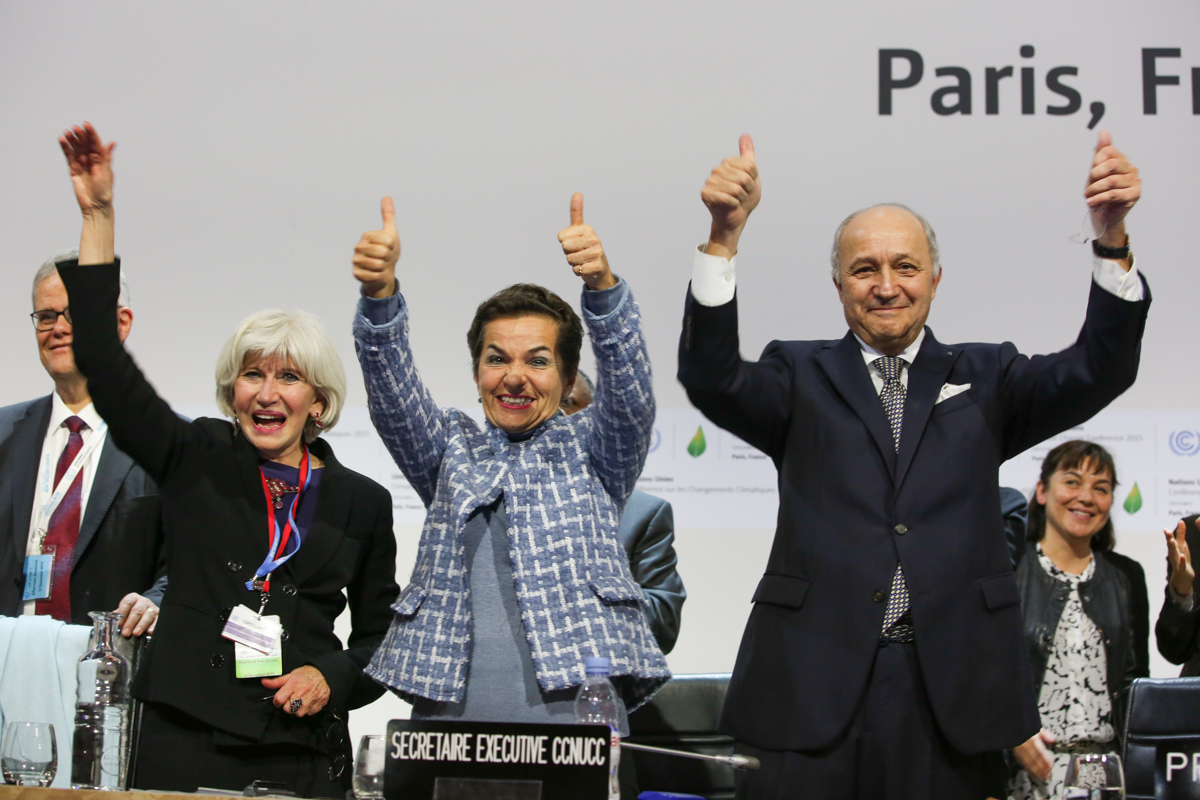
Laurence Tubiana, Christiana Figueres and Laurent Fabius celebrate the adoption of the Paris Agreement at COP21,12 December 2015. Credit: IISD.
-

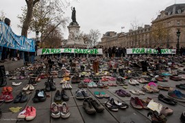
Thousands of people gathered at a peaceful protest for the climate on Boulevard Voltaire in Paris, France, 29 November, 2015. © Emma Cassidy/Survival Media Agency.

Opportunities to engage
Activists in polar bears costumes still featured strongly in the protest iconography surrounding COP21. But very few images made a link to broader climate change questions. For example, how climate impacts affect public health, the challenges that rising temperatures pose for farming and food production, or the growth in low-carbon jobs. There was a distinct lack of “ordinary people” in the images we analysed, and very little sense of the ways in which people in countries and communities across the world might be experiencing the issue.
Yet our research found that people engaged more positively with photographs of “real people doing real work” in response to climate change, or communities directly affected by climate change. Such images seemed to appeal across the political spectrum. For example, a relatively unremarkable image of a man installing loft insulation produced one of the strongest positive emotional responses among people on the right of the political spectrum in our survey. It was one of the few images where people on the political right were more motivated to change their behaviour than those on the left.
This doesn’t mean there are no images being produced or created that speak to these types of themes, of course. But they are not showing up in most mainstream channels. At a minimum, the dominant visual themes commemorating the momentous achievement at COP21 certainly do not reflect the richness and diversity of climate change as a social and cultural issue.
Our restricted visual vocabulary for climate change is by no means limited to the reporting of COPs. But given that the annual COPs are one of the few moments when global media attention is focused on climate change, this raises some important questions about whether our visual shorthand for climate change at key moments in the climate calendar is a help or a hindrance for communication and public engagement.
A fresh approach
In response to this question, we’re taking the Climate Visuals project to Marrakech to work with communicators, campaigners and photographers at COP22. Through interviews with key visual decision-makers involved in the creation, commission and dissemination of images around COP22, we identified a number of steps that should be taken this year to bring the iconography of the event more closely in line with the evidence base on how people react to climate imagery.
As a starting point, communicators should make the best of a restricted visual landscape. Some literal documentation of the COP is obviously required, but images capturing authentically emotional moments are worth a dozen “day-to-day” shots of negotiators and help give the technocratic COPs a human face.
Although activists have an important role in holding the politicians inside the COP to account, many demonstrations are “performances” for the media to report. Reflecting on how these performances are received outside of the green bubble is crucial – and our research suggests that showing a wider range of “ordinary” people (rather than professionally-convened protestors) is a way to reach a more diverse audience.
In the shadow of COP21, competing with the US election and with headlines not guaranteed, COP22 is an opportunity to experiment and trial new approaches. The event offers a platform to say “something else” about climate change. This might not be a literal telling of the COP, or even a depiction of the fringe activities but something interesting, new, powerful and inspiring that relates to key themes being discussed. With negotiators’ attention likely to be focused on adaptation finance, loss and damage, ratification and renewables, these issue provide a starting point for an enhanced visual vocabulary.
Choosing the right image
In a competitive digital environment, images that “stand out” are valuable tools. In our Climate Visuals research, images that involved humour or subversion seemed to achieve this. Although not universally loved, our discussion group participants were sensitive to (and generally appreciative of) undercurrents of humour or contrast in images (for example, a couple in their wedding outfits in a flood-ravaged street). Juxtaposition is also powerful – which could mean a “before-and-after” contrast, or the comparison of people with contrasting lives and experiences.
There are, of course, many considerations in choosing the right image. Journalists have very different purposes to campaigners; different audiences (in different countries and cultures) will respond in different ways to the same image. But even if journalists are not seeking to persuade their audience of a particular policy position, they should still be interested in attracting – and keeping – the attention of their readers with the image that accompanies their article. Climate Visuals offers an evidence base to inform these decisions.
It might not be possible to pick the “perfect image”. But if the evidence-base on how people engage with climate imagery can be used to inform the choices made by photographers, campaigners and journalists around key events such as COP22, then that is certainly a major step forward in widening climate change engagement and, ultimately, working towards a more inspiring visual language for climate change.
-
Guest post: Power of images to shape climate change perceptions
-
Take the polar bear costume off; Dr Adam Corner on using images to engage people about climate change