Seven charts showing how countries’ carbon footprints compare
Sophie Yeo
08.22.16Sophie Yeo
22.08.2016 | 3:53pmThe UN’s climate body, which was responsible for the Paris Agreement adopted in December 2015, has long been collecting detailed data on greenhouse gas emissions.
When countries met in 2014 for their annual climate conference, they decided that it would be easier to track progress if some of the data from developed countries — annex one countries in UN jargon — was collected together in one document.
The UN produced such a document for the first time in 2015, which compiled emissions data from 2013. At this time, only 31 countries had submitted their data.
The UN has now released the latest version, with emissions compiled for 2014, and this time including 43 countries. Carbon Brief has mined the latest document for the most interesting nuggets of information.
All data is self-reported and, therefore, based on a range of different assumptions and methods, although countries do undergo a check-up by expert review teams. This process of data collection is seen as key to ensuring that each country is sticking to its commitments.
Greenhouse gases come from a variety of sources, including power generation, industry, cars, planes, aviation and leakages. Not every potential source of pollution contributes equally to a country’s emissions.
Knowing the composition of a country’s carbon footprint provides an insight into its economy, and also highlights which sectors it should be targeting as it tackles climate change.
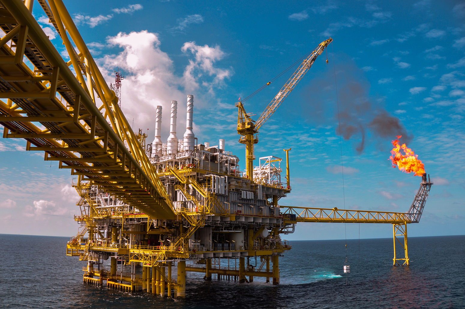
Oil and gas platform. Photo: curraheeshutter/iStock/Getty Images.
Transportation
Road transport accounts for around 20% of countries’ footprints, on average. Emissions are estimated based on fuel sales in each country, which explains why transport makes up 56% of Luxembourg’s total footprint. Vehicles entering the country to buy fuel, thanks to low VAT and excise duty, raise its emissions on paper, even though the fuel is probably burnt outside the country’s borders.
Road transport’s share of total emissions in developed countries (%), 2014. Source: UNFCCC. Chart by Carbon Brief, using Highcharts.The data for aviation tells a different story. Countries have reported the share of total emissions taken up by domestic aviation — that is, flights that stay within the country’s borders.
Here, Norway takes the top spot, with 2.4% of its total emissions taken up by domestic flights. Hungary and Luxembourg, which run no internal flights, emit nothing in this category.
Percentage share of total emissions from domestic aviation for developed countries, 2014. Source: UNFCCC. Chart by Carbon Brief, using Highcharts.Emissions from international aviation are not included in a country’s individual inventory, but the data does compare how much fuel is consumed by domestic and international flights leaving each country.
Jet kerosene and aviation gasoline consumed by domestic (blue columns) and international aviation (yellow columns) in developed countries (exajoules, EJ), 2014. Source: UNFCCC. Chart by Carbon Brief, using Highcharts.For almost all countries, most of the fuel is used in international flights — a sector which currently does not have an emissions reduction target.
The US is a notable exception to this rule, due to a number of factors, including its size, a preference for holidaying in America and poor public transport. Here, domestic flights consume more fuel than international flights, showing the significance of the recent move in the US to pave the way towards regulations that would limit emissions from domestic flights.
Fugitive emissions
Fugitive emissions are greenhouse gas emissions, mainly methane, that are accidentally lost during the production, storage or transport of oil, coal and gas.
These are, therefore, included in the data that countries have to report. They do so separately for coal, and oil and gas.
The following graph shows each country’s total coal production set against the fugitive emissions this causes, expressed as a share of its total emissions.
Coal production in developed countries (blue bars, millions of tonnes, Mt, left-hand axis). Share of total emissions from coal production fugitive methane (purple dots, %, right-hand axis), 2014. Source: UNFCCC. Chart by Carbon Brief, using Highcharts.The chart shows that producing a large amount of coal does not necessarily mean that the resulting fugitive emissions from mining and handling will occupy a large slice of a country’s overall emissions.
The US is a case in point. It produces more coal than any other developed country, yet its fugitive emissions from coal occupy a small share of the country’s total emissions, at just 1%. Compare this to Kazakhstan, at the other end of the scale, where coal production is comparatively low, but is nonetheless responsible for 8.5% of the country’s emissions.
Such disparities will depend on factors such as the extent to which the economy depends on coal mining as a whole, and whether its mining technology is modern and efficient.
For oil and gas, fugitive emissions are only shown as a percentage of total aggregated emissions in the UNFCCC document, as the graph below shows.
Fugitive methane and CO2 emissions from oil and gas in developed countries as a share of total emissions (%), 2014. Source: UNFCCC. Chart by Carbon Brief, using Highcharts.By this metric, Russia clearly has the biggest problem with fugitive emissions in its oil and gas sector, with leaked methane and CO2 responsible for more than 30% of its total footprint.
The following graph takes the total share of fugitive methane emissions for oil, coal and gas production in each country and compares it to the total volume of fugitive methane emissions. Countries submit the latter data to the UNFCCC, although it was not included in the aggregation document.
Fugitive methane emissions from oil, coal and gas (blue bars, Mt of CO2 equivalent, left-hand axis). Fugitive emissions’ share of developed countries’ total footprint (purple dots, %, right-hand axis). Fugitive emissions data for the US, Ukraine, Australia, Kazakhstan, Belarus, New Zealand, Austria and Ireland is for 2012, as 2014 data was not yet available. All percentage share data is for 2014. Source: UNFCCC and Annex 1 Global Map. Chart by Carbon Brief, using Highcharts.This shows that Russia both emits more fugitive methane from its fossil fuel production than any other developed country, and that this occupies a larger share of the country’s total emissions. The US emits the next largest volume of emissions, through this occupies a smaller slice of its overall emissions.
There are several reasons why fugitive methane emissions differ so drastically as a share of total emissions between countries.
It will partly depend on the size of the country’s energy extraction industry compared to other emitting sectors, but also on the extent to which the sector is regulated and the type of fossil fuel production.
The inventory reports reflect estimates, rather than measurements of emissions. As a result, some of the reported differences could be down to the choice of accounting method rather than actual emissions.
According to a 2015 study of fugitive emissions by the economic research firm, Rhodium Group:
“Reported leakage rates can vary due to type of oil and gas produced (offshore generally has lower leakage rates than onshore), the state of national infrastructure, air quality and safety policies, and industry management practices, as well as differences in measurement accuracy. For example, using EPA emissions estimates, the US natural gas leakage rate is 1.3%. China’s national methane emissions estimates imply a leakage rate of about 0.02%.”
Animals
In some countries, agriculture may be responsible for a greater share of emissions than energy.
Countries have provided detailed estimates of their “enteric emissions” — that is, the methane emitted by cows, pigs and sheep. The following chart shows the number of these animals in each country, and the share of total emissions for which they are responsible.
Numbers of pigs, cows and sheep (blue and yellow columns, millions, left-hand axis). Enteric emissions as a share of total emissions (purple dots, %, right-hand axis), 2014. Source: UNFCCC. Chart by Carbon Brief, using Highcharts.It is in this category that New Zealand dominates. Its 40 million pigs, cows and sheep are responsible for 35% of its emissions. The US has 163 million livestock, yet their methane emissions are responsible for only 5% of its total footprint.
Agriculture is responsible for 46% of New Zealand’s emissions, with energy making up just 42%. In the US, energy is responsible for 85%, leaving agriculture responsible for just 11%.
Manure management is also responsible for a chunk of agricultural emissions. This is mainly small as a share of total emissions, but can be significant. For instance, in Denmark, it is responsible for 4% of the country’s emissions.
-
Seven charts showing how countries' carbon footprints compare
-
35% of New Zealand's national emissions come from animals