Six charts show UK progress towards low-carbon energy
Simon Evans
07.28.16Nearly half of the UK’s electricity came from renewables and nuclear in 2015, while fossil fuel’s share of energy supplies hit a record low.
The latest Digest of UK Energy Statistics (DUKES) from the Department for Business, Energy and Industrial Strategy (BEIS) reveals a nation in the midst of a low-carbon transition. However, it also shows that fossil fuel extraction increased for the first time in 15 years.
Carbon Brief has produced five interactive charts to show what happened to the UK’s energy mix in 2015.
Fossil decline
Fossil fuels supplied 82% of the UK’s primary energy in 2015, by far the lowest share in records going back nearly half a century. Within that, coal use fell to 25 million tonnes of oil equivalent (Mtoe), down 21% in a year and just one quarter of the amount used in 1970.
Top: UK primary energy use by source, millions of tonnes of oil equivalent (Mtoe), 1970-2015. Bottom: Shares of UK energy use (%). Source: DUKES table 1.1.1. Chart by Carbon Brief using Highcharts.The fall in coal use means it reached a new nadir, having already dropped to levels not seen since the industrial revolution. Oil and gas demand increased slightly in 2015, up 1.4% and 2.7% respectively because of falling prices and cooler weather compared to a year earlier.
Note 1/8/16 – The chart above shows primary energy use, which measures the energy input. In the case of thermal energy sources – fossil fuels, biomass and nuclear – only a fraction of the primary energy input is converted to useful energy output, also called final energy. Most of the energy in a lump of coal or barrel of oil is wasted as heat that is lost during combustion.
This means that primary energy statistics overstate the amount of useful energy we get from fossil fuels and nuclear, while understating the amount from renewables. You can see the significance of waste heat in the flow chart, below (see: “conversion losses”).
Transport turnaround
Overall, UK energy use increased slightly in 2015, though it continued its decade-long decline once variations in weather are taken into account. Transport energy use is now the exception to this trend, having increased for two years running as cheap oil fuels increased traffic.
UK energy use by sector (Mtoe), 1970-2015. Source: DUKES table 1.1.5. Chart by Carbon Brief using Highcharts.Domestic energy use continues to fall, with ups and downs due to the weather. It’s interesting to note that reductions in industrial energy use appear to be tailing off, either because energy efficiency efforts are slowing or because output is increasing.
Low-carbon power
The speed of the UK’s low-carbon transition has been particularly dramatic in the electricity sector. Nuclear (21%) and renewables (25%) generated nearly half of the UK’s electricity in 2015, with renewables up five percentage points.
Top: UK electricity generation by source, terawatt hours (TWh), 1996-2015. Bottom: Shares of UK electricity generation (%). Source: DUKES table 5.5. Chart by Carbon Brief using Highcharts.Coal-fired power generation continues to plummet, falling by a quarter in one year and by nearly half since 2012, the high point of the past two decades. Coal has fallen even further in the first half of 2016. Notably electricity generated from gas has remained steady, with renewables claiming market share from coal.
Renewable rise
Wind, solar and biomass all contributed to the rising share of renewable electricity. Onshore wind generation increased by 23% on a year earlier, while offshore wind and biomass grew 30% as new windfarms were completed and Drax continued its conversion from coal to wood pellets.
The largest percentage increase was for solar, which grew 87% year-on-year and met around 2% of the UK’s electricity needs for 2015. In May 2016, Carbon Brief analysis showed that solar generated more electricity than coal for a full month for the first time ever.
UK renewable electricity by source (TWh), 1990-2015. Source: DUKES table 6.1.1. Chart by Carbon Brief using Highcharts.The increases in solar and biomass electricity are unlikely to continue at such a rate during 2016. Solar installation rates surged during 2015 to take advantage of closing subsidy schemes, while Drax is unlikely to convert further coal units to biomass for the foreseeable future.
Maximising recovery
While the UK is in the midst of a low-carbon transition, that doesn’t mean it has stopped the extraction of fossil fuels. In fact, combined coal, oil and gas production rose in 2015, the first annual increase since 1999. Within this increase, coal extraction fell by 26% year-on-year.
UK fossil fuel extraction by source (Mtoe), 1998-2015. Source: Dukes table 1.1. Chart by Carbon Brief using Highcharts.The government has made it a legal obligation to draw up strategies to “maximise economic recovery” of UK fossil fuel resources. As chancellor, George Osborne introduced a series of tax breaks designed to meet this obligation. The exchequer is actually paying some oil majors, as they can reclaim tax paid in previous years to offset the costs of decommissioning North Sea assets.
Conclusion
As ever, it’s worth keeping a longer-term perspective on the UK’s low-carbon transition. While last year saw record contributions from low-carbon sources, the UK still relies on fossil fuels for 82% of its energy and 54% of its power.
The UK’s fifth carbon budget, recently passed into law, will require the power sector to be largely decarbonised by 2030. Meanwhile, the Paris Agreement on climate change means the UK has pledged, along with almost 200 other nations, to almost completely decarbonise all energy use soon after mid-century. There’s a long way to go.
And finally…
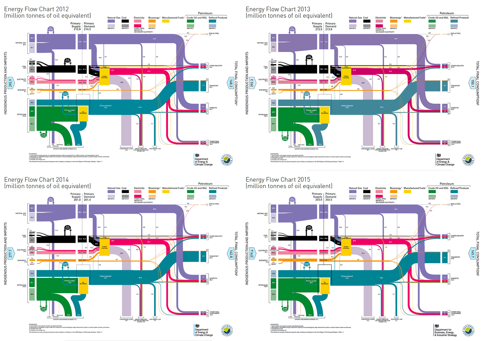
Below, Carbon Brief has produced an animated GIF of the DUKES energy flow charts for the UK 2012-2015. It shows at a glance how the inputs and outputs to UK energy use have changed over recent years.

UK energy flow chart 2012 to 2015. Gif by Rosamund Pearce.
Click on the image for a larger version. The flows show shares of each year’s total, obscuring the overall decline in energy use noted above. Even so, some interesting trends are visible.
Note, for instance, how coal use shrinks over the four-year period, while the darker pink band showing renewable electricity inputs grows.
It’s also worth noting that this year the chart is published by BEIS, the new department created in a merger of the old Department of Energy and Climate Change and the department for Business, Innovation and Skills.

