Mat Hope
31.03.2014 | 10:20amThe latest instalment of the Intergovernmental Panel on Climate Change (IPCC)’s big report on the impacts of climate change is chock-full of information. To help readers wade through it all, the IPCC’s scientists have condensed some of it into handy charts, graphs, and graphics.
We pick three of the most intriguing from the IPCC’s Working Group 2 Summary for Policymakers.
Mapping impacts
From drought, to flooding and wildfires, the IPCC estimates climate change will have some significant impacts. This map illustrates where it expects them to hit.
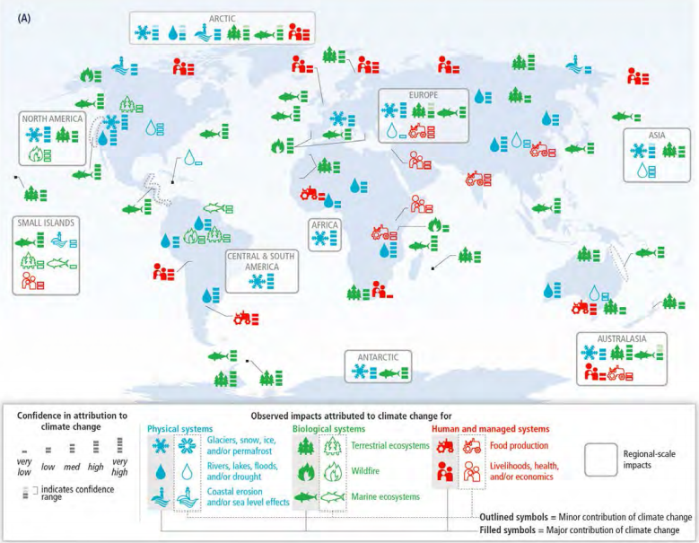
Each symbol on the map represents a different impact. If the symbols are filled in, it means climate change is thought to have a major contribution to the problem.
If they’re empty, it means climate change is thought to make a minor contribution. The small dashes indicate the level of confidence the IPCC has about the findings (with five dashes meaning confidence is “very high”, and one dash meaning it’s “very low”).
As the map shows, the IPCC expects climate change to have a major impact on glaciers, snow and ice in all regions (excluding small islands).
It’s also expected to have a major effect on rivers, lakes, floods, and drought in Europe, North America, Asia, Africa and the Arctic. Rising temperatures affect rainfall patterns and the rate at which snow and ice melts and glaciers retreat, the IPCC says.
In addition to this, climate change is expected to have a minor impact on food production. Recent food and cereal price rises “indicate a sensitivity of current markets to climate extremes”, the report says.
Endangered species
A range of species are at risk as climate change hits their habitats, the report says. Many species will be “unable to track suitable climates under mid- and high-range rates of climate change”, the IPCC suggests.
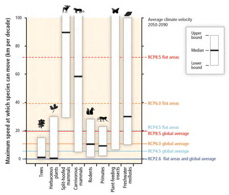
Each white bar on the chart above shows how quickly a species’ group can migrate as their natural habitats change from 2050 to 2090. The thick black bar shows the median – or average – speed at which the IPCC estimates they can move in the absence of human intervention.
The coloured lines relate to the IPCC’s emission scenarios, known as Representative Concentration Pathways (RCP). The RCP numbers relate to how quickly each scenario envisages the climate changing, with higher numbers meaning faster rates of change.
If the thick black bars are below the coloured line, it means scientists don’t think the species will be able to migrate fast enough to escape to more suitable habitats.
As the chart shows, all but split-hoofed mammals – such as horses, deer and moose – are projected to be too slow to be able to escape the impacts of climate change on their habitats in flat areas under the IPCC’s highest estimated rate of climate change.
Trees and herbs are at the most risk. It’s likely they’ll need human intervention to help them adapt in all but the lowest estimate of climate change.
Crop yields
Climate change is expected to significantly change crop yields in the coming decades, putting a strain on food production, the report projects.
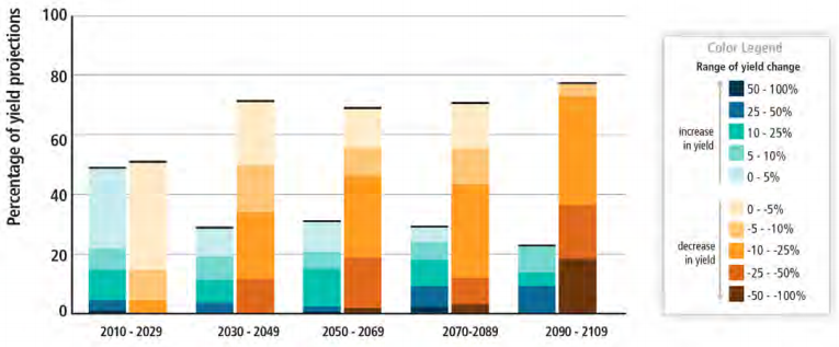
The IPCC estimates climate change will reduce average crop yields by between zero and two per cent per decade for the rest of the century, at the same time as demand increases by about 14 per cent per decade. That could put a strain on food production in some areas, the IPCC adds – particularly in poor regions.
One degree of warming above pre-industrial levels will mean lower wheat, rice, and maize harvests on average in some regions, it claims. Because conditions won’t change in the same way everywhere, some areas may experience increased yields as the climate changes, the IPCC says.
The graph above shows when climate change might affect crops if there is no effort to adapt to changing conditions.
The colour of the bars relates to whether or not yields will increase (shades of blue) or decrease (the yellow blocks). Each bar represents a 29 year period. The size of the block shows how many of the studies reviewed in the IPCC report predict the changes.
The graph shows that crop yields are expected to decrease at a quicker rate than they increase in other areas, over the coming decades.
Big impact
The IPCC’s latest report says climate change will leave its mark “on all continents and across the oceans”.
In making policymakers aware of the impacts, the scientists hope they can help them start to plan for the impacts of climate change – as well as taking action to cut emissions.