Roz Pidcock
16.01.2015 | 11:40amEvery year around this time, there’s a flurry of activity in the world’s major meteorological agencies as they prepare to release official global temperature figures for the previous year.
This year, there’s particular interest as it looks likely 2014 will be the hottest year on record.
First out the blocks with the official data was the Japan Meteorological Agency (JMA). Earlier this month, it confirmed 2014 had taken the top spot with global temperatures 0.27 degrees Celsius above the long-term average. Today, it’s the turn of NASA and the US National Oceanic and Atmospheric Administration, with the UK Met Office following suit next week.
Why so many records? While global temperature is a simple enough idea, measuring it is harder than you might think. We take a look at how scientists measure global temperature.
The basics
To get a complete picture of Earth’s temperature, scientists combine measurements from the air above land and the ocean surface collected by ships, buoys and sometimes satellites, too.
The temperature at each land and ocean station is compared daily to what is ‘normal’ for that location and time, typically the long-term average over a 30-year period. The differences are called an ‘anomalies’ and they help scientists evaluate how temperature is changing over time.
A ‘positive’ anomaly means the temperature is warmer than the long-term average, a ‘negative’ anomaly means it’s cooler.
Daily anomalies are averaged together over a whole month. These are, in turn, used to work out temperature anomalies from season-to-season and year-to-year.
Four major datasets
Scientists use four major datasets to study global temperature. The UK Met Office Hadley Centre and the University of East Anglia’s Climatic Research Unit jointly produce HadCRUT4 .
In the US, the GISTEMP series comes via the NASA Goddard Institute for Space Sciences (GISS), while the National Oceanic and Atmospheric Administration (NOAA) creates the MLOST record. The Japan Meteorological Agency ( JMA) produces a fourth dataset.
Here’s how global temperatures in the four datasets compare over the past 130 years. You can see they all show a warming trend, but there are some year-to-year differences too.
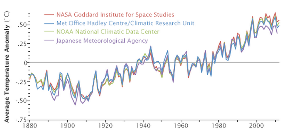
Global average temperature anomaly from 1880 to 2012, compared to the 1951-1980 long term average. Source: NASA Earth Observatory.
Of the four datasets, GISTEMP (red line) shows the fastest warming. JMA tends to track slightly lower than the others (purple). So why do we see differences between the datasets?
The answer to this lies in how the different datasets deal with having little or no data in remote parts of the world, measurement errors, changes in instrumentation over time and other factors that make capturing global temperature a less-than-straightforward task.
Data coverage has, perhaps, the biggest influence. NASA GISTEMP has the most comprehensive coverage, with measurements over 99 per cent of the globe. By contrast, JMA covers just 85 per cent of the globe, with particularly poor data in the poles, Africa and Asia.
HadCRUT4 and challenges in the Arctic
How do the datasets deal with missing data?
Nasa’s GISTEMP uses statistical methods to fill in gaps using surrounding measurements. How much each measurement influences the final value depends on how close it is geographically to the missing point. NOAA follows a similar process for the MLOST dataset.
HadCRUT4 is the only dataset to leave regions with missing data blank, rather than try to fill them in. This effectively assumes temperatures there are in line with the global average.
This wouldn’t be a issue if the world was warming at the same rate everywhere. But data suggests the Arctic, for example, is warming more than twice as fast as the global average.
It’s reasonable then that a missing Arctic could lead to a global temperature that’s lower than in the real world. Indeed, updates to an old version of the temperature record (HadCRUT3) to include better Arctic data saw northern hemisphere temperatures rise by 0.1 degrees Celsius.
But data gaps still exist, as the white areas in the top map in the figure below show. A paper last year attempted to fix this well-known issueusing satellite data to reconstruct the holes in the surface temperature record (bottom map below). Doing so suggested Earth’s surface has warmed twice as much over the past 15 years than HadCRUT4 suggests.

Top: White areas show gaps in the HadCrut4 dataset. Bottom: Reconstructed data shows faster warming in the Arctic than the rest of the world. Source: Cowtan & Way (2013).
A question of detail
After working out the annual temperature anomalies for each land or ocean station, the next job for scientists is to divide the earth up into grid boxes.
They work out the average temperature for each box by combining data from all the available stations. The smaller the grid boxes, the better the average temperature of the box will reflect the actual temperature at any given point, leading to a more accurate estimate global temperature when you add them all together.
This is another point on which the datasets differ. The NASA GISTEMP record is the most detailed of the four datasets, with grid boxes two degrees longitude by two degrees latitude.
The other three have grid boxes measuring five by five degrees. They also differ in how many land stations they have around the world, too. HadCRUT4 has about 5,500, GISTEMP takes middle place with about 6,300, but MLOST has the most of all, with about 7,000 land stations.
The four datasets differ in other important ways, too, including the time period they cover. HadCrut4 stretches back the furthest to 1850. GISTEMP and MLOST both begin in 1880, whereas JMA starts a bit later in 1891.
Working out global temperature
By combining the grid boxes, scientists work out average temperatures for the northern and southern hemispheres. How much each box contributes to the global temperature is adjusted to account for the fact that the degree of longitude is bigger at the equator than at the poles. Together, the hemispheric values provide an estimate of global average temperature.
But it’s not as simple as adding the two numbers together, however. To avoid the better sampled northern hemisphere from dominating the temperature record, scientists take the average of the two hemispheric values.
A satellite quality check
As well as measuring the temperature at Earth’s surface, satellites can collect data from the bottom 10 kilometres of Earth’s atmosphere, known as the lower troposphere.
Unlike the surface temperature record, tropospheric temperatures only extend back to the start of the satellite era in 1979. Lower troposphere temperature is different from that at the surface. The influence of the El Niño weather phenomenon is much larger, for example.
But scientists can use lower troposphere measurements as a further evidence of a changing climate. Several different groups now keep track of tropospheric temperatures and all four show a warming trend in the last 30 years.
Despite this, it is sometimes argued in parts of the media that the opposite is true – that troposphere is warming more slowly than earth’s surface, even slightly cooling.
This stems from research published in 1990 by John Christy and Roy Spencer from the University of Alabama. Intrigued, other scientists set about investigating and found errors in the original methods to do with differences between sensors on the satellites, and the satellites themselves drifting over time. Once corrected, the differences between tropospheric and surface temperatures diminished – and a warming trend is now clear.
Consistent signs
Each of the four global datasets, as well as the satellite measurements, have advantages and disadvantages, by virtue of their different approaches to tackling some of the main issues with taking earth’s temperature.
All of the surface datasets are updated every month as new data becomes available and understanding of uncertainties improves. It’s through a combination of all available data that scientists are able to get a robust estimate of how temperatures are changing.