Six charts show mixed progress for UK renewables
Jocelyn Timperley
07.30.18Onshore and offshore wind power rose by 34% last year in the UK compared to 2016, new government statistics show.
The latest Digest of UK Energy Statistics (DUKES), published yesterday by the Department for Business, Energy and Industrial Strategy (BEIS), also shows that coal supplied just 5% of UK energy in 2017. Only five years earlier, it supplied 20%.
But the report also reveals a tailing off in the expansion of solar electricity. This increased by 38% in 2016, but only rose 11% last year.
Carbon Brief has produced six charts to illustrate the changes occuring in the UK’s energy mix.
Coal descent
The UK’s sources of energy have changed significantly over the past half century, as the chart below show.
Top: UK primary energy use by source, millions of tonnes of oil equivalent (Mtoe), 1970-2017. Bottom: Shares of UK energy use (%). Source: DUKES 2018 Table 1.1.1. Chart by Carbon Brief using Highcharts.These figures show primary energy use – or, in other words, inputs into the UK’s energy system. Therefore, it is worth noting that these exaggerate fossil fuels’ contribution to useful final energy services, because much of the primary energy is wasted during combustion.
As the lower chart above shows, fossil fuels supplied 80% of the UK’s primary energy in 2017, a drop of one percentage point compared to 2016. This is the lowest ever share in the modern era. Even just 10 years earlier, the share stood at 91%. Meanwhile, the overall proportion of renewables in the primary energy mix reached 11.3% in 2017, its highest ever share. This was a rise of 1.2 percentage points compared to 2016 levels.
The fall in fossil fuel share is largely driven by the continuing descent of coal supply. This dropped by 19% in 2017 compared to 2016, following a historic 51% drop in 2016. Coal supplied just 5% of UK energy last year, down from a 6% share in 2016, 20% share in 2012 and 47% share back in 1970.
Gas supply also fell slightly in 2017 by 2%. This followed a 13% rise in 2016, as gas rose to replace, in part, the record reduction in coal.
In 2017, the fall in coal was replaced by increasing renewables supply, driven, in part, by a 14% rise in renewable energy capacity to 41 gigawatts (GW). Wind, solar and hydro energy supply together increased by 26%, compared to the previous year. Bioenergy also increased by 5%.
All these figures should also be seen in the context of falling energy demand. This dropped 1.5% in 2017, a 19% fall from the 2005 peak.
Sector use
Final use of energy across the UK economy also fell slightly last year, after an increase the year before. However, demand from the transport and industry sectors still increased within this, as the chart below shows.
UK energy use by sector (Mtoe), 1970-2017. Source: DUKES 2018 Table 1.1.5. Chart by Carbon Brief using HighchartsTransport energy use has now increased for four years running, rising by 0.5 million tonnes of oil equivalent (Mtoe). Most of the increase was due to rising demand in air transport, which rose by 3.5%, or 0.4 Mtoe, and now accounts for 23% of transport energy use. Road transport energy use also rose very slightly by 0.1%, while rail energy use remained unchanged from the previous year.
Energy demand from industry also increased, due to consumption increases in the chemicals, construction, vehicles, and food, drink and tobacco sectors. As the chart above shows, however, the slight rise comes in the context of a gradual decline in demand from the sector over the past few decades. Demand sat at 24 million tonnes of oil equivalent (Mtoe) in 2017, 38% lower than the 39Mtoe used in 1990.
Domestic energy use, on the other hand, fell by 4% – the first reduction in two years. This continues a general decline in home energy demand over the past decade. The reduction comes after warmer average temperatures in 2017, particularly during the winter, led to lower home energy use compared to 2016 and 2015. Home energy consumption has fallen by 19% since its peak in 2010.
Low-carbon majority
Narrowing in on the UK’s electricity supply, this fell by 0.7% last year, as demand for electric heating decreased compared to the previous two years.
Renewable electricity generation in the UK reached a record 99.3 terawatt hours (TWh) in 2017. This pushed up the proportion of electricity supplied by renewables to 30%, up from 25% in both 2016 and 2015, as the chart below shows.
The increase was driven by a large boost to wind generation from rising capacity and wind speeds, as well as smaller increases in solar and hydro generation.
Top: UK electricity generation by source, terawatt hours (TWh), 1996-2017. Bottom: Shares of UK electricity generation (%). Source: DUKES 2018 Table 5.6. Chart by Carbon Brief using Highcharts.Meanwhile, coal-fired generation fell for the sixth consecutive year in 2017, reaching just a 7% share of overall electricity supply. This follows a huge reduction in coal-generated electricity the year before, when it fell from a 23% share in 2015 to a 9% share in 2016. The drop in 2017 means coal-generated electricity fell to below a third of its 2015 level.
Electricity supplied by gas also fell by 5% last year, while the contribution of nuclear to the electricity mix remained steady.
Combined, these changes mean that the low-carbon share – including renewables and nuclear – of the UK’s electricity supply topped 50% for the first time last year, as first reported by Carbon Brief back in January. The low-carbon share sat at 46% a year earlier.
Wind advance
The progress in renewable electricity compared to 2016 was due to higher wind speeds, as well as a 14% increase in overall renewables capacity. The increase in electricity supplied by both onshore and offshore wind is clear in the chart below.
UK renewable electricity by source (TWh), 1990-2017. Source: DUKES 2018 Table 6.1.1. Chart by Carbon Brief using Highcharts.Onshore wind, in particular, showed a large increase, rising by 40% compared to 2016 (although this comes after a small fall in 2016 due to lower wind speeds that year). Altogether, onshore wind electricity has now risen by 139%, or close to two-and-a-half times, since 2012.
Offshore wind generation also saw a significant rise in 2017, increasing by 28% compared to 2016. Overall, offshore wind generation has increased by 175% since 2012.
In contrast, the figures show progress in solar generation tailing off to some extent. While it increased by 11% compared to 2016, far larger rises have been seen in recent years.
A similar story is seen for biomass power. This increased dramatically between 2011 and 2015 as Drax, formerly the UK’s largest coal plant, converted half its units to burn wood pellets. Now the conversion is complete, the past two years saw much smaller increases. However, Drax is now in the midst of converting a fourth unit to biomass, which it aims to reopen in late 2018.
Fossil extraction
Fossil fuel extraction in the UK fell slightly by around 2% last year, driven by a fall in coal and gas extraction. This came after a rise in extraction over the previous two years.
Coal extraction fell for the sixth year in a row, dropping by 27% compared to 2016. This followed a 51% reduction the year earlier and an overall 93% drop since 1998.
However, the decrease this year was mainly a result of one of the UK’s large surface mines stopping production due to care and maintenance issues, BEIS said.
UK fossil fuel extraction by source (Mtoe), 1998-2017. Source: DUKES 2018 Table 1.1-1.3 Chart by Carbon Brief using Highcharts.The UK produced 3m tonnes of coal last year and imported 8.5 million tonnes. Russia was the UK’s largest supplier of coal imports with a 46% share, followed by the US which supplied 28% of imports.
It is worth noting, though, that the Banks Group recently began extracting a planned half million tonnes of coal from its controversial open cast coal mine in Durham.
Meanwhile, North Sea oil production decreased by 2% in 2017. UK oil production now sits at around a third of the peak in 1999.
Coal fall, renewables rise
The animation below, produced by Carbon Brief from DUKES energy flow charts for 2012-2017, provides a snapshot of the recent changes in the UK’s energy inputs and outputs.
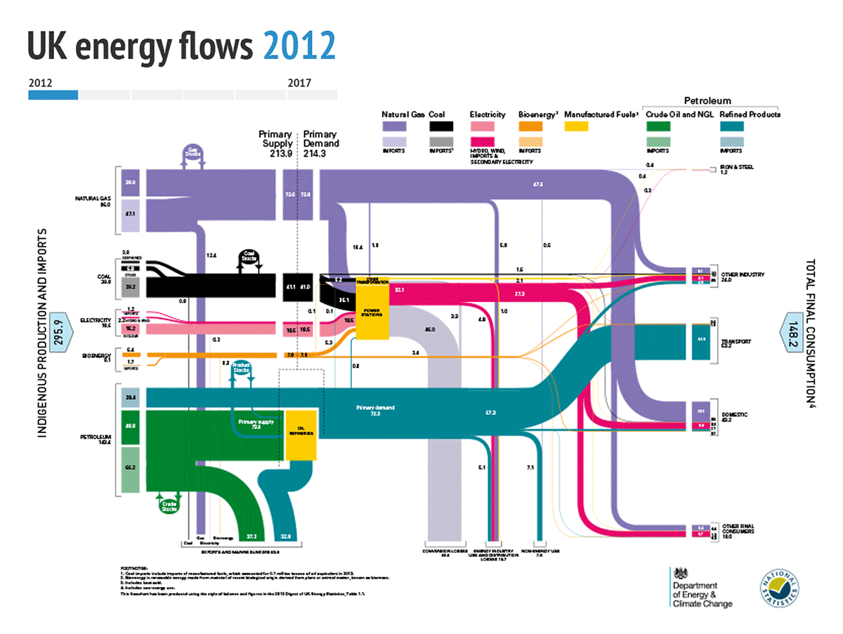
On the left, the chart shows the energy inputs to the UK economy from coal, oil, gas, nuclear, renewables and bioenergy. For coal, oil, gas and bioenergy, lighter shades indicate imports and darker shades domestic supplies. Nuclear is light pink, while electricity imports and renewables are dark pink.
As highlighted above, the falling prominence of coal in the UK’s primary energy supply is clearly visible in the shrinking width of the black lines. The rise of biomass and other renewables are also particularly prominent.
-
Six charts show mixed progress for UK renewables
-
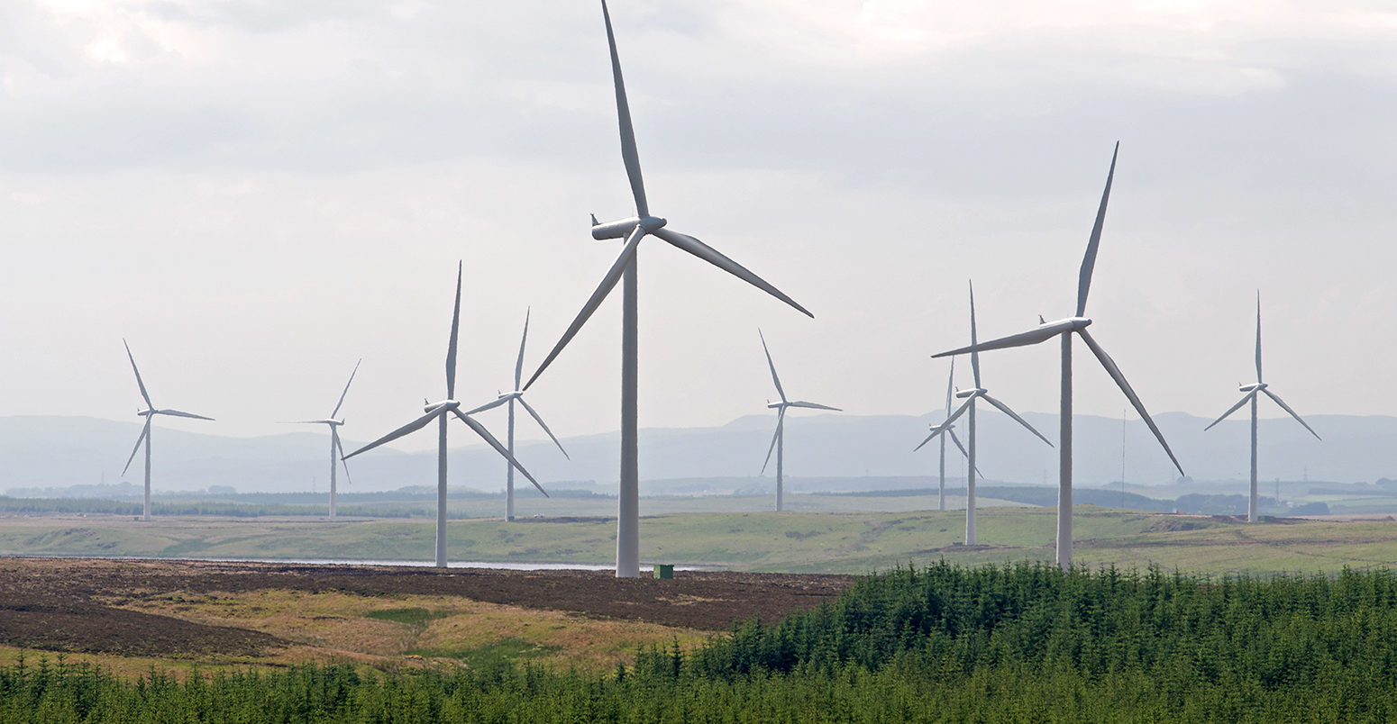
UK wind power increased by a third in 2017