State of the climate: New record ocean heat content and a growing El Niño

Ocean heat content (OHC) set a new record in the first half of 2018, with more warmth in the oceans than at any time since OHC records began in 1940.
That’s one of the headlines from Carbon Brief’s latest “state of the climate” report, a quarterly series on global climate data that now includes temperatures, ocean heat, sea levels, greenhouse gas concentrations, climate model performance and polar ice.
Global surface temperatures in 2018 are on track to be the fourth warmest since records began in the mid-1800s, behind only 2015, 2016 and 2017. Temperatures in 2018 were near record highs despite a moderate cooling La Niña event during the first half of the year.
Moderate El Niño conditions are expected to develop during November, which will contribute to a slightly warmer finish to 2018. However, as El Niño’s warming impact on surface temperatures tends to lag by a few months this event will mostly affect 2019.
The latest data shows that the level of the world’s oceans continued to rise in 2018, with sea levels around 8 centimeters (cm) higher than in the early 1990s. Atmospheric concentrations of greenhouse gases including CO2, methane (CH4) and nitrous oxide (N2O) also reached record high levels in 2018.
While sea ice was at record or near-record lows in the Arctic for the early part of the year, the summer minimum was only the 6th lowest since records began in the late 1970s. There is also currently near-record low levels of multi-year sea ice in the Arctic, with around 80% of sea ice only one to two years old.
Ocean heat content at a record high
So far, 2018 has set a new record for the total amount of warmth stored in the seas – known as ocean heat content (OHC). Measured OHC was warmer than any other year since observations began in the early 1940s.
Human-emitted greenhouse gases trap extra heat in the atmosphere. While some of this warms the Earth’s surface, the vast majority – upwards of 90% – goes into the oceans. Most of this accumulates in the top 700 metres, but some is also mixed into the deep oceans. OHC estimates between 1940 and present for both the upper 700m and 700m-2000m depths of the ocean are shown in the figure below.
Monthly global ocean heat content (in zettajoules – billion trillion joules, or 10^21 joules) for the 0-700 metre and 700-2000 metre layers. Data from Cheng et al 2017, updated through June 2018. Chart by Carbon Brief using Highcharts.In many ways, OHC represents a much better measure of climate change than global average surface temperatures. It is where most of the extra heat ends up and is much less variable on a year-to-year basis than surface temperatures.
Changes in the amount or rate of warming are much easier to detect in the ocean heat content record than on the surface. For example, OCH shows little evidence of the slowdown in warming in the mid-2000s, seen in surface temperature records. It also shows a distinct acceleration after 1991, matching the increased rate of greenhouse gas emissions over the past few decades.
Just about every year since 1991 has set a new OHC record, showing that heat has continued to accumulate in the Earth system as concentrations of atmospheric greenhouse gases have increased.
Surface temperatures likely fourth warmest
Global surface temperatures are reported by a number of different international groups, including NASA, NOAA, Met Office Hadley Centre/UEA, Berkeley Earth and Cowtan and Way. Copernicus/ECMWF also produces a surface temperature estimate based on a combination of measurements and a weather model – an approach known as “reanalysis”.
The chart below compares the annual global surface temperatures from these different groups since 1970 – or 1979 in the case of Copernicus/ECMWF. The coloured lines show the temperature for each year, while the dots on the right-hand side show the year-to-date estimate for January through September 2018. Values are shown relative to a common baseline period, the 1979-2000 average temperature for each series. Surface temperature records have shown around 0.86C warming since the year 1970, a warming rate of about 0.19C per decade.
Annual global mean surface temperatures from NASA GISTemp, NOAA GlobalTemp, Hadley/UEA HadCRUT4, Berkeley Earth, Cowtan and Way (lines) and Copernicus/ECMWF, along with 2018 temperatures to-date (January-September, coloured dots). Anomalies plotted with respect to a 1979-2000 baseline. Chart by Carbon Brief using Highcharts.2018 is likely be the fourth warmest record on record for all of the surface temperature series apart from Copernicus, where it will likely be either the third or fourth warmest. A growing El Niño event in the tropical Pacific, which is discussed in detail in the following section of the article, will likely contributing to slightly warmer temperature anomalies for the remaining three months of the year.
Temperatures to-date in 2018 are also fairly close to what would be expected given the long-term warming trend in the data – represented by the dotted black line – despite having cooled down a bit after the highs of 2015 and 2016 that were due in part to a super-El Niño event.
While the different groups show similar rates of warming overall, there are differences depending on how much of the Arctic is covered by the record, and the sea surface temperature (SST) record that is used. These differences have been particularly pronounced in the past few years, a phenomenon that will continue in 2018.
These differences are clearest in monthly temperature data, shown in the figure below for each record between January 2014 and September 2018.
Monthly global mean surface temperatures from NASA GISTemp, NOAA GlobalTemp, Hadley/UEA HadCRUT4, Berkeley Earth, Cowtan and Way and Copernicus/ECMWF. Anomalies plotted with respect to a 1979-2010 baseline. Chart by Carbon Brief using Highcharts.For example, in early 2018 records from NOAA and Hadley/UEA (yellow and blue lines) showed considerably cooler temperatures than other groups, as they did not fully account for unusually warm conditions in the Arctic. As the UK Met Office points out, all of the records match closely when they are restricted to areas of common coverage.
El Niño starting to emerge
The first half of 2018 was cooled by a modest La Niña event, while the final quarter of 2018 is expected to feature modest El Niño conditions. Nearly all forecast models expect modest El Niño conditions for the remainder of 2018, with sea surface temperatures in the tropical Pacific around between 0.5C and 1C above the recent average.
El Niño and La Niña events – collectively referred to as the El Niño Southern Oscillation, or ENSO – are the main driver of year-to-year variation on top of the long-term surface warming trend. ENSO events are fluctuations in temperature between the ocean and atmosphere in the tropical Pacific, which help to make some years warmer and some cooler.
The figure below shows a range of ENSO forecast models produced by different scientific groups, with the average for each type of models shown by thick red, blue and green lines. Positive values above 0.5C reflect El Niño conditions, while negative values below -0.5 reflect La Niña conditions.
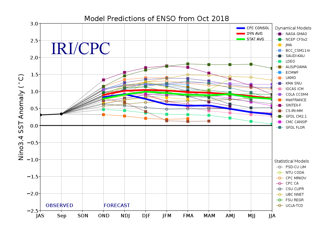
There is a nearly 90% chance that El Niño conditions will form in the remainder of 2018 and during early 2019, according to NOAA’s Climate Prediction Center and Columbia University’s International Research Institute.
In general, El Niño periods tend to be warmer than other months, with the large warm patch in the tropical east pacific transferring extra heat to the atmosphere. Similarly, La Niña events cool global temperatures. In both cases the effects tend to have a bit of a lag: the effect on global temperatures is small at the beginning of the event, and larger by the end, – or slightly after.
This is apparent in the figure, below, from NOAA’s National Centers for Environmental Information (NCEI). The figure shows monthly data from NOAA’s global temperature record with each month colored based on its ENSO status. Red-colored months represent El Niño conditions, while blue-colored months represent La Niña conditions. Grey months are those where ENSO conditions are neutral.
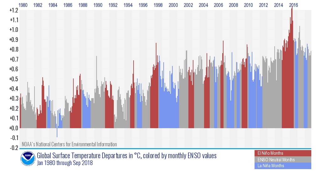
There is a clear warming trend in all three types of months – El Niño, La Niña and ENSO-neutral. La Niña events today are often warmer than El Niño events were only a decade before. While year-to-year variability in global temperatures is strongly influenced by ENSO, the effect is small compared to the long-term warming trend driven by human emissions of CO2 and other greenhouse gases.
Comparing climate models with observations
Despite slightly cooler conditions after the 2016 super El Niño, surface temperatures are still well within the envelope of climate model projections.
Climate models provide physics-based estimates of future warming given different assumptions about future emissions, greenhouse gas concentrations and other climate-influencing factors.
Model estimates of temperatures prior to 2005 are a “hindcast” using known past climate influences, while temperatures projected after 2005 are a “forecast” based on an estimate of how things might change.
The figure below shows the range of individual models forecasts featured in the IPCC fifth assessment report – CMIP5 models – between 1970 and 2020 with grey shading and the average projection across all the models shown in black. Individual observational temperature records are represented by coloured lines.
Annual global average surface temperatures from CMIP5 models and observations between 1970 and 2020. Models use RCP4.5 forcings after 2005. They include sea surface temperatures over oceans and surface air temperatures over land to match what is measured by observations. Anomalies plotted with respect to a 1970-2000 baseline. Chart by Carbon Brief using Highcharts.While global temperatures were running a bit below warming projected by climate models between 2005 and 2014, the last few years have been pretty close to the model average. This is particularly true for globally-complete temperature records like NASA, Cowtan and Way, Berkeley and the Copernicus reanalysis.
Sea level rise continues
Sea levels rose to a new high in 2018 to-date, due to a combination of melting land ice – glaciers and ice sheets – and the thermal expansion of water as it warms.
The figure below shows the increase in global sea level since it was first measured by satellites in the early 1990s. Earlier sea level data from tide gauges is also available, with data going back to the late 1800s.
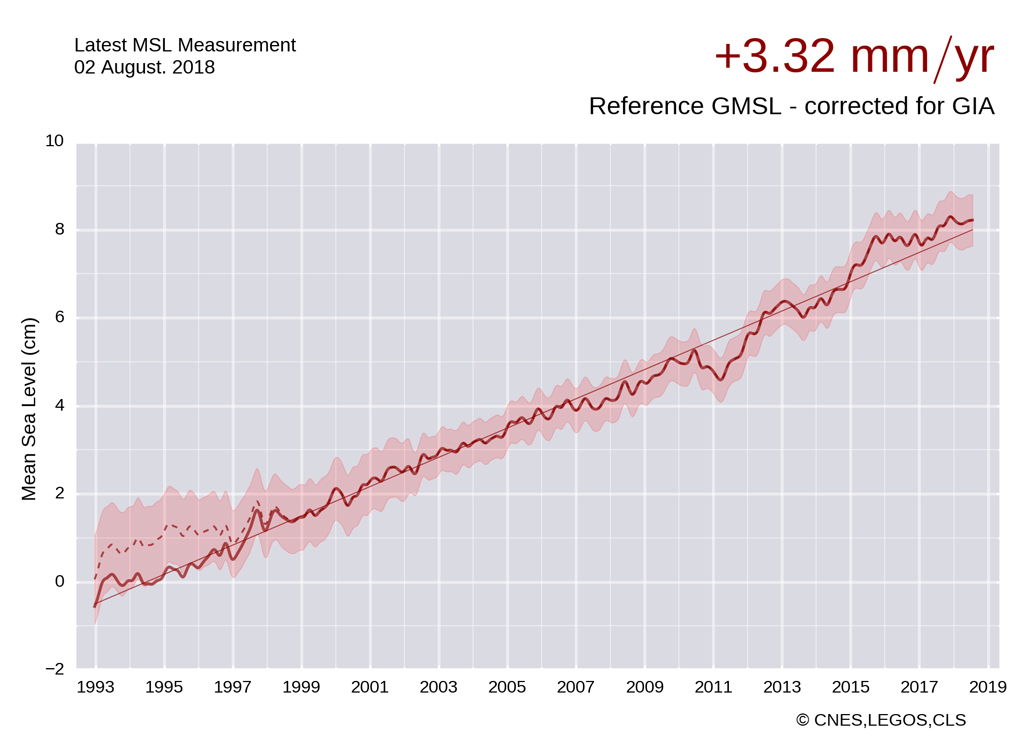
Sea level rise is sensitive to global surface temperatures; El Niño years where temperatures are a bit warmer tend to have more rapid sea level rise than La Niña years. For example, sea level increased rapidly from 2014 to 2016. However, these are relatively small fluctuations around the consistent long-term trend. Overall sea levels have risen around 8 cm since the early 1990s, and around 22 cm since the 1880s.
Sea level data is corrected for glacial isostatic adjustment – the fact that the ocean basins are getting slightly larger since the end of the last glacial cycle, due to the rebound of the Earth from the several kilometre thick ice sheets that covered much of North America and Europe around 20,000 years ago. This adjustment is relatively small, only adding around 0.3 mm/yr to sea level rise rates, or around 10% of the current rate of sea level rise.
Greenhouse gas concentrations increase
Greenhouse gas concentrations reached a new high in 2018, driven by human emissions from fossil fuel, land use and agriculture.
Three greenhouse gases – CO2, CH4 and N2O – are responsible for the bulk of additional heat trapped by human activities. CO2 is by far the largest factor, accounting for roughly 50% of the increase in “radiative forcing” since the year 1750. CH4 accounts for 29%, while N2O accounts for around 5%. The remaining 16% comes from other factors including carbon monoxide, black carbon and halocarbons such as CFCs.
Human emissions of greenhouse gases have increased atmospheric concentrations of CO2, CH4 and N2O to their highest levels in at least a few million years – if not longer. The figure below shows concentrations of these greenhouse gases – in parts per million (PPM) for CO2 and parts per billion (PPB) for CH4 and N2O – from the early 1980s through present.
Global concentrations of CO2, CH4 and N2O. Based on data from NOAA’s Earth Systems Research Laboratory. Monthly values are shown by the solid lines, with a 12-month average shown by the dashed lines. Chart by Carbon Brief using Highcharts.While CO2 and N2O concentrations have been steadily increasing – and even accelerating in recent years – CH4 concentrations show a bit of an unusual pattern. After a period of flat concentrations in the early 21st century, concentrations are growing once again since 2007.
The cause of the increase in CH4 concentrations over the last decade is still a subject of scientific debate. Some studies have suggested that wetlands and rice farming in the tropics are the primary culprit and that the expansion of unconventional oil and gas extraction plays a limited role. Others argue that fossil fuels have a similarly important role in the increase as agriculture.
Sea ice remains low
Sea ice spent much of early 2018 at record lows in the Arctic and quite low in the Antarctic. It has recovered somewhat in the Arctic over the past few months, but remains at the low end of the historical range over the 1979-2010 period.
The figure below shows both Arctic and Antarctic sea ice extent in 2018 (solid red and blue lines), the historical range in the record between 1979 and 2010 (shaded areas) and the record lows (dotted black line). Unlike global temperature records, sea ice data is collected and updated on a daily basis, allowing sea ice extent to be viewed through to present.
Arctic and Antarctic daily sea ice extent from the US National Snow and Ice Data Center. The bold lines show daily 2018 values, the shaded area indicates the two standard deviation range in historical values between 1979 and 2010. The dotted black lines show the record lows for each pole. Chart by Carbon Brief using Highcharts.Sea ice extent only tells part of the story about changes at the poles; thickness (and volume) are also important variables, though they are more difficult to measure. The Pan-Arctic Ice Ocean Modeling and Assimilation System (PIOMAS) project provides estimates of sea ice volume since 1979, shown in the figure below.
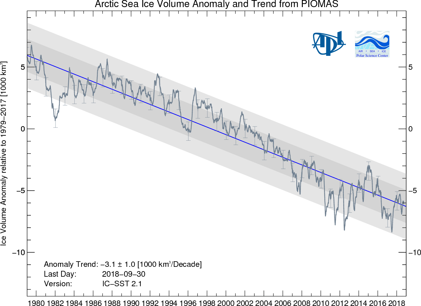
Sea ice volume shows a clear downward trend. While some individual months have lower or higher values than others, the range in 2018 to date is consistent with the long-term decline in arctic sea ice volume.
There is also currently near-record low levels of multi-year sea ice in the Arctic. The figure below, from of US National Snow and Ice Data Center (NSIDC), shows the age of sea ice at the end of the summer melt season for each year since the mid-1980s.
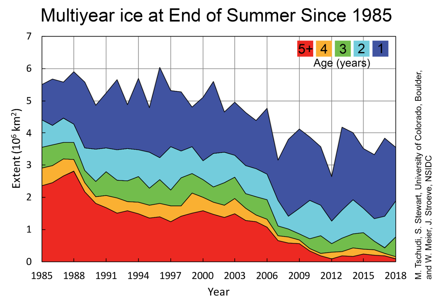
Only around 20% of current sea ice is three or more years old, NSIDC estimates, with the remaining 80% only one to two years old. This decline of multi-year sea ice makes the Arctic more vulnerable to additional melting and reflects the overall decline in sea ice volume.