
Explainer: How climate change is accelerating sea level rise
Zeke Hausfather
09.23.19Zeke Hausfather
23.09.2019 | 2:06pmSea level rise (SLR) is one of the most severe impacts of climate change, with rising waters threatening to inundate small-island nations and coastal regions by the end of the century.
At the same time, SLR is one of the impacts with the largest uncertainties, with different studies projecting widely different ranges over the 21st century.
The Earth’s oceans have already risen by around 0.2m since the late 1800s, with the rate of SLR accelerating in recent decades. In its 2013 fifth assessment report (AR5), the Intergovernmental Panel on Climate Change (IPCC) estimated that SLR was “unlikely” to exceed 1m this century, even if emissions were very high.
However, a number of studies published in the years since then suggest that the worst-case projections for SLR could be much higher – up to 2m or more this century.
With this week’s release of the IPCC Special Report Ocean and Cryosphere in a Changing Climate (SROCC), it is useful to take a look at the current understanding of how sea level has changed in the past and may change in the future.
In this explainer, Carbon Brief examines estimates of historical sea level rise and the evidence that rates are accelerating. It explores the drivers of historical and future sea level rise, including thermal expansion of water, melting glaciers and melting ice sheets. Finally, it compares the worst-case projections from the IPCC with other studies published before and after AR5 was released.
Sea level rise accelerating
Reconstructing past changes in global sea levels is far from a simple task. While high-quality satellite measurements with global coverage are available since the early 1990s, prior to that researchers have to rely on tide gauges scattered around the world.
These tide gauges primarily cover coastal regions, leaving it up to researchers to figure out how best to fill the gaps. Tide gauges are also subject to factors that can complicate the interpretation of local sea level changes, namely subsidence (sinking land) or isostatic rebound (rising land due to melting glaciers).
AR5 featured three estimates of global sea level rise: from Church and White, Jevrejeva, and Ray and Douglas. Two additional SLR datasets – Hay and Dangendorf – have been published in recent years. (See the recent Carbon Brief article on the Dangendorf dataset.)
All five of these datasets are shown in the figure below (coloured lines), along with satellite altimeter measurements (in black) after 1993. The top plot shows estimates of global sea level change (in millimetres), while the bottom plot shows the 20-year average rate of change (mm/year).
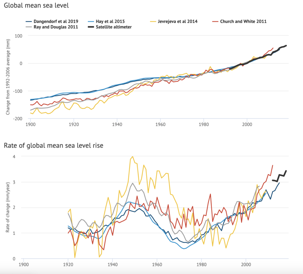
Sea levels have risen by between 0.18 and 0.2m (180 to 200mm) since 1900. The newer Hay and Dangendorf datasets tend to show less sea level rise than the earlier Church and White and Jevrejeva datasets. While SLR estimates mostly agree in recent decades, larger divergences are evident before 1980.
Rates of change in global sea levels are shown as longer-term 20-year averages because individual years are sensitive to global surface temperatures; El Niño years where temperatures are a bit warmer tend to have more rapid SLR than cooler La Niña years.
Recently, there has been some debate around whether the current rate of SLR exceeds that experienced back in the 1940s. Three of the five datasets (Dangendorf, Hay, and Church and White) suggest that the current rate of sea level rise – as measured by accurate satellite altimeters – is around 50% faster than was experienced in the 1940s.
The Ray and Douglas dataset suggests that current rates of SLR measured by satellite altimeters are modestly above the 1940s peak, while one of the five – Jevrejeva – suggests that the current rate of SLR is below that of the 1940s.
However, even the authors of the Jevrejeva dataset suggest in their accompanying paper that a longer view of sea level – from 1800 to present – still suggests that “the rate of sea level rise is increasing with time”.
There is also evidence of accelerating SLR over the post-1993 period when high-quality satellite altimetry data is available. According to the recent 2018 BAMS State of the Climate report, acceleration in SLR during the post-1993 period is around 0.1mm each year; this means that the rate of SLR is increasing by 1mm per year each decade.
It is important to note that global SLR hides a lot of local variability in past sea level changes and those expected in the future. According to the IPCC AR5:
“[S]hifting surface winds, the expansion of warming ocean water, and the addition of melting ice can alter ocean currents which, in turn, lead to changes in sea level that vary from place to place.”
AR5 also suggests that melting glaciers can affect the shape and gravitational field of the Earth, causing regional fluctuations in sea levels. Sediment compaction, plate tectonics and localised subsidence can all play a role in specific regions.
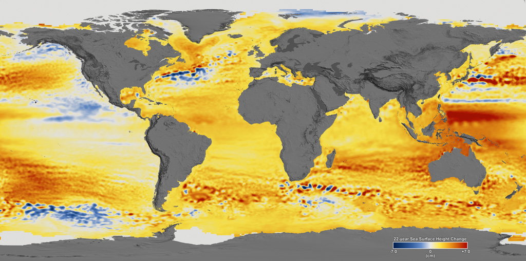
These local differences are clearly seen in the figure below, which shows SLR data from satellite altimeters during the period from 1992 to 2014.
Parts of the world – such as Australia – have seen SLR much faster than the global average, shown in shades of red, while others – such as parts of the US and Mexican west coasts – have actually seen falling sea levels (shades of blue).
Drivers of sea level rise
While there are clear links between rising global temperatures and sea level, the specific mechanisms by which warming results in SLR are more complex.
One of the major drivers of the SLR the world has experienced in recent decades is not from melting glaciers or ice sheets. Rather, it is driven by the thermal expansion of water. As the ocean warms, seawater becomes less dense and expands, raising sea levels.
The rapid increase in ocean heat content has led to around 19mm of sea level rise just from thermal expansion between 1993 and 2010, around a third of the total increase of 54mm.
The major drivers of annual average sea level rise are shown in the figure below, which is based on data in the IPCC AR5 and covers three overlapping time periods (1901-1990, 1971-2010 and 1993-2010).
These drivers are thermal expansion (dark blue), melting glaciers (both in Greenland, yellow, and globally, light blue), the melting ice sheets of Greenland (orange) and Antarctica (red), as well as changes in land water storage (lakes, reservoirs, and groundwater, dark red).
The estimated rate of SLR in the Church and White dataset is shown by the black square, highlighting the fact that neither models nor observations are able to fully capture all of the drivers contributing to SLR. However, it is worth noting that the gap is smaller in the 1901-1990 period if the Hay or Dangendorf datasets are used, as they only show around 1.1mm/year warming.
Estimates of contributions to SLR from each driver are incomplete, particularly for earlier periods. For example, observations of thermal expansion were not available in the 1901-1990 period in the IPCC AR5.
Similarly, ice sheet loss estimates have only become available over the last few decades and have been greatly improved by gravimetric sensors (GRACE) launched on satellites in the early 2000s. Climate models in the AR5 generally did not include historical SLR estimates from the Greenland and Antarctic ice sheets.
Nevertheless, the chart shows that while glacier melt and thermal expansion were responsible for the majority of historical SLR, this has been changing in recent years. There are now larger contributions to SLR coming from ice sheet melt and changes in land water storage – driven in part by groundwater depletion for irrigation. According to the 2018 BAMS State of the Climate report, melting glaciers and ice sheets contributed two thirds of the total SLR between 2005 and 2016.
The IPCC AR5 provided projections of future SLR under four different emissions scenarios, called “Representative Concentration Pathways”, or “RCPs”. The figure below shows the projected global SLR between 1986-2005 and 2081-2100 as a black line best estimate and grey box of uncertainty, for each RCP, as well as the older A1B SRES scenario.
Below each projection of total SLR, the coloured bars show the relative contribution of thermal expansion, glaciers, ice sheets, and land water storage.
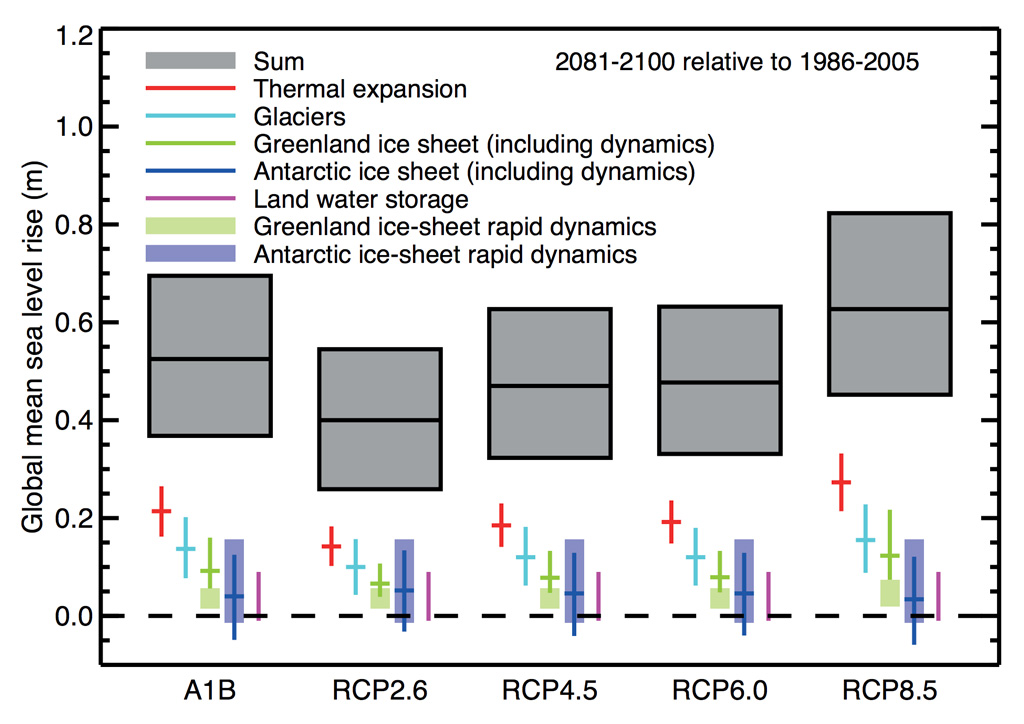
The IPCC AR5 projected that thermal expansion would be the single largest factor in future SLR under all emissions scenarios, followed by melting glaciers and ice sheets.
It generally expected Greenland to play a larger role than Antarctica in contributing to SLR over the 21st century and projected a relatively small contribution from ice sheets compared to other factors.
However, these relatively conservative projections have been challenged by a number of papers over the past few years that have sought to better understand ice sheet dynamics and stability in a warming climate.
IPCC conservatism
Since AR5 in 2013, a large number of new studies on future SLR have been published. Many of these have shown substantially higher worst-case SLR estimates by the end of the 21st century than those published in the AR5 – largely due to a reassessment of the potential losses from Antarctic and Greenland ice sheets.
The figure below shows estimates of SLR by 2100, if emissions are very high, published between 1983 and 2018. The figure is based on research from Dr Andra Garner of Rowan University and colleagues.
Individual studies are shown in blue, with the dots representing the best-estimate and the bars representing the high- and low-end estimates (when available) from each study. The SLR projections found in the five IPCC assessment reports are shown in black, with the grey shaded region showing the IPCC range from each report until a new one is published.
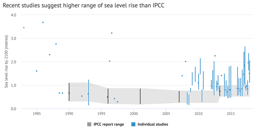
Some early estimates in the 1980s and 1990s were quite high, but that was also a period when the science surrounding ice sheet melting was less well-understood.
While a number of studies over the last decade have best-estimates of future SLR in-line with IPCC projections, their worst-case estimates are nearly all higher than the upper end of the IPCC range. As Garner tells Carbon Brief:
“Since the publication of the IPCC report in 2013, we’ve seen the range of future SLR projections expand significantly, with some studies suggesting the possibility of up to 2.5m of global mean SLR by 2100.
“There are a number of factors driving the uncertainty in future SLR amounts and rates, but the behaviour of the Antarctic and Greenland ice sheets in a warming climate is, perhaps, one of the largest contributors to this uncertainty. In particular, as new studies have come out suggesting the possibility of larger contributions to sea level rise from the Antarctic ice sheet than previously thought, we’ve seen the upper bound of future SLR projections climb upwards.”
Antarctic ice sheets, in particular, have proven to be a large source of uncertainty in future SLR projections. One study, published in Nature in 2016, suggested that a previously unconsidered process known as “marine ice-cliff instability” (MICI) meant the glaciers in the Antarctic were more unstable than scientists had thought. The paper concluded that “Antarctica has the potential to contribute more than a metre of SLR by 2100 and more than 15m by 2500” if future emissions are very high.
However, an article published in the Atlantic reported that the authors of the study “have lowered some of their worst-case projections for the 21st century” after making improvements to their model. The results are likely to put Antarctica’s contribution to SLR in 2100 at “about a foot” (30cm), the article says, which is “much closer to projections made by other glaciologists”.
A recent paper – also in Nature – argued that while MICI was not necessary to reproduce the SLR seen in ice ages, even without MICI Antarctica will likely contribute around 0.15m to sea level by 2100 under RCP8.5, with a “likely” range of 13-31cm. These estimates are notably higher than the 0.05m best-estimate contribution from Antarctica published in the IPCC AR5.
Garner and colleagues suggest a number of reasons why projected SLR in IPCC reports may be lower than high-end estimates from other studies.
These reasons include that the process models – models based purely on physics rather than trained using observations – cited by the IPCC tend not to show large contributions from ice sheets as temperatures rise, as they may poorly capture potential dynamic ice sheet responses such as MICI.
Another factor is that IPCC estimates show the range of “likely” (17th to 83rd percentile) SLR, while many other studies show “very likely” (5th to 95th percentile) ranges of potential futures.
Finally, Garner and colleagues suggest that “the IPCC reports have tended to err on the side of providing intentionally cautious and conservative estimates of SLR, rather than focusing on less likely, extreme possibilities that would be of high consequence, should they occur”.
They suggest that studies using more novel approaches, that have yet to gain broad support among the wider research community, may be discounted in these sorts of assessments – even if they reflect real potential risks.
New IPCC report
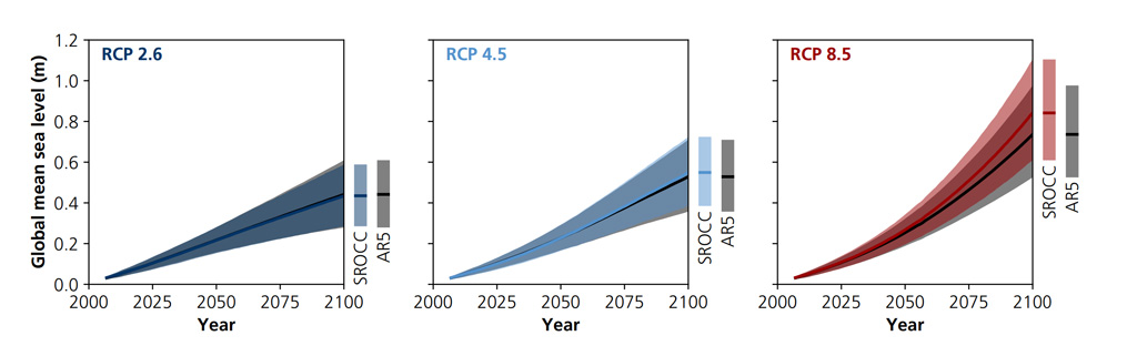
Given the large body of literature suggesting that the high-end IPCC estimates may be overly conservative, it is not surprising that the IPCC Special Report Ocean and Cryosphere in a Changing Climate (SROCC) considered potential 21st century SLR estimates higher than those in the IPCC AR5. The changes expected in the SROCC are mostly at the top end, whereas estimates for medium- or low-emissions scenarios are less likely to see big shifts. This is an important point from a policy perspective, because it implies future emissions – and the magnitude of mitigation – can play a large role in shaping the outcome of future SLR and avoiding worst-case outcomes. The figure below shows the SROCC SLR estimates compared to those in the AR5:
Even these new estimates may end up being conservative. For example, a recent study by Prof Jonathan Bamber at the University of Bristol and colleagues brought together a group of 22 experts to assess their views of the likelihood of different future SLR scenarios. They found that a global SLR exceeding 2m by 2100 “lies within the 90% uncertainty bounds for a high-emission scenario”. This is more than twice the upper value found in the IPCC AR5.
Update: This article was updated on 26/09/2019 to add the new sea level rise projections from the IPCC SROCC