Guest post: How the Greenland ice sheet fared in 2020

Guest authors
09.04.20This year has seen exceptional warmth across much of the Arctic, with record high temperatures recorded in Svalbard, the collapse of the last remaining ice shelf in the Canadian Arctic, record heat and widespread fires in Siberia and a new record low sea ice extent for July.
However, unlike in 2019, Greenland has actually had a relatively “normal” year with regard to ice changes at its surface. Yet losses via the breaking off of icebergs remain at the high end compared to the early years of the satellite record, which stretches back to the late 1970s.
The ice sheet ends the season losing about 152bn tonnes when accounting for both surface melting and discharge of icebergs. This means that the ice sheet is continuing to lose ice, though at a slower rate than seen in 2019.
As another melt season draws to an end over the Greenland ice sheet, it’s time for our annual look back at the weather in Greenland and how it has affected the ice sheet since September last year. (See our previous annual analysis for 2019, 2018, 2017, 2016 and 2015.)
Melt season
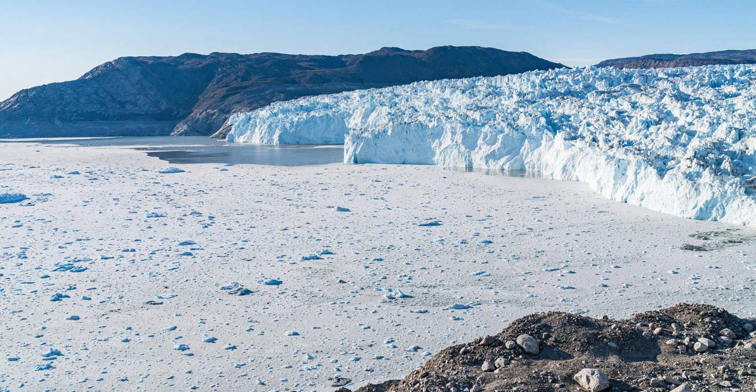
The end of August marks the ideal time to assess the health of the Greenland ice sheet.
Typically, this is the point in the year where the ice melt seen through late spring and summer comes to an end and the ice sheet starts to gain mass again as northern hemisphere temperatures decline through autumn and into winter.
Totting up the snow gains and ice losses at the ice sheet’s surface over the past 12 months gives scientists the “surface mass balance” (SMB). The 2019-20 SMB comes in at a gain of 349bn tonnes of ice.
The chart below shows the cumulative SMB over 2019-20 (blue line), which tracks below the long-term average (grey) for much of the year. The red line shows the record low year of 2011-12 for comparison.
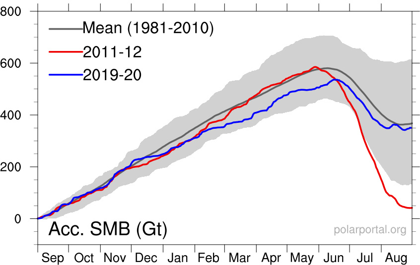
Cumulative surface mass budget of the Greenland ice sheet for 2019-20 (blue line), the record low SMB year of 2011-12 (red), and the 1981-2010 average (grey). Credit: DMI Polar Portal.
The map below illustrates the geographical spread of surface mass losses (red shading) and gains (blue) over 2019-20 compared to the long-term average. In general, the map reveals more losses on the western side of Greenland over the past year and gains in the east.
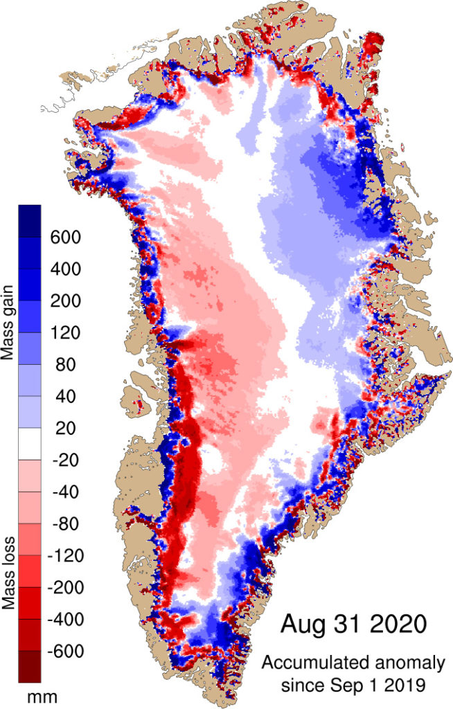
Map shows the difference between the annual SMB in 2019-20 and the 1981-2010 period (in mm of ice melt). Blue shows more ice gain than average and red shows more ice loss than average. Credit: DMI Polar Portal.
But this is only half of the story. To get the total mass balance, we must also factor in the losses of ice from the breaking off, or “calving”, of icebergs and from ocean melting at its edge.
Including these processes gives a total mass loss of 152bn tonnes for the year.
This means that the Greenland ice sheet has again seen an overall decline in ice mass this year. However, this loss is not as large as last year – which saw a loss of 329bn tonnes – or the annual average over the past decade of around 250bn per year.
Comparing years
The start of Greenland’s 2019-20 annual cycle saw a winter that was a little drier than average, though not as snow-free as 2018-19.
The ice sheet then started the melt season on 22 June – around 10 days later than average. Fresh snow in late May and early June had delayed the start of ice loss season, in contrast to last year’s very high melt rates around the same time.
July was a relatively warm and sunny month in Greenland and the area experiencing melt was at the high end of the range, though not record high.
However, in mid-August, unusually large storms brought four times the normal monthly rainfall to western Greenland. This fell as snow at higher levels over the ice sheet and temporarily stopped the net loss of ice.
These storms were probably decisive in reducing the amount of melt as the fresh snow is bright white and reflective, compared to the darker old snow and bare glacier ice after a summer of high melting.
This is highlighted in the maps below, which compare the albedo – a measure of how well the surface reflects sunlight – in August 2020 (left) and August 2019 (right), compared to the 2000-09 average. The maps show above average albedo (blue shading) – so a more reflective surface – in 2020 and below average (red) in 2019.
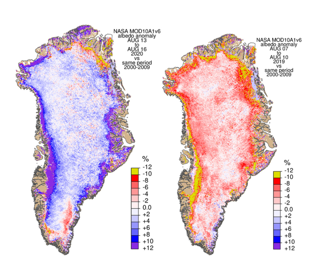
Maps showing albedo, relative to the 2000-09 average, around mid-August 2020 (left) and 2019 (right). Shading indicates a higher (blue) and lower (red) albedo than average. Credit: Polar Portal.
Following the snow and rainfall, melting and ice loss resumed. But, as autumn has returned to Greenland, it has been rather subdued leading to lower mass loss than otherwise would be expected.
Decadal decline
Akin to a bank account, the SMB includes credits in the form of snowfall at the surface and debits in the form of ice melt that runs off. If we take the average over the past 40 years, the ice sheet typically ends the balance year with a gain of around 341bn tonnes – very close to this year’s figure of 350bn tonnes.
In our records, where September marks the start of the year, it means that the end of the 2020 season completes another decade (2011-20 inclusive). As a result, we can now look at the average SMB for four different decades. This shows that – although the SMB varies from one year to another – overall, there has been a declining average SMB over time.
In the 1980s, the average SMB saw a gain of 406bn tonnes each year. In the 1990s, this increased to 426bn tonnes, but in subsequent decades it fell – to 270bn tonnes in the 2000s and then 260bn tonnes in the 2010s. (Though it should be noted that these results are calculated based on a climate model output, so different models with different forcing data may give slightly different results).
Over this period, Greenland has not only warmed up on average, but it has also had more periods of high pressure over the ice sheet with lots of sunshine. This has significantly increased the amount of melt in summer, leading to a decrease in the balance remaining in the surface mass budget account. The melt season of 2018-19 is a classic example.
However, as mentioned above, to get the full ice sheet budget we also have to calculate how much is lost by calving from the face of glaciers. Fortunately, we have satellites to help us with this.
From the middle of the 1980s, satellite measurements can be used to measure glacier flow speeds all around the edges of the ice sheet and from these we can estimate how much of the ice is being lost as icebergs.
The chart below shows satellite-derived estimates of ice “discharge” from calving and submarine melting. The black dots show the discharge in individual years, with the grey lines indicating the uncertainty in the estimates. The orange line shows the annual average.

Timeseries of ice discharge from the Greenland Ice Sheet. Dots represent when observations occurred, and grey bars show the uncertainty. The orange stepped line is the annual average. Data is updated monthly and available to download from here. Source: Mankoff et al (2020).
This analysis shows that in the early 2000s many of these glaciers accelerated and have carried on flowing at high speed into the fjords, carrying a lot of ice with them.
The combination of declining SMB and increasing iceberg discharge and submarine melting has been shown clearly in a study published last year. Overall, the Greenland ice sheet has lost around 4tn tonnes of ice since 1992.
As the chart below reveals, this rate of loss from Greenland – when combined with ice losses from Antarctica (see black line) – is very close to that projected as a high emissions scenario (red line) in the fifth assessment report (AR5) of the Intergovernmental Panel on Climate Change (IPCC).
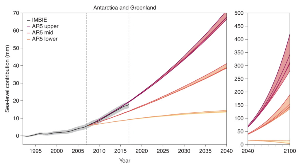
Combined Antarctic and Greenland ice-sheet contribution to global sea level according to IMBIE reconciled satellite observations (black) and IPCC AR5 projections between 1992–2040 (left) and 2040–2100 (right). For each AR5 emission scenario, the upper (maroon), mid (orange) and lower (yellow) estimates are taken from the 95th percentile, median and 5th percentile values of the ensemble range, respectively. Within the upper, mid and lower sets, AR5 pathways are represented by darker lines in order of increasing emissions: RCP2.6, RCP4.5, RCP6.0, SRES A1B (pdf) and RCP8.5. Shaded areas represent the spread of AR5 scenarios and the uncertainty around the observations. The dashed vertical lines indicate the period during which the satellite observations and AR5 projections overlap (2007–17). AR5 projections have been offset to equal the satellite record value at their start date (2007). Source: Slater et al (2020).
New satellite data
This year we now also have the successor to NASA’s GRACE satellite, known as GRACE-Follow On (GRACE-FO), and this will give us an independent means of assessing if our analysis is correct. However, as usual, we will need to wait a few months until the data is available.
After thorough investigations of data quality, it is now evident that the GRACE and GRACE-FO data are, indeed, consistent across the gap between the two satellite missions from late 2017 to mid-2018.
The GRACE‐FO data has now been used to document the large summer ice mass loss of 2019. A recent paper in Communications Earth & Environment has shown that 2019 was indeed an extreme melt year, though the melt totals in the study are a little higher than those we reported last year, probably due to the different models used to calculate SMB.
However, their results – and the findings of another paper in the same journal – basically confirm the results we have shown on the Polar Portal.
The chart and map below shows the changes in ice volume derived from data from the GRACE and (from 2018) the GRACE-FO satellites on a monthly basis.
The red dots on the chart show the month-by-month observations of ice sheet mass. The chart illustrated both the mass loss (right-hand axis) and what contribution to sea level rise this corresponds to (left-hand axis). In general, 100bn tonnes of melted ice adds 0.28mm to global sea levels.
Each winter the ice sheet gains a small amount and in the summer it is lost – this seasonal fluctuation is what creates the wavy pattern. However, the loss of ice has been outstripping the winter gains consistently through the satellite record.
The map shows, which shows the ice mass in August 2019 relative to April 2002, highlights that most of the loss of ice (red shading) occurs along the edge of the ice sheet. Independent observations also indicate that the ice is thinning, that the glacier fronts are retreating in fjords and on land, and that there is a greater degree of melting from the surface of the ice.
High on the central region of the ice sheet, however, the GRACE satellites show that there is a small increase in the mass of the ice (blue shading). Other measurements suggest that this is due to a small increase in snowfall.
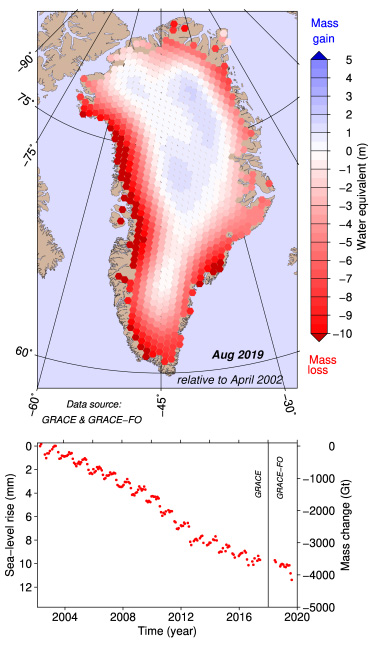
Map and chart of Greenland ice mass changes from April 2002 to August 2019 from the GRACE and GRACE-FO satellite missions. Shading of hexagons on the map indicates increases (blue) and decreases (red) in surface height (in metres of water equivalent). Red dots on the chart show monthly changes in ice in terms of mass (right-hand axis) and sea level rise equivalent (left-hand axis). Credit: DTU-Space Polar Portal.
Finally, we would like to note that this has been an unusual and sorrowful year for us at the Polar Portal and our constituent institutes. The shutdown of society and transport in and out of Greenland due to Covid-19 affected fieldwork on the ice sheet. Then in August came the terrible news of the loss of our close collaborator Prof Konrad Steffen on fieldwork at Swiss Camp. He will be much missed.
-
Guest post: How the Greenland ice sheet fared in 2020
-
Greenland lost 150bn tonnes of ice in the past 12 months