
Guest post: The perils of counter-intuitive design in IPCC graphics

Dr Karlijn van den Broek
11.26.20Dr Karlijn van den Broek
26.11.2020 | 4:36pmThe periodic assessment reports of the UN’s Intergovernmental Panel on Climate Change (IPCC) play a crucial role for policymakers, providing regular scientific assessments on climate change and its risks.
In these reports – the next of which is due to be published next year – key findings are displayed in an array of charts, maps and other graphics. These figures are intended to help readers understand often complicated topics.
But do decision-makers correctly interpret them? And do decision-makers know which graphics they do or do not understand?
In a new paper, published in Environmental Research Letters, my colleagues and I investigate how decision-makers interpret two graphics: one with an intuitive design and one with a counter-intuitive design.
We find that while the intuitive graphic tended to be interpreted correctly, the counter-intuitive graphic was systematically misinterpreted, leading decision-makers to draw the opposite conclusion. Yet they were still confident of their interpretation.
Since inaccurate interpretation of key findings conveyed in IPCC graphics can have far-reaching implications for climate change policy, these findings signal a critical need for more intuitive design of IPCC graphics.
Subjective and objective comprehension
Displaying key findings in maps and charts can have important cognitive and motivational advantages, such as reducing the effort required to process information or understand risks.
However, evidence suggests that confusing graphic design can result in systematic misunderstandings and contribute to poor decision-making.
Our study focuses on both subjective and objective comprehension of IPCC graphics. The former refers to someone’s own assessment of their understanding of a graphic, while the latter refers to whether they have actually understood it correctly.
We attempt to discover whether readers have insight into the degree of their understanding of IPCC graphics, whether they correctly indicate which graphics they do – and do not – understand, and whether this varies with the design.
The topic is important because there can be critical political consequences from misplaced confidence. For example, research shows that public servants whose subjective comprehension of climate change was higher than their objective comprehension tended to endorse more risky policy choices. It was a bigger factor in their decisions than attitudes or political views.
Hence, it is important that we understand not just when people objectively understand IPCC graphics, but also investigate their subjective comprehension – and how the two align.
Understanding of IPCC graphics
We studied understanding of IPCC graphics in a sample of IPCC’s target audience, which included 110 decision-makers from climate-related governmental and non-governmental organisations from 54 countries and a sample of 33 German junior diplomats.
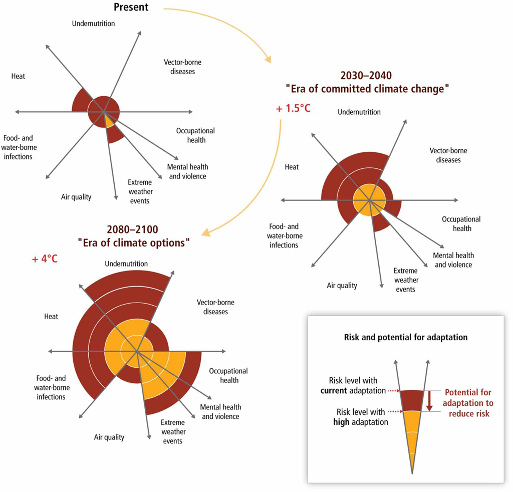
We selected two graphics from the Working Group II report – which covers impacts, vulnerability and adaptation – of the IPCC’s fifth assessment, which was published in 2013-14. We chose one graphic that followed principles of intuitive-design and one that did not. We designed a survey with objective and subjective comprehension questions for each figure.
For the intuitive graphic, shown below, we assessed objective comprehension by asking participants: “What does the graphic tell you about the 4C warmer world?” Participants indicated which element has the potential for the greatest risk reduction: a) undernutrition, b) extreme weather events OR mental health and violence OR occupational health, c) vector-borne diseases, or d) heat OR food- and water-borne infections.
For the counter-intuitive graphic, below, we asked: “Which of the following regions is expected to have the highest frequency in maximum daily temperatures that would have occurred only once in 20 years in the late 20th century according to scenario A2 (red bar)?”. The response options were a) North Asia, b) Central America/Mexico, c) North Europe, or d) South Asia.
We consider the graphic to be counter-intuitive because the taller bars in the individual charts actually indicate a lower frequency of extreme heat, rather than a higher frequency.

To assess subjective comprehension we asked participants to rate how certain they were that they had answered the objective comprehension correct on a scale from “25%: just guessing” to “100%: completely certain”.
Systematic misinterpretations
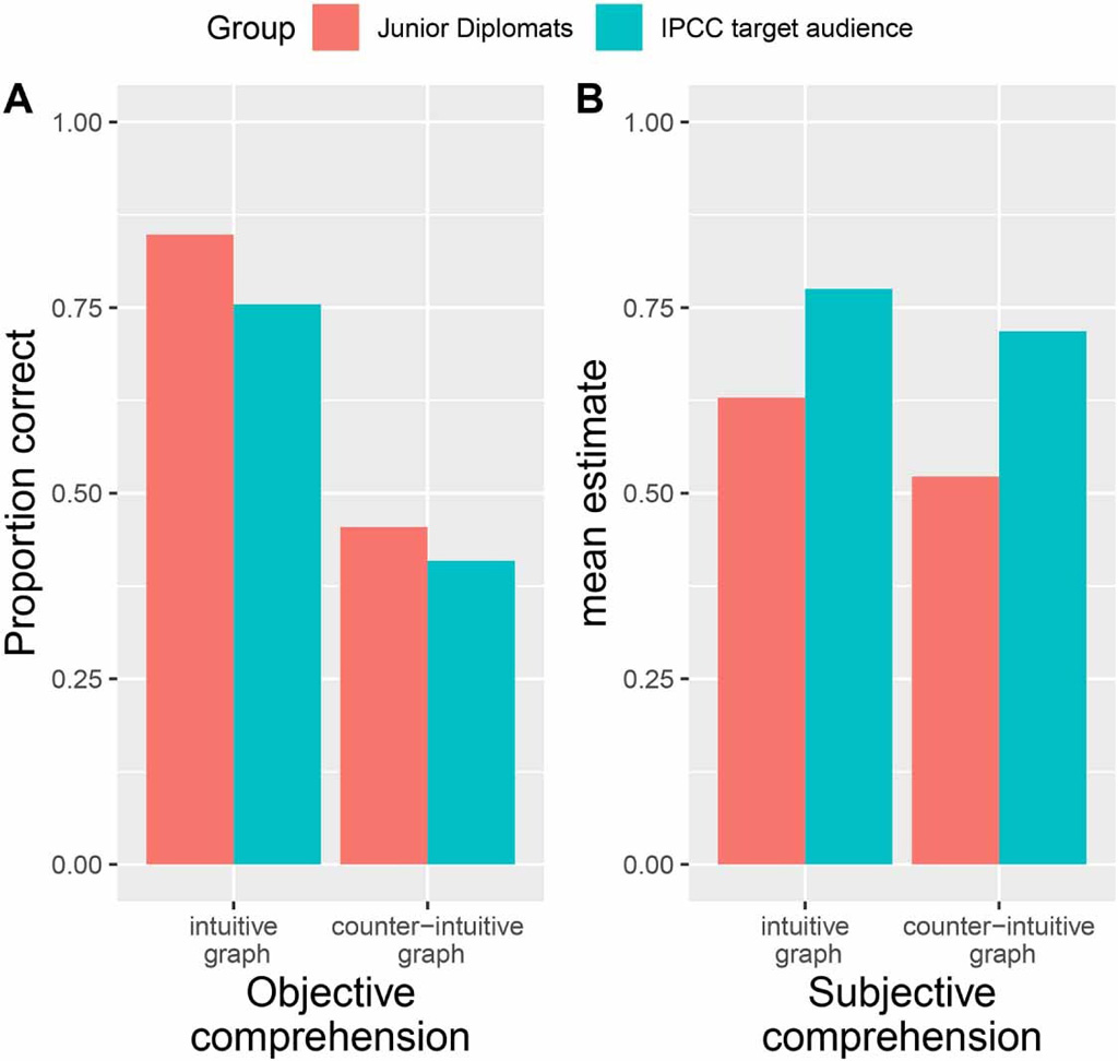
The results – displayed in the chart below – show that for the intuitive graphic, most participants selected the correct answer of “undernutrition”. However, for the counter-intuitive graphic, only the minority of participants opted for the correct answer of “Central America/Mexico”. Instead, the most frequently selected response was “Northern Europe”.
This gives us an indication of why people may have misinterpreted this graphic: these were the regions that were actually least affected, suggesting that they interpreted higher values in the graphic to indicate higher levels of climate impact, while this was not the case.
While it might be expected that participants would be less confident about their interpretation of the counter-intuitive graphic, this is not what we found.
Subjective comprehension did not differ substantially across the two graphics, despite the large differences in the accuracy of interpretation. These results were similar for IPCC’s target audience and junior diplomats.
In fact, we found that objective and subjective comprehension only correlated for the intuitive graphic, but not for the counter-intuitive one. This means that for the intuitive graphic, more confident participants were also more accurate, while there was no relation between confidence and correct interpretations for the counter-intuitive graphic.
Next, we predicted objective comprehension from subjective comprehension. In other words: if we know how confident someone is about their answer, does that give us information on how accurate their interpretation was?
It might be expected that the higher someone’s subjective comprehension, the higher the objective comprehension. This is the situation illustrated by the blue dashed line in the chart below. We found that subject and objective comprehension was more closely aligned for the intuitive graphic (dotted black line) than the counter-intuitive one (solid black line). In other words, the dotted black line more closely follows the blue dashed line.
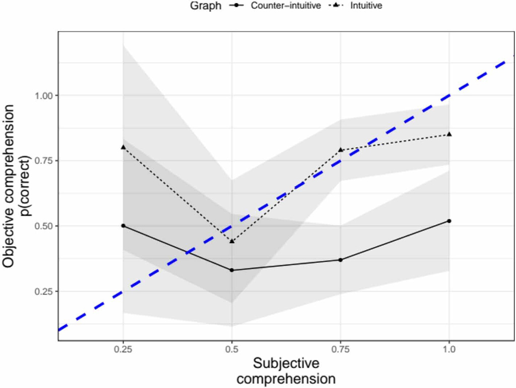
The figure also reveals that, for the counter-intuitive graphic, participants were vastly overconfident of their understanding for judgments made with medium to high confidence (75% or 100% certainty).
This contrasts with results for the intuitive graphic, where participants were only overconfident in their understanding of judgments made with 100% certainty – and to a considerably lesser extent. In fact, for the counter-intuitive graphic, even among those who were 100% certain that their interpretation was correct, only 50% interpreted the graphic accurately – compared to approximately 80% for the intuitive graphic.
The importance of clear IPCC graphics
The results of our study clearly highlight the importance of clear graphics for the IPCC. The fact that IPCC’s target audience often drew the opposite conclusion from what was meant to be conveyed by the counter-intuitive graphic shows that the design of IPCC graphics can systematically distort interpretation among decision-makers.
Furthermore, their unawareness of their misinterpretations is worrying, as this may prevent them from seeking further information to correct their understanding and they may be more inclined to take more risky policy decisions. For example, research suggests that decision-makers who are overconfident in their understanding might – ironically – appear particularly convincing to others, hence, persuading others of their misunderstandings.
Counterintuitive IPCC graphics, therefore, pose a double hazard. First, by preventing policymakers from distilling the correct scientific information, which warrants political decision-making that is not based on the available evidence. And, second, by preventing decision-makers from realising their lack of understanding.
Both perils can be prevented by employing principles of intuitive design in the creation of informative graphics.
The results of our study also provide some insights into how to foster better graphic interpretation among this audience. Specifically, our findings suggest that graphic design should be consistent with conventional features – for example, higher values indicating higher impact. Furthermore, our findings also support the idea that high visual complexity should be avoided where possible.
Reducing the visual complexity of graphics depicting climate data may be challenging as a certain level of detail may be necessary to maintain scientific rigour and nuance.
However, strategies have been outlined that consider insights from the cognitive sciences, such as breaking down the data into different visual “chunks” or considering whether information that is not essential for interpretation could be provided in text or a separate figure.
In addition, the IPCC itself has recently created guidelines (pdf) for report authors on good graphical design, and progress has been made in the recent series of IPCC special reports (on 1.5C of warming, the land, and the ocean and cryosphere). This suggests that graphics in the forthcoming sixth assessment report are more likely to be informed by principles of intuitive design.
Fischer, H. et al. (2020) When IPCC graphs can foster or bias understanding: evidence among decision-makers from governmental and non-governmental institutions, Environmental Research Letters, doi:10.1088/1748-9326/abbc3c