State of the climate: First quarter of 2020 is second warmest on record

This year is shaping up to be one of the warmest years on record – if not the warmest. This is particularly noteworthy because 2020 is likely to see neutral El Niño/La Niña conditions that will play little-to-no role in boosting annual temperatures.
The first three months of 2020 were the second warmest on record, behind only the super-El Niño-fuelled 2016. The past 12 months were also nearly tied for the warmest 12-month period on record. Near-record sea surface temperatures have driven extensive coral bleaching during the southern hemisphere summer.
Global temperatures are currently running at or above the level projected by the generation of climate models featured in the 2013 Intergovernmental Panel for Climate Change (IPCC) fifth assessment report (AR5).
Global sea level continues to rise in 2020. This is being driven by melting glaciers and ice sheets, as well as the thermal expansion of water as it warms. Arctic sea ice currently is on the low end of its historical range after seeing the joint-second lowest minimum Arctic sea ice extent on record in 2019, while Antarctic sea ice is closer to normal levels for this time of year.
Second warmest start to a year
Global surface temperatures are recorded and reported by a number of different international groups, including NASA, NOAA, Met Office Hadley Centre/UEA, Berkeley Earth and Cowtan and Way. Copernicus/ECMWF also produces a surface temperature estimate based on a combination of measurements and a weather model – an approach known as “reanalysis”.
The chart below compares the annual global surface temperatures from these different groups since 1970 – or 1979 in the case of Copernicus/ECMWF. The coloured lines show the temperature for each year, while the dots on the right-hand side show the year-to-date estimate for January to March 2020. Values are shown relative to a common baseline period – the 1981-2010 average temperature for each series. Surface temperature records have shown around 0.9C warming since the year 1970, a warming rate of about 0.18C per decade.
Year-to-date values are only shown for NASA, NOAA, and Copernicus as data for March is not yet available from the other groups. The year-to-date values in this chart will be updated when that data becomes available.
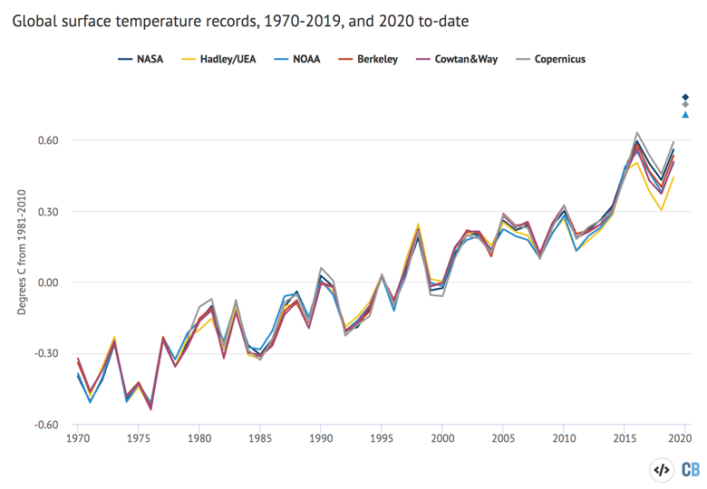
Annual global mean surface temperatures from NASA GISTEMP, NOAA GlobalTemp, Hadley/UEA HadCRUT4, Berkeley Earth, Cowtan and Way and Copernicus/ECMWF (lines), along with 2020 temperatures to-date (January-March, coloured dots). Anomalies plotted with respect to a 1981-2010 baseline. Chart by Carbon Brief using Highcharts.
The temperatures in the first three months of 2020 were remarkably warm. If they end up being representative of the entire year, then 2020 will set a clear record as the warmest year. However, it is likely that global temperatures will not be quite as warm for the remainder of the year – in part because global temperatures are more variable during the October-March period than the April-September period due to El Niño events tending to peak in the winter.
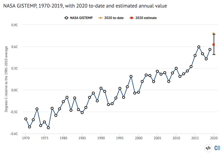
The figure below shows how temperatures to-date compare to prior years in the NASA dataset. It shows the temperature of the year-to-date for each month of the year, from January through to the full annual average.
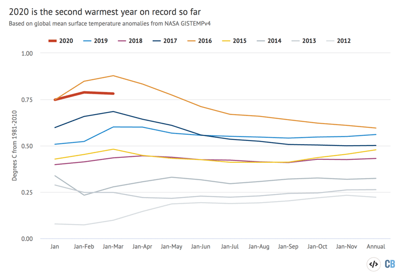
Year-to-date temperatures for each month from 2012 to 2020 from NASA GISTEMP. Anomalies plotted with respect to a 1981-2010 baseline. Chart by Carbon Brief using Highcharts.
Despite its unusually high temperatures during the first three months, 2020 is still running behind 2016 in terms of year-to-date (Q1) temperatures. The winter months were particularly warm in 2016 – 0.89C above the 1981-2010 average in the NASA GISTEMP dataset. (Summer temperature anomalies in 2016 were notably cooler, resulting in an annual average temperature anomaly of 0.60C.) By comparison, the first three months of 2020 had a temperature anomaly of 0.78C, putting it solidly in second place.
However, the start of 2016 was boosted substantially by an extremely strong El Niño event, whereas in comparison, late 2019 and early 2020 have seen neutral sea surface temperature conditions in the Pacific Ocean.
El Niño and La Niña events – collectively referred to as the El Niño Southern Oscillation, or ENSO – are the main driver of year-to-year variation on top of the long-term surface warming trend. ENSO events are characterised by fluctuations in temperature between the ocean and atmosphere in the tropical Pacific, which help to make some years warmer and some cooler.
The majority of forecasts for El Niño/La Niña suggest neutral conditions will persist for the remainder of 2020, with sea surface temperatures in the tropical Pacific around between -0.5C and 0.5C from the recent average.
This can be seen in the figure below, which shows a range of ENSO forecast models produced by different scientific groups, with the average for each type of models shown by thick red, blue and green lines. Positive values above 0.5C reflect El Niño conditions, while negative values below -0.5 reflect La Niña conditions.
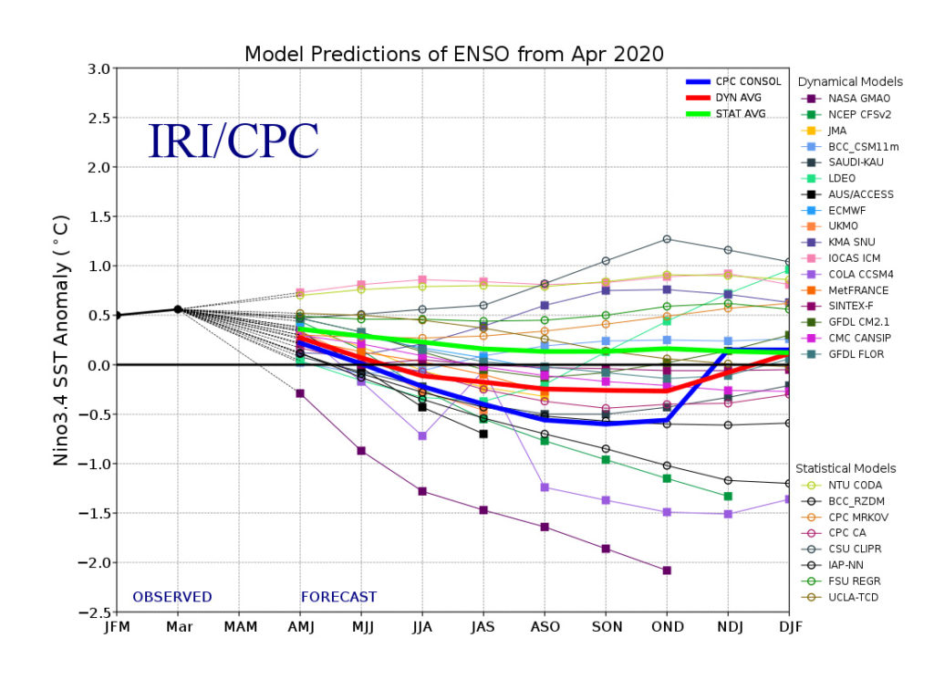
El Niño Southern Oscillation (ENSO) forecast models for three-month periods in the Niño3.4 region (February, March, April – FMA – and so on), taken from the IRI/CPC ENSO forecast.
Climate models and observations
Climate models provide physics-based estimates of future warming given different assumptions about future emissions, greenhouse gas concentrations and other climate-influencing factors.
Model estimates of temperatures prior to 2005 are a “hindcast” using known past climate influences, while temperatures projected after 2005 are a “forecast” based on an estimate of how things might change.
The figure below shows the range of individual models forecasts featured in the IPCC’s AR5 – known collectively as the CMIP5 models – between 1970 and 2020 with grey shading and the average projection across all the models shown in black. Individual observational temperature records are represented by coloured lines.
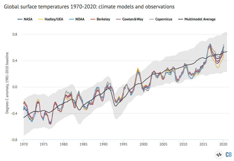
12-month average global average surface temperatures from CMIP5 models and observations between 1970 and 2020. Models use RCP4.5 forcings after 2005. They include sea surface temperatures over oceans and surface air temperatures over land to match what is measured by observations. Anomalies plotted with respect to a 1981-2010 baseline. Chart by Carbon Brief using Highcharts.
While global temperatures were running a bit below the pace of warming projected by climate models between 2005 and 2014, the last few years have been pretty close to the model average. This is particularly true for globally-complete temperature records such as NASA, Berkeley Earth and the Copernicus reanalysis that include temperature estimates for the full Arctic region.
Temperatures were warmer than the multimodel average during the 2015-16 super-El Niño event and were a bit cooler during the 2018 La Niña. In the past two years temperature have ticked back upwards, and are currently above the multimodel average in most of the datasets.
Notably, temperatures over the prior 12-month period (April 2019-March 2020) are close behind the August 2015-September 2016 period in being the warmest 12-months on record, particularly in the Copernicus/ECMWF dataset.
Predicting 2020 temperatures
The first three months of 2020 can give some sense of what to expect for the entire year. By looking at the relationship between the first three months and the annual temperatures for every year since 1950, Carbon Brief has created a projection of what the final global average temperature for 2020 may turn out to be. The analysis also estimates the large uncertainty in 2020 outcomes, given that temperatures from only three months of the year are available so far.
The figure below shows the results of Carbon Brief’s analysis using the NASA GISTemp dataset. The yellow dot shows the average 2020 temperature over the first three months, while the red square shows the most likely 2020 annual temperature estimate. The error bars surrounding it indicate the 95% confidence interval – namely, there’s a 95% likelihood that the 2020 global average temperature will fall in this range.
Annual global average surface temperature anomalies from NASA plotted with respect to a 1981-2010 baseline. To-date 2020 values include January-March. Estimated 2020 annual value based on relationship between the January-March temperatures and annual temperatures since 1950. Chart by Carbon Brief using Highcharts.
This analysis suggests that the full 2020 annual temperatures will likely be notably below the year-to-date temperatures. At this point it is extremely likely that 2020 will be one of the Top 4 warmest years on record, and there is a real chance that it might beat 2016 to set the record as the warmest year. Most projections made at the start of 2020 – such as those from NASA GISTEMP and the UK Met Office – suggest that the year will end up as the second warmest after 2016.
Sea levels continue to rise
Modern-day sea levels rose to a new high in late 2019 and early 2020, due to a combination of melting land ice – glaciers and ice sheets – and the thermal expansion of water as it warms.
The figure below shows the increase in global sea level since it was first measured by satellites in the early 1990s. The different coloured lines indicate different satellite missions over the years. Earlier sea level data from tide gauges is also available, with data going back to the late 1800s.
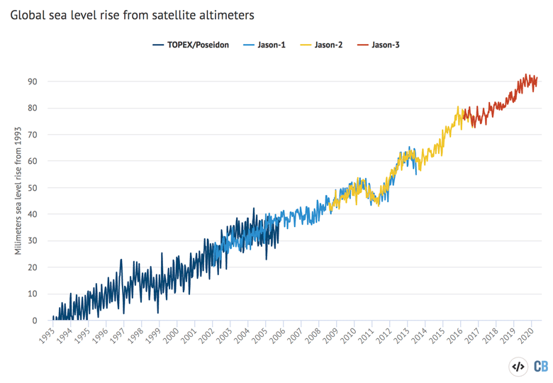
Global average sea level based on satellite data from January 1993 to present from NOAA. A correction for global average isostatic rebound of 0.3mm/yr is added. Chart by Carbon Brief using Highcharts.
Sea level rise is sensitive to global surface temperatures; El Niño years where temperatures are a bit warmer tend to have more rapid sea level rise than La Niña years. For example, sea level increased rapidly from 2014 to 2016. However, these are relatively small fluctuations around the consistent long-term trend. Overall sea levels have risen around 90mm since the early 1990s, and around 200mm since 1900.
Sea level data is corrected for glacial isostatic adjustment – the rebound of the Earth from the several kilometre-thick ice sheets that covered much of North America and Europe around 20,000 years ago. This adjustment is relatively small, only adding around 0.3mm/yr to sea level rise rates, or around 10% of the current rate of sea level rise.
Arctic sea ice moderately low
Arctic sea ice spent much of early 2020 at the low end of the historical 1979-2010 range, but above record lows seen in early 2019. Antarctic sea ice was close to the long-term average over the first three months of 2020. Reliable sea ice coverage data is only available since polar-observing satellites were launched in the late 1970s.
The figure below shows both Arctic and Antarctic sea ice extent in 2020 (solid red and blue lines), the historical range in the record between 1979 and 2010 (shaded areas) and the record lows (dotted black line). Unlike global temperature records, sea ice data is collected and updated on a daily basis, allowing sea ice extent to be viewed through to the present.
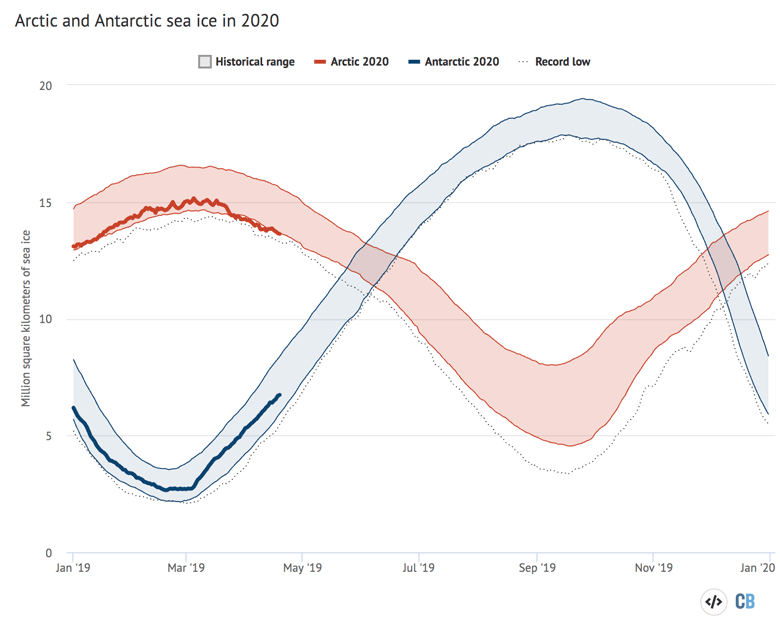
Arctic and Antarctic daily sea ice extent from the US National Snow and Ice Data Center. The bold lines show daily 2020 values, the shaded area indicates the two standard deviation range in historical values between 1979 and 2010. The dotted black lines show the record lows for each pole. Chart by Carbon Brief using Highcharts.
Sea ice extent only tells part of the story. In addition to declining ice extent, the sea ice that remains tends to be younger and thinner than ice that used to cover the region. The figure below, using data from the Pan-Arctic Ice Ocean Modelling and Assimilation System (PIOMAS), shows the Arctic sea ice thickness for every year between 1979 and 2020. While sea ice volume was quite low in 2019, it has recovered modestly in early 2020, but is still in-line with the long-term downward trend.
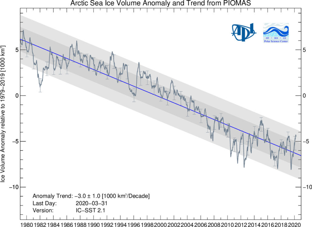
Arctic sea-ice volume anomalies from 1979 through March 2020 from PIOMAS.