
State of the climate: Low sea ice and near-record warmth define 2019 to date
Zeke Hausfather
10.16.19Zeke Hausfather
16.10.2019 | 4:51pmThis year is shaping up to be the second warmest on record for most surface temperature datasets, behind only the super-El Niño year of 2016. This is particularly noteworthy because 2019 has been characterised by a weak El Niño that has played little role in boosting temperatures.
The summer of 2019 also saw a sea ice extent minimum in the Arctic that tied for the second lowest since satellite records began in the late 1970s. Arctic sea ice set new record lows in April, May, July and August of this year.
With three-quarters of this year’s official data now in, these are some of the key findings from Carbon Brief’s latest “state of the climate” report, a quarterly series on global climate data.
Temperatures in the troposphere – the lowest part of the Earth’s atmosphere – have also been quite warm, though the various measuring groups differ on their projections on where 2019 will rank. For example, while one dataset shows that it will likely be the second warmest year on record, another suggests it will be the third or fourth warmest.
Global sea level continues to rise in 2019, with a particularly fast increase over the first six months of the year. This sea level rise is being increasingly driven by melting glaciers and ice sheets, which now contribute two-thirds of recent sea level rise.
Shaping up for second warmest year
This year to date has seen exceptional surface temperatures all around the world. According to NASA’s GISTEMP dataset, 2019 had the fourth warmest January, the third warmest February and May, the second warmest March, April, August and September, and the warmest June and July since records began in the late 1800s. These extremely warm summer temperatures have driven record-breaking heat waves across Europe and other regions.
Animation of daily, monthly, and all-time record highs set at long-term weather stations from May 1st to August 30, 2019.
This summer two major heat waves set a huge number of new all-time records in Europe. pic.twitter.com/pzCuEepUFg
— Dr. Robert Rohde (@RARohde) September 17, 2019
The average temperature over the first nine months of the year is the second warmest on record, with the “super-El Niño”-boosted 2016 still the clear record holder. The figure below shows how temperatures so far in 2019 (red line) compare to prior years (grey lines) in the NASA GISTEMP dataset. It shows the temperature of the year-to-date for each month of the year, from January through the full annual average.
Year-to-date temperatures for each month from 2012 to 2019 from NASA GISTEMP v4. Anomalies plotted with respect to a 1981-2010 baseline. Chart by Carbon Brief using Highcharts.At this point it is highly likely that 2019 will end up as the second warmest year on record – behind only 2016 – in nearly all the surface temperature records. It would take a run of unusually cold months for the remainder of the year to change the outcome. At the same time, it is extremely unlikely that 2019 will surpass 2016 as the warmest year on record.
In 2019, the Intergovernmental Panel on Climate Change (IPCC) released two special reports – on the land and the ocean and cryosphere. These highlighted how climate change is happening at different rates – and having different effects on – the world’s oceans and land area.
The figure below shows the amount of warming that has occurred since the late 1800s for land regions (orange), ocean regions (blue) and the world as a whole (black), using data from NASA GISTEMP. The likely range of 2019 global temperatures are shown by the red bar, based on temperatures to-date and the current El Niño forecast.
Land, ocean and global temperature rise since the late 1800s using data from NASA GISTEMP v4. Values are plotted with respect to a 1880-1900 baseline. Red bar shows the very likely range of 2019 global temperatures based on year-to-date values. Chart by Carbon Brief using Highcharts.While the world as a whole has warmed around 1.1C since the late 1800s, warming over land has been much faster, reaching around 1.8C above late-1800s levels. The oceans have warmed more slowly than the global average, showing only around 0.7C warming to date. As the world is mostly covered with oceans, these have the largest effect on global temperatures. However, as human society is built on land, the much faster warming land temperatures reflect the global warming that we have experienced.
El Niño and La Niña events – collectively referred to as the El Niño-Southern Oscillation, or ENSO – are the main driver of year-to-year variation on top of the long-term surface warming trend. ENSO events are characterised by fluctuations in temperature between the ocean and atmosphere in the tropical Pacific, which help to make some years warmer and some cooler.
In general, El Niño periods tend to be warmer than other months, with the large warm patch in the tropical east Pacific Ocean transferring extra heat to the atmosphere. Similarly, La Niña events cool global temperatures. In both cases the effects tend to have a bit of a lag: the effect on global temperatures is small at the beginning of the event and larger by the end – or slightly after.
The figure below shows a range of ENSO forecast models produced by different scientific groups, with the average for each type of models shown by thick red, blue and green lines. Positive values above 0.5C reflect El Niño conditions, while negative values below -0.5 reflect La Niña conditions.
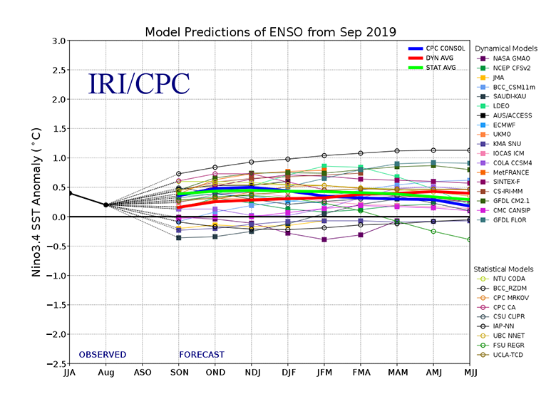
El Niño Southern Oscillation (ENSO) forecast models for three-month periods in the Niño3.4 region (June, July, August – JJA – and so on), taken from the CPC/IRI ENSO forecast.
ENSO conditions are forecast to remain in a neutral or weak El Niño state for the rest of 2019 and into 2020, with relatively little chance of either a strong El Niño or La Niña emerging any time soon.
Divergent troposphere temperatures
In addition to surface measurements over the world’s land and oceans, satellite microwave sounding units have been providing estimates of the lower troposphere since 1979.
The records produced by Remote Sensing Systems (RSS) and the University of Alabama, Huntsville (UAH) show very different rates of warming over the past two decades and disagree about where 2019 will likely end up. RSS agrees with surface records, suggesting that 2019 will very likely be the second warmest year on record. UAH, on the other hand, shows that 2019 will likely end up either as the third or fourth warmest year on record, after 2016, 2008 and possibly 2017. The two records are shown in the figure below – RSS in red and UAH in blue.
Global average lower troposphere temperatures from RSS version 4 (red) and UAH version 6 (blue) relative to a 1981-2010 baseline. Chart by Carbon Brief using Highcharts.These satellites measure the temperature of the lower troposphere and capture average temperature changes around 5km above the surface. This region tends to be influenced more strongly by El Niño and La Niña events than the surface and satellite records show correspondingly larger warming or cooling spikes during these events. This is why, for example, 1998 shows up as one of the warmest years in satellites, but is only around the 12th warmest in surface records. These satellite records are not measuring surface temperatures and should not be directly compared with surface temperature measurements.
We measure global surface temps based on weather station and data from ships and buoys. Satellites also can estimate temps of the lower atmosphere (troposphere) over the past few decades. However, temps at the surface are not the same as those 2 miles up. Lets take a look: 1/5
— Zeke Hausfather (@hausfath) August 7, 2019
Both the RSS and UAH satellite records are subject to some large uncertainties and have seen major adjustments in recent years that have warmed RSS and cooled UAH compared to prior versions of each record.
Sea levels rising faster
Modern-day sea levels have risen to a new high in 2019 so far, due to a combination of melting land ice – glaciers and ice sheets – and the thermal expansion of water as it warms. In recent years there have been larger contributions to sea level rise from melting ice sheets and glaciers. According to the 2018 BAMS State of the Climate report, melting glaciers and ice sheets contributed two-thirds of the total sea level rise between 2005 and 2016.
The figure below shows the increase in global sea level since it was first measured by satellite altimeters in the early 1990s.
Global average sea level based on satellite data from January 1993 to present from AVISO. Chart by Carbon Brief using Highcharts.In addition to the satellite data available since the early 1990s, earlier global sea levels have been reconstructed from a network of global tide gauge measurements. This allows researchers to estimate how sea level has changed since the late 1800s.
Five different sea level rise datasets are shown in the figure below (coloured lines), along with satellite altimeter measurements (in black) after 1993. The top plot shows estimates of global sea level change (in millimetres), while the bottom plot shows the 20-year average rate of change (mm/year).
Global mean sea level rise data from Church and White 2011 (red), Jevrejeva et al 2014 (yellow), Ray and Douglas 2011 (grey), Hay et al 2015 (light blue) and Dangendorf et al 2019 (dark blue). Satellite altimeter data from 1993 (black) to present is taken from AVISO. Top figure shows annual average values (in millimetres – mm), while the bottom figure shows 20-year rates of change (mm/year) using a lagging moving average. Chart by Carbon Brief using Highcharts.Sea levels have risen by between 0.18 and 0.2m (180 to 200mm) since 1900. The newer Hay and Dangendorf datasets tend to show less sea level rise than the earlier Church and White and Jevrejeva datasets. While sea level rise estimates mostly agree in recent decades, larger divergences are evident before 1980.
Most of these datasets (Dangendorf, Hay, and Church and White) suggest that the current rate of sea level rise – as measured by satellite altimeters – is around 50% faster than was experienced in the 1940s.
There is also evidence of accelerating sea level rise over the post-1993 period when high-quality satellite altimetry data is available. According to the recent 2018 BAMS State of the Climate report, acceleration in sea level rise during the post-1993 period is around 0.1mm each year. This means that the rate of sea level rise is increasing by 1mm per year each decade. (See Carbon Brief’s new explainer on how climate change is accelerating sea level rise.)
Second lowest Arctic sea ice on record
Sea ice spent much of mid-2019 at record lows in both the Arctic and Antarctic. It set daily record lows during most of April, May, July and August in the Arctic, and from May through July in the Antarctic.
The Arctic spent almost all of the first three quarters of 2019 well below the historical range over the 1979-2010 period. It tied with 2007 and 2016 as having the second lowest summer minimum sea ice extent since records began in the late 1970s. Only 2012 had lower summer minimum sea ice in the Arctic. In recent days, the Arctic has experienced an unusually slow sea ice recovery, and is now back to setting new daily record lows.
The figure below shows both Arctic and Antarctic sea ice extent in 2019 (solid red and blue lines), the historical range in the record between 1979 and 2010 (shaded areas) and the record lows (dotted black line).
Arctic and Antarctic daily sea ice extent from the US National Snow and Ice Data Center. The bold lines show daily 2019 values, the shaded area indicates the two standard deviation range in historical values between 1979 and 2010. The dotted black lines show the record lows for each pole. Chart by Carbon Brief using Highcharts.The chart below shows the average Arctic sea ice extent for each week of the year for every year between 1978 and 2019, with 2019 so far highlighted with a thick black line. (Prior to 1978, satellite measurements of sea ice extent are not available and the data is much less reliable.)
Arctic and Antarctic weekly sea ice extent from the US National Snow and Ice Data Center from 1979 through April 2019.The figure shows a clear and steady decline in Arctic sea ice since the late 1970s, with darker colours (earlier years) at the top and lighter colors (more recent years) much lower. A typical summer now has nearly half as much sea ice in the Arctic as it had in the 1970s and 1980s.
Sea ice extent only tells part of the story. In addition to declining ice extent, the sea ice that remains tends to be younger and thinner than ice that used to cover the region. The figure below, using data from the Pan-Arctic Ice Ocean Modelling and Assimilation System (PIOMAS), shows the Arctic sea ice thickness for every year between 1979 and 2019.
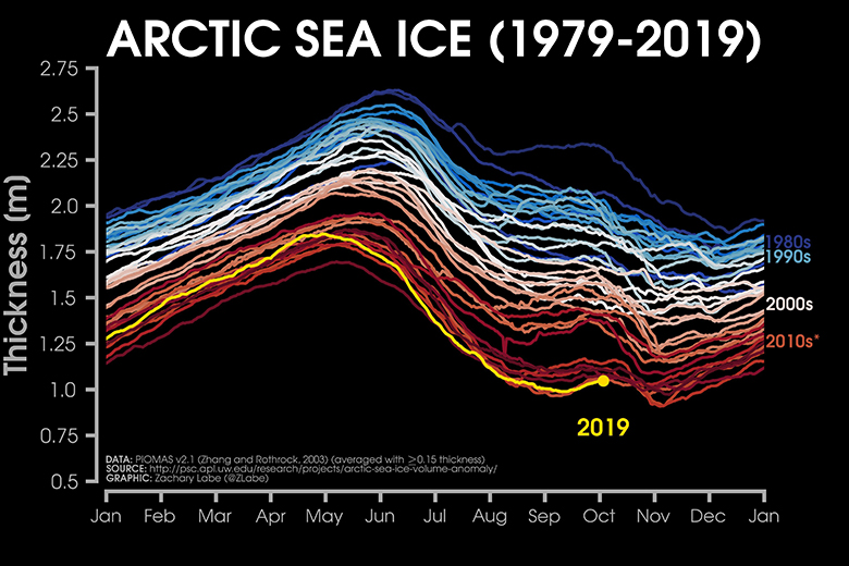
Arctic sea ice thickness from 1979-2019 using PIOMAS data, via Zachary Labe (twitter).
While sea ice thickness was quite low for much of the year, it recently tied for the thinnest on record by the end of September.