State of the climate: 2021 off to cooler start due to fading La Niña
Zeke Hausfather
05.21.21Zeke Hausfather
21.05.2021 | 5:36pmAfter a record-tying warm year in 2020, the world is on track for a cooler year in 2021, driven by moderately strong La Niña conditions in the late part of 2020 and early 2021.
However, 2021 will almost certainly be one of the Top 10 warmest years since records began in the mid-1800s. Despite cooler temperatures than over the past few years, 2021 will still be well in-line with the long-term warming trend that the world has experienced since 1970.
The first four months of 2021 were the seventh warmest start to a year on record so far, cooler than every year since 2015. Temperatures may be a bit warmer during the remaining months of the year, however, as La Niña conditions have already faded.
Global temperatures are currently running at around the level projected by the generation of climate models featured in the 2013 Intergovernmental Panel for Climate Change (IPCC) fifth assessment report (AR5).
Arctic sea ice currently is on the low end of its historical range after seeing the second lowest minimum Arctic sea ice extent on record in 2020, while Antarctic sea ice is closer to “normal” levels for this time of year based on the 1979-2010 period.
Seventh warmest start to a year
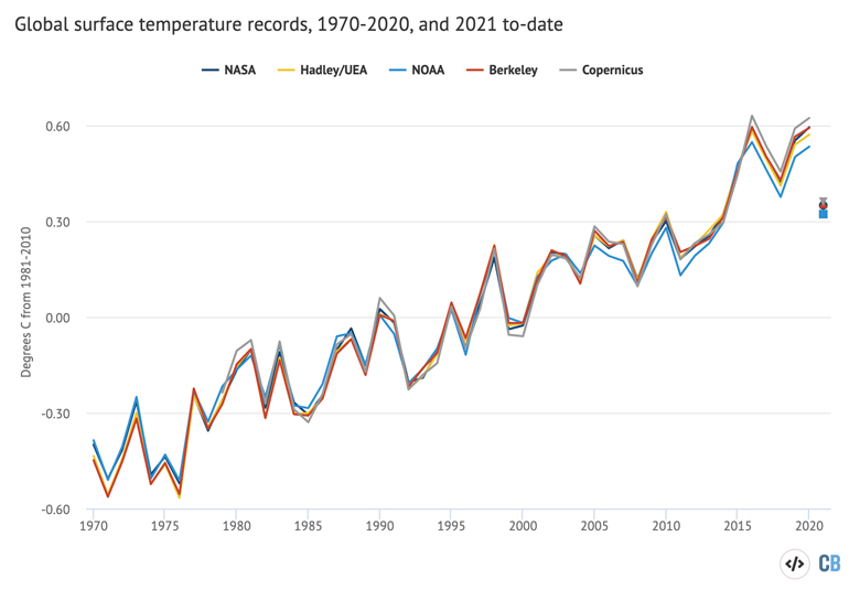
Global surface temperatures are recorded and reported by a number of different international groups, including NASA, NOAA, Met Office Hadley Centre/UEA, and Berkeley Earth. Copernicus/ECMWF also produces a surface temperature estimate based on a combination of measurements and a weather model – an approach known as “reanalysis”.
The chart below compares the annual global surface temperatures from these different groups since 1970 – or 1979 in the case of Copernicus/ECMWF. The coloured lines show the temperature for each year, while the dots on the right-hand side show the year-to-date estimate for January to April 2021 (or January to March for Berkeley Earth). Values are shown relative to a common baseline period – the 1981-2010 average temperature for each series. Surface temperature records have shown around 0.9C warming since the year 1970, a warming rate of about 0.18C per decade.
Year-to-date values are not yet available from Hadley/UEA due to processing delays associated with the introduction of their new HadCRUT5 dataset. The year-to-date values in this chart will be updated when that data becomes available.
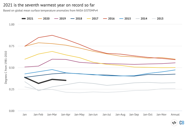
The temperatures in the first four months of 2021 were the seventh warmest first four months of the year on record, behind all of the past six years – but warmer than every year on record prior to 2015. The figure below shows how temperatures to-date compare to prior years in the NASA dataset. It shows the temperature of the year-to-date for each month of the year, from January through to the full annual average.
El Niño and La Niña events – collectively referred to as the El Niño Southern Oscillation, or ENSO – are the main driver of year-to-year variation on top of the long-term surface warming trend. ENSO events are characterised by fluctuations in temperature between the ocean and atmosphere in the tropical Pacific, which help to make some years warmer and some cooler.
The La Niña conditions that characterised the late part of 2020 and early 2021 have abated, with the majority of forecasts for El Niño/La Niña suggesting that neutral conditions will persist for the remainder of 2021.
This can be seen in the figure below, which shows a range of ENSO forecast models produced by different scientific groups, with the average for each model type shown by thick red, blue and green lines. Positive values above 0.5C reflect El Niño conditions, negative values below -0.5 reflect La Niña conditions and values between the two represent ENSO neutral conditions.
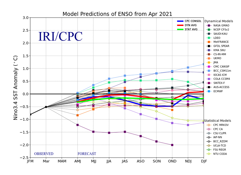
Global temperatures tend to lag behind ENSO conditions by a few months, so the current cooler global conditions may persist even after the La Niña event has ended. That said, most of the remainder of the year will likely be modestly warmer and, overall, 2021 annual temperatures will be warmer than that experienced over the first four months.
Climate models and observations
Climate models provide physics-based estimates of future warming given different assumptions about future emissions, greenhouse gas concentrations and other climate-influencing factors.
The figure below shows the range of individual model forecasts featured in the IPCC’s AR5 – known collectively as the CMIP5 models – between 1970 and 2030. The black line and grey shading indicate the average projection and spread, respectively, across all the models. Individual observational temperature records are represented by coloured lines.
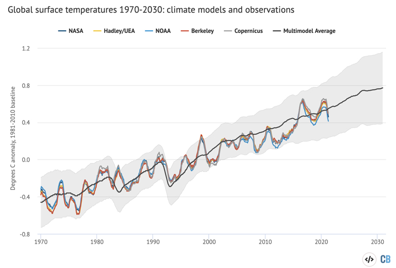
Model estimates of temperatures prior to 2005 are a “hindcast” using known past climate influences, while temperatures projected after 2005 are a “forecast” based on an estimate of how things might change.
While global temperatures were running a bit below the pace of warming projected by climate models between 2005 and 2014, the last few years have been pretty close to – if not slightly above – the model average. This is particularly true for globally complete temperature records that include temperature estimates for the full Arctic region, which now includes four of the five records (with only NOAA lacking coverage over the region).
Predicting 2021 temperatures
The first four months of 2021 can give some sense of what to expect for the entire year. By looking at the relationship between the first four months and the annual temperatures for every year since 1970 – as well as ENSO conditions for the first four months of the year and projected conditions for the remaining eight months – Carbon Brief has created a projection of what the final global average temperature for 2021 will likely turn out to be.
The analysis includes the estimated uncertainty in 2021 outcomes, given that temperatures from only the first third of the year are available so far.
The projection suggests that 2021 has the best chance of ending up as the seventh warmest year on record – and is very likely to be somewhere between the fourth and ninth warmest.
Annual temperatures are likely to be just below what would be expected based on the long-term warming trend since 1970 – which is shown by the dashed line in the figure.
Arctic sea ice moderately low
Arctic sea ice extent spent much of early 2021 at the low end of the historical 1979-2010 range, but above record lows seen in parts of 2019. Arctic sea ice only set a new record daily low during one day in late March, while the annual winter maximum extent clocked in as the seventh lowest on record.
Antarctic sea ice was close to the long-term average over the first four months of 2021. Reliable sea ice coverage data is only available since polar-observing satellites were launched in the late 1970s.
The figure below shows both Arctic and Antarctic sea ice extent in 2021 (solid red and blue lines), the historical range in the record between 1979 and 2010 (shaded areas) and the record lows (dotted black line). Unlike global temperature records (which only report monthly averages), sea ice data is collected and updated on a daily basis, allowing sea ice extent to be viewed through to the present.
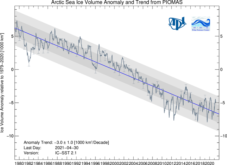
Finally, it is worth noting that sea ice extent only tells part of the story. In addition to declining ice extent, the sea ice that remains tends to be younger and thinner than ice that used to cover the region. The figure below, using data from the Pan-Arctic Ice Ocean Modelling and Assimilation System (PIOMAS), shows the Arctic sea ice thickness for every year between 1979 and 2021.
While sea ice volume is currently above its 2020 values, it is still well in-line with the long-term downward trend.