State of the climate: 2020 ties as warmest year on record
Zeke Hausfather
01.14.21Zeke Hausfather
14.01.2021 | 4:00pmWith all the official climate data now in, the world’s surface temperatures in 2020 have been confirmed as effectively tied with 2016 as the warmest year on record.
In this article, Carbon Brief explains why the year proved to be so remarkable across the planet’s oceans, atmosphere, cryosphere and surface.
Last year set a number of records for the Earth’s climate:
- Record warm surface temperatures: It was the warmest or second warmest year on record for surface temperature – depending on the dataset used – and effectively tied with 2016 within the range of measurement uncertainty in all the surface temperature records examined here. This is all the more remarkable because the latter half of 2020 has seen a natural cooling effect from a modest La Niña event.
- Record levels of ocean heat content: It was the warmest year on record for ocean heat content, which increased markedly between 2019 and 2020.
- Record warmth in satellite records: It was either the warmest or second warmest year in the Earth’s troposphere – the lower part of the atmosphere – depending on the dataset examined.
- Arctic sea ice sees second lowest summer minimum: It saw record lows in sea ice extent and volume in the Arctic for much of the period between July and November. The minimum Arctic sea ice extent reached in September was the second lowest on record.
- Sea levels continue to rise: Global sea levels and atmospheric greenhouse gas concentrations reached new record highs in 2020, while the world’s glaciers continued to melt rapidly.
Record warm surface temperatures
Global surface temperatures in 2020 were exceptionally warm. Data from NASA show it was the warmest year on record, while data from NOAA, Berkeley Earth, Copernicus ERA5 and the newly updated Hadley Centre/UEA HadCRUT5 record have it as the second warmest.
In all cases, the difference between 2020 and 2016 average temperatures is less than 0.03C, while the global records can only predict current temperatures within around 0.05C or so. This means that scientists cannot be confident that 2020 was cooler than 2016 – and the two are best seen as a tie for the warmest year on record.
Temperatures back in 2016 were boosted up to a few tenths of a degree by one of the largest El Niño events in the past century. In contrast, 2020 was characterised by a modest La Niña event that likely had a natural cooling influence in the second half of the year.
It is rather remarkable that a La Niña year could match the warmth of one of the strongest El Niños on record just a few years ago – illustrating the powerful impact that human greenhouse gas emissions are having on global temperatures.
Global surface temperature records can be calculated back to 1850, though some groups choose to start their records in 1880 when more data was available. Prior to 1850, records exist for some specific regions, but are not sufficiently widespread to calculate global temperatures with any reasonable accuracy. These records are created by combining ship-and buoy-based measurements of ocean sea surface temperatures with temperature readings of the surface air temperature from weather stations on land (Copernicus ERA5 is an exception, as it uses weather model-based reanalysis).
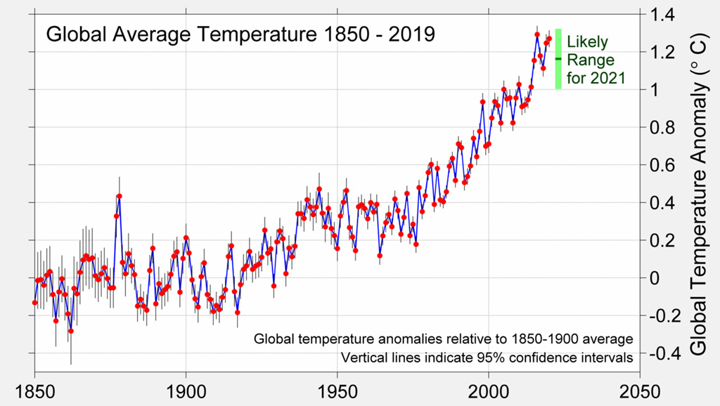
The chart below shows global temperature records since 1850, with temperatures shown relative to the 1880-1899 period to highlight warming since the pre-industrial period.
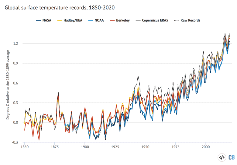
Annual global average surface temperatures from 1850-2020. Data from NASA GISTEMP, NOAA GlobalTemp, Hadley/UEA HadCRUT5, Berkeley Earth and Carbon Brief’s raw temperature record. 1979-2000 temperatures from Copernicus ERA5 (as the reanalysis record starts in 1979). Anomalies plotted with respect to a 1880-1899 baseline to show warming since the preindustrial period. Chart by Carbon Brief using Highcharts.
Temperatures in 2020 were between 1.2C and 1.3C warmer than temperatures in the late 19th century (between 1880 and 1900), depending on the temperature record chosen. They represented the seventh consecutive year that global temperatures have exceeded 1C above pre-industrial levels in most of the datasets and the third year above 1.2C in most datasets.
In an update to the data shown in prior years, Carbon Brief’s State of the Climate now uses the new HadCRUT5 instead of HadCRUT4 (see the recent Carbon Brief analysis of HadCRUT5 for details). The Cowtan and Way record is no longer shown as it is largely redundant with HadCRUT5; it uses the same data and a similar approach to filling in data gaps. (Cowtan and Way was created to deal with data gaps in HadCRUT4.)
The global warming seen over the past century is not a result of any adjustments made to the underlying temperature records. The figure above includes a “raw records” line (shown as a dotted line) calculated by Carbon Brief using data not subject to any adjustments or corrections for changes in measurement techniques. Over the full 1850-2020 period, the adjusted temperature records actually tend to show less warming than the raw data.
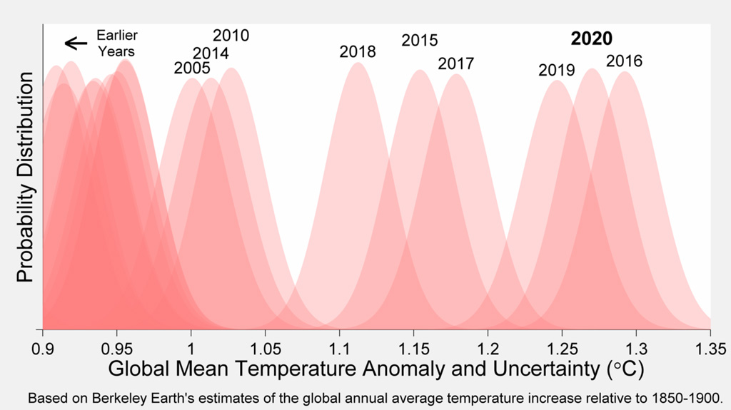
The past six years of the record really stand out as much warmer than anything that has come before. This can be seenin the figure below from Berkeley Earth. Each shaded curve represents the annual average temperature for that year. The further that curve is to the right, the warmer it was.
The width of each year’s curve reflects the uncertainty in the annual temperature values (caused by factors such as changes in measurement techniques and the fact that some parts of the world have fewer measurement locations than others).
The figure below provides a zoomed-in look at global surface temperature records over the past 50 years. This plot uses a more recent 1981-2010 period as a baseline to provide a clearer view of differences between temperature records over the past few decades. Note that the 1981-2010 period is around 0.6C to 0.75C warmer than the 1880-1900 pre-industrial period, depending on the record used.
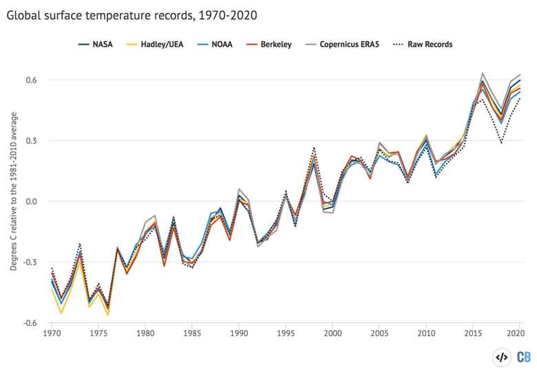
Same as first figure, but with data from 1970-2020 and using a 1981-2010 baseline period. Chart by Carbon Brief using Highcharts.
Patterns of surface warming in 2020
The focus on global surface temperature as a key metric of climate change is important, but can obscure very different rates of change across the planet.
For example, while most of the Earth’s surface is covered by oceans, nearly all human settlements and activities are in land areas. The land has been warming around 70% faster than the oceans – and 40% faster than the global average – in the years since 1970.
The figure below shows global average surface temperatures in black, land-only temperatures in orange, and ocean-only temperatures in blue. It is based on a combination of HadCRUT5 data from 1850-1978 and Copernicus/ERA5 data thereafter, as, at the time of writing, only ERA5 had released the data needed to separately calculate land and ocean temperatures through to the end of 2020.
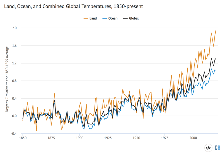
Annual global average surface temperatures from 1850-2020. Data from Hadley/UEA HadCRUT5 from 1850-1978 and Copernicus ERA5 from 1979-2020 (as the reanalysis record starts in 1979). The two datasets are combined by minimising the overlap between the 1981-2010 period. Anomalies plotted with respect to a 1850-1899 baseline to show warming since the pre-industrial period. Chart by Carbon Brief using Highcharts.
While the world as a whole has warmed by around 1.3C since the pre-industrial period (1850-1899) in this dataset, land areas have warmed a much larger amount – by 1.9C on average. In contrast, the oceans have warmed more slowly – by around 1C since pre-industrial times. (See Carbon Brief’s recent guest post on why the land and ocean warm at different rates.)
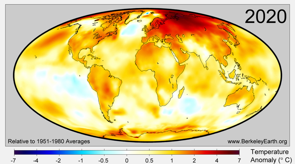
Different parts of the land and ocean are also warming at different rates. The warmth in 2020 covered large regions of the world, with particularly high temperatures in the Arctic, over Siberia, Europe, Central and South America, the Middle East, the northern Pacific Ocean and the Antarctic Ocean. The figure below, from Berkeley Earth, shows the average annual temperature anomalies across the world for the year.
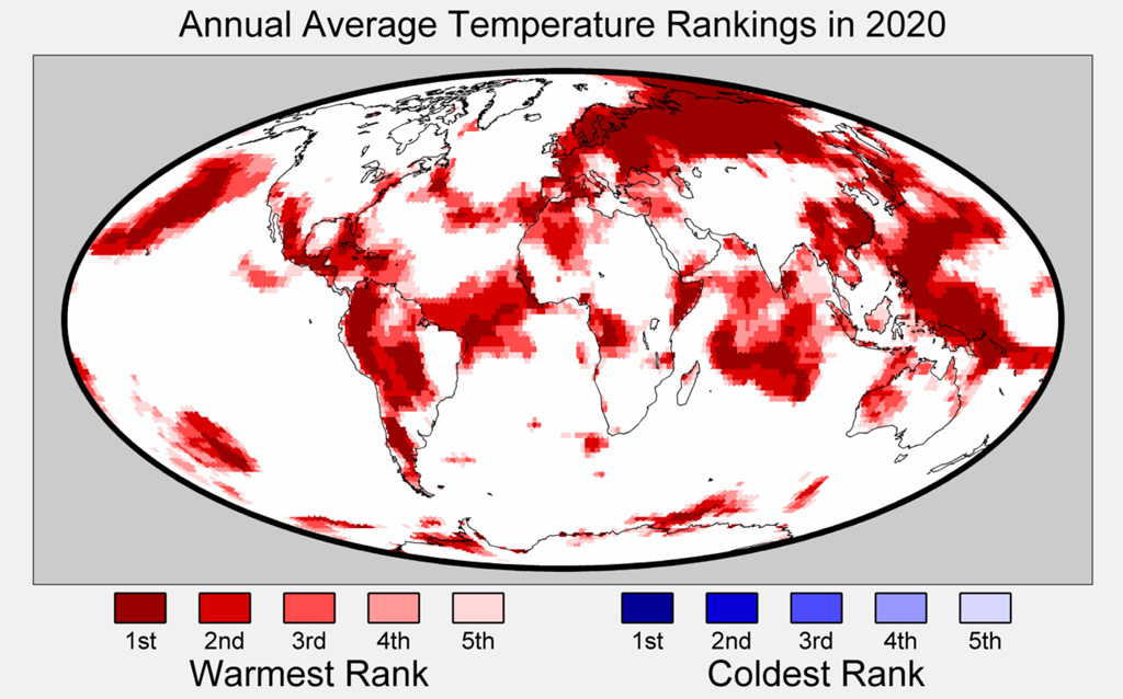
Based on an analysis by Berkeley Earth, 2020 had the warmest annual average since instrumental records began in the following 45 countries: Andorra, Antigua and Barbuda, Argentina, Belarus, Belgium, Belize, Bolivia, Colombia, Cuba, Djibouti, Dominica, Estonia, Federated States of Micronesia, Fiji, Finland, France, The Gambia, Guatemala, Guinea-Bissau, Honduras, Jamaica, Japan, Latvia, Lithuania, Luxembourg, Maldives, Marshall Islands, Mexico, Moldova, Nauru, Peru, Republic of the Congo, Russia, Saint Kitts and Nevis, Senegal, Seychelles, Sierra Leone, Solomon Islands, Somalia, Sweden, Taiwan, Tuvalu, Ukraine, Vanuatu and Venezuela.
The figure below – also from Berkeley Earth – shows the regions of the world where either warm or cold records were set in 2020. It is noteworthy that while large parts of the planet set new warm records, there was no location on Earth where annual average temperatures were among the coldest on record.
Observations closely tracking climate modelling projections
Climate models provide physics-based estimates of future warming given different assumptions about future emissions, greenhouse gas concentrations and other climate-influencing factors.
Here, Carbon Brief examines two different sets of climate models – both the older models (CMIP5) used in the 2013 fifth assessment report (AR5) from the Intergovernmental Panel on Climate Change (IPCC) and the new models (CMIP6) developed for the upcoming 2021 IPCC sixth assessment report.
In CMIP5, model estimates of temperatures prior to 2005 are a “hindcast” using known past climate influences, while temperatures projected after 2005 are a “forecast” based on an estimate of how things might change. CMIP6 models, on the other hand, have hindcasts reaching up until 2014.
The figure below shows the range of individual CMIP5 models projections since 1850, as well as future projections through to 2100 under the middle-of-the-road RCP4.5 emissions scenario. The black line shows the average of 38 different models, while the grey area shows the 95% (two sigma) range of the model projections. Observational temperatures are plotted on top of the climate model data, with individual observational records are represented by coloured lines.
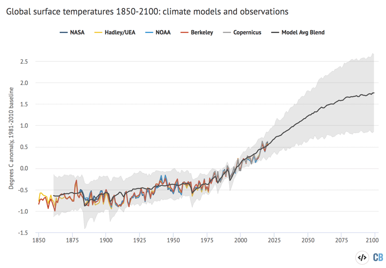
Annual global average surface temperatures from CMIP5 models and observations between 1850 and 2100 (through 2020 for observations). Models use the RCP4.5 scenario after 2005. They include sea surface temperatures over oceans and surface air temperatures over land to match what is measured by observations. Anomalies plotted with respect to a 1981-2010 baseline. Chart by Carbon Brief using Highcharts.
The climate model outputs shown here are blended – that is, they combine surface air temperature over the land with sea surface temperatures over the ocean in the same way they are measured in the observational climate record. This allows for a more accurate comparison of the two.
Observations fall well within the range of CMIP5 climate model projections over the past 170 years. Temperatures in 2020 are quite close to the model average. The figure below shows a zoomed in view of climate models and observations over the past 70 years (1950-2020). It also includes a dashed black line showing non-blended model results (e.g. global surface air temperatures).
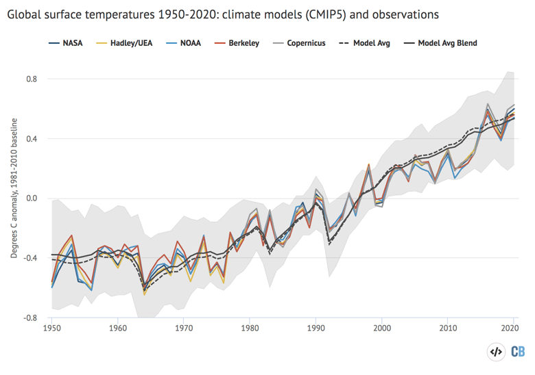
Same as the prior chart, but for the period from 1850-2100. Models use the RCP4.5 scenario after 2005. Chart by Carbon Brief using Highcharts.
While not all of the models participating in CMIP6 have reported runs at the time this was written, enough – 33 models – had both historical and RCP4.5 future warming projections to enable a comparison with observations. The figure below shows an analysis of both CMIP6 models and observations between 1950 and 2020. (Note that only non-blended model results are shown for CMIP6, as blended CMIP6 fields have yet to be created.)
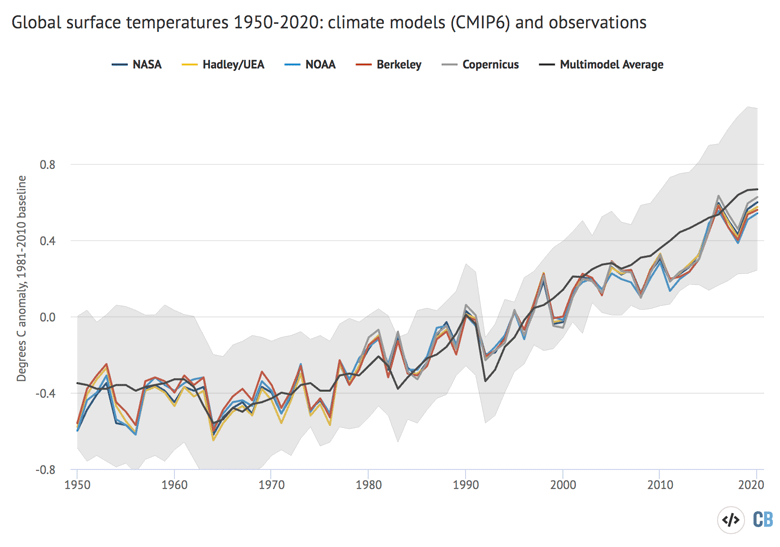
Same as the prior chart, but for CMIP6 models. Models use the RCP4.5 scenario after 2014. Chart by Carbon Brief using Highcharts.
CMIP6 models generally predict more warming than CMIP5 – both in the historical period and in the future. Observations are noticeably below the model average in recent years in CMIP6, though still well within the 95% range (grey area).
For more discussion of the new CMIP6 results and how they differ from the prior generation of CMIP5 models, see the Carbon Brief CMIP6 explainer.
Record warmth in satellite records
In addition to surface measurements over the world’s land and oceans, satellite microwave sounding units have been providing estimates of global lower atmospheric temperatures since 1979.
These measurements, while subject to some large uncertainties, also show 2020 as a record warm year – effectively tied with 2016 within the margin of uncertainty.
The record produced by Remote Sensing Systems (RSS) shows 2020 as the warmest year on record, slightly warmer than 2016, while the record from the University of Alabama, Huntsville (UAH) shows it as the second warmest, slightly cooler than 2016. The chart below shows the two records – RSS in red and UAH in blue.
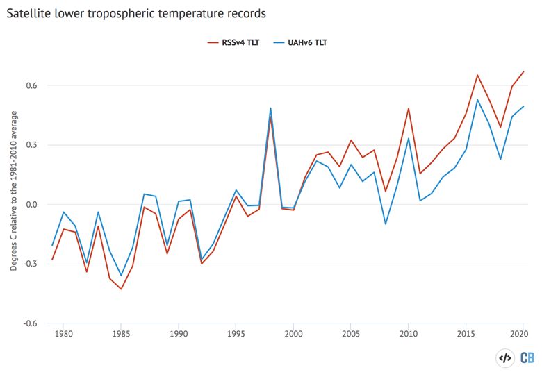
Global average lower troposphere temperatures from RSS version 4 (red) and UAH version 6 (blue) for the period from 1979-2020, relative to a 1981-2010 baseline. Chart by Carbon Brief using Highcharts.
These satellites measure the temperature of the lower troposphere and capture average temperature changes around 5km above the surface.
This region of the atmosphere tends to be influenced more strongly by El Niño and La Niña events than the surface and satellite records show correspondingly larger warming or cooling spikes during these events. This is why, for example, 1998 shows up as one of the warmest years in satellites, but not in surface records.
The two lower tropospheric temperature records show large differences after the early 2000s. RSS shows an overall rate of warming quite similar to surface temperature records, while UAH shows considerably slower warming in recent years than has been observed on the surface. Both have seen large adjustments in recent years that have warmed RSS and cooled UAH compared to prior versions of each record.
Record levels of ocean heat content
More than 90% of the heat trapped by increasing greenhouse gas concentrations is taken up by the Earth’s oceans.
While surface temperatures fluctuate a bit from year to year due to natural variability, ocean heat content increases much more smoothly and is, in many ways, a more reliable indicator of the warming of the Earth – albeit one with a shorter historical record.
Last year set a clear record for the highest ocean heat content since reliable records began in 1958, according to the Institute of Atmospheric Physics of the Chinese Academy of Sciences (IAP-CAS), which maintains an up-to-date ocean heat content database.
The figure below shows ocean heat content for each year in the region of the ocean between 0 to 700 metres (light blue bars) and 700 to 2,000 metres (dark blue) of depth, which comprises the bulk of the world’s oceans. Ocean warming is plotted relative to the 1958-1960 average.
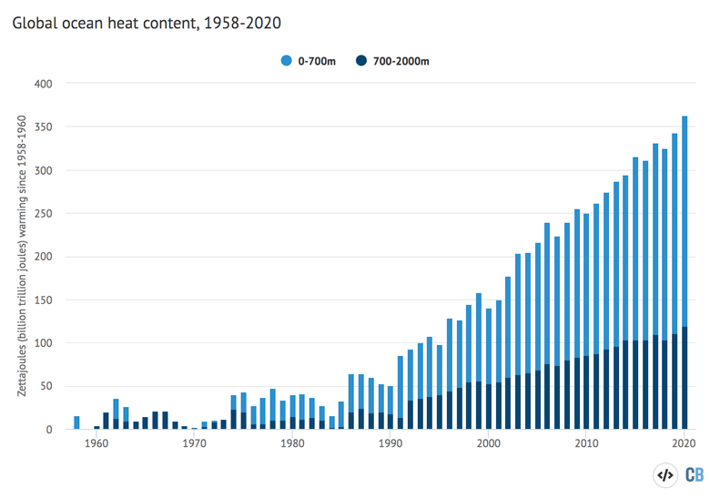
Annual global ocean heat content (in zettajoules – billion trillion joules, or 10^21 joules) for the 0-700 metre and 700-2000 metre layers. Data from Cheng et al 2020. Chart by Carbon Brief using Highcharts.
Ocean heat content in 2020 was significantly higher than in 2019, the next warmest year. While 2016 was quite a warm year on the surface, it was only the sixth warmest year for ocean heat content, as the El Niño event that helped 2016 surface temperatures be so warm redistributed heat out of the ocean and into the atmosphere.
Ocean heat content accelerated notably after 1990, due to an increase in heat being trapped by greenhouse gases and to recovery from the Pinatubo volcanic eruption in 1992, and most years after that have set a new record.
Sea levels continue to rise
Modern-day sea levels have risen to a new high, due to a combination of melting land ice (such as glaciers and ice sheets), the thermal expansion of water as it warms and changes in land water storage. In recent years, there have been larger contributions to sea level rise from melting ice sheets and glaciers.
Since the early 1990s, the increase in global sea level has been estimated using altimeter data from satellites. Earlier global sea levels have been reconstructed from a network of global tide gauge measurements. This allows researchers to estimate how sea level has changed since the late 1800s.
The chart below shows five different sea level rise datasets (coloured lines), along with satellite altimeter measurements from NASA (in black) after 1993. (As sea level rise data has not yet been released for the whole year, the figure below only includes data through to the end of 2019.)

Global mean sea level rise data from Church and White 2011 (red), Jevrejeva et al 2014 (yellow), Ray and Douglas 2011 (grey), Hay et al 2015 (light blue) and Dangendorf et al 2019 (dark blue). Satellite altimeter data from 1993 (black) to present is taken from NASA. Chart by Carbon Brief using Highcharts.
Sea levels have risen by between 0.18 and 0.2m (180-200mm) since 1900. While sea level rise estimates mostly agree in recent decades, larger divergences are evident before 1980. There is also evidence of accelerating sea level rise over the post-1993 period when high-quality satellite altimetry data is available. (See Carbon Brief’s explainer on how climate change is accelerating sea level rise.)
Glacier melt continues to accelerate
Scientists measure the mass of glaciers around the world using a variety of remote sensing techniques, as well as through GRACE measurements of the Earth’s gravitational field. The balance between snow falling on a glacier and ice loss through melting or “calving” determines if glaciers grow or shrink over time.
An international consortium called the World Glacier Monitoring Service tracks 164 different glaciers in 19 different regions around the world. The figure below shows the change in global average glacier mass from 1950 through to the end of 2019 (2020 values are not yet available).
Glacier melt is reported in metres of water equivalent, which is a measure of how much mass has been lost on average.
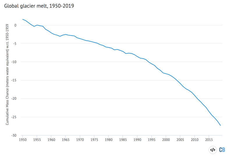
Global average glacier melt from 1950-2018 the World Glacier Monitoring Service in meters of water equivalent. Carbon Brief using Highcharts.
Greenhouse gas concentrations reach new highs
Greenhouse gas concentrations reached a new high in 2020, driven by human emissions from fossil fuels, land use and agriculture.
Three greenhouse gases – CO2, methane (CH4) and nitrous oxide (N2O) – are responsible for the bulk of additional heat trapped by human activities. CO2 is by far the largest factor, accounting for roughly 50% of the increase in “radiative forcing” since the year 1750.
Methane accounts for 29%, while nitrous oxide accounts for around 5%. The remaining 16% comes from other factors including carbon monoxide, black carbon and halocarbons, such as CFCs.
Human emissions of greenhouse gases have increased atmospheric concentrations of CO2, methane and nitrous oxide to their highest levels in at least a few million years – if not longer.
The figure below shows concentrations of these greenhouse gases – in parts per million (ppm) for CO2 (blue line) and parts per billion (ppb) for methane (orange) and nitrous oxide (red) – from the early 1980s through to October 2020 for CO2 and September 2020 for CH4 and N2O (the most recent data currently available).
The data shows that greenhouse gases continued to accumulate in the atmosphere, despite the temporary dip in global emissions caused by Covid-19 lockdowns around the world.
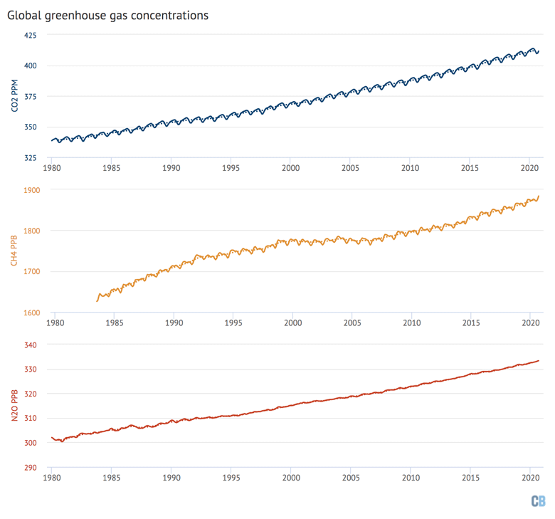
Global concentrations of CO2, methane (CH4) and nitrous oxide (N2O). Based on data from NOAA’s Earth Systems Research Laboratory. Note that the y-axes do not start at zero. Chart by Carbon Brief using Highcharts.
Arctic sea ice sees second lowest summer minimum
Arctic sea ice spent much of the northern hemisphere summer months at record lows in 2020. It set daily record lows during large parts of July, August, October, and November. It saw the second lowest summer minimum sea ice extent – behind only 2012 – since records began in the late 1970s.
The Arctic experienced an unusually slow sea ice recovery after the September minimum, though it has recovered to just below the long term (1979-2010) average in recent months.
In contrast to the Arctic, sea ice surrounding Antarctica remained within the long-term average range for the entirety of 2020.
The figure below shows both Arctic (red line) and Antarctic (blue line) sea ice extent for each day of the year, along with how it compares to the historical range (corresponding shading).
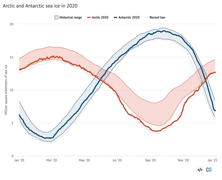
Arctic and Antarctic daily sea ice extent from the US National Snow and Ice Data Center. The bold lines show daily 2020 values, the shaded area indicates the two standard deviation range in historical values between 1979 and 2010. The dotted black lines show the record lows for each pole. Chart by Carbon Brief using Highcharts.
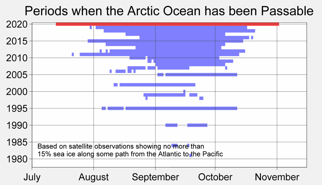
The remarkably low levels of Arctic sea ice for much of the summer in 2020 made the Northern Sea Route (e.g. the Northeast Passage) open for shipping for a record long period of time.
The Berkeley Earth chart below shows the periods each year that the Northern Sea Route has been open (blue lines). Prior to the year 2005, open ocean passages in the Arctic rarely formed; in 2020 (red line) the Northeast Passage was open for three and a half months straight. This was in part due to exceptional warming in Siberia, and associated ice-free conditions north of that region.
Looking ahead to a slightly cooler 2021
While a modest La Niña event likely helped cool the latter part of 2020, these conditions are expected to persist for the first half of the year. Because there is a lag of a few months between when El Niño or La Niña conditions peak in the tropical Pacific and their impact on global temperatures, current La Niña conditions will likely have a larger impact on 2021, which is why the year is expected to be cooler than the prior two years.
Three groups – the UK Met Office, NASA’s Dr Gavin Schmidt, and Berkeley Earth – have already predicted what temperatures might look like in 2021. All three suggest that 2021 will most likely be cooler than 2020.
The Met Office and Berkeley Earth both predict that it will be around the fifth warmest year on record, with a best guess of somewhere between the fourth to the seventh (though it is too early to firmly rule out a cooler or warmer outcome than that).
The figure below shows the range of possible 2021 temperature outcomes in green based on the Berkeley Earth analysis, with the average estimate shown by the horizontal black bar.
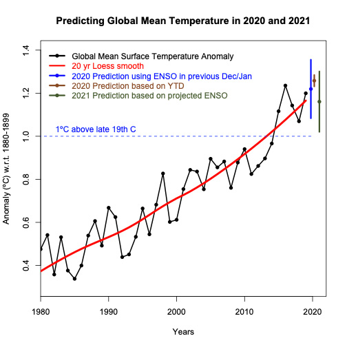
The NASA projection is a bit higher, with a best estimate of 2021 as the third warmest year on record, with a likely range of between the first and sixth. While it is unclear what specific factors are driving the differences between these forecasts, it may in part be driven in part by different assumptions around how big an effect the La Niña event will have on 2021 temperatures.
The figure below, by Schmidt, shows 1980-2019 temperatures in black, a 2020 projection made at the end of 2019 in dark blue, a 2020 projection using data through to November in light blue, and a 2021 projection based on modelled future El Niño conditions in green.
While it is too early to predict with any certainty where 2021 will end up, it would be nothing out of the ordinary to have a year a bit cooler than the prior few.
What matters for the climate is not the leaderboard of individual years. Rather, it is the long-term upward trend in global temperatures driven by human emissions of greenhouse gases. Until the world reduces emissions down to net-zero, the planet will continue to warm.