
State of the climate: 2020 set to be first or second warmest year on record
Zeke Hausfather
07.30.20Zeke Hausfather
30.07.2020 | 3:00pmWith the data now in for the first half of the year, Carbon Brief estimates that 2020 is most likely to be either the warmest or second warmest year on record, depending on the approach used to calculate global temperatures.
Global surface temperatures have been exceptionally warm over the first half of 2020, tying with the record warmth seen in 2016. This is particularly remarkable because El Niño conditions have been largely “neutral” in 2020 to-date, unlike 2016 which was considerably boosted by an extremely strong El Niño event in the tropical Pacific.
Additionally, June 2020 was the warmest or second warmest June since records began in 1850 across most of the surface temperature datasets analysed by Carbon Brief.
A number of extreme heat events characterised the first six months of 2020; Australia saw record heat, while Siberia has experienced staggering heat for much of the first six months of the year – with northern Siberia around 7C warmer than the preindustrial period. This level of extreme heat would have been almost impossible in the absence of human-caused global warming, scientists recently concluded.
Arctic sea ice has also been at record low levels for most of the month of July. While it is too early to know for sure where the summer minimum will end up, 2020 will likely see one of the lowest Arctic sea ice extents on record.
Record heat in first six months
The first six months of 2020 were remarkably warm, either tied with or just a bit behind 2016, currently the record warmest year. Carbon Brief has analysed records from six different research groups that report global surface temperature records: NASA; NOAA; Met Office Hadley Centre/UEA; Berkeley Earth; Cowtan and Way; and Copernicus/ECMWF.
The table below shows the ranking of months – with “1” indicating the warmest temperature on record for that month. Months that were the warmest or tied for the warmest on record are highlighted in green.
| NASA GISTEMP | Hadley/UEA HadCRUT4 | NOAA GlobalTemp | Berkeley Earth | Cowtan&Way | Copernicus/ECMWF | |
|---|---|---|---|---|---|---|
| Jan | 2nd | 1st | 1st | 2nd | 2nd | 1st |
| Feb | 2nd | 2nd | 2nd | 2nd | 2nd | 2nd |
| Mar | 2nd | 2nd | 2nd | 4th | 2nd | 4th |
| Apr | 1st | 2nd | 2nd | 1st | 1st | 2nd |
| May | 1st | 1st | 1st | 1st | 1st | |
| June | 1st* | 4th | 3rd | 1st | 2nd |
January, April, May and June all had months that set records in at least one of the six datasets.
The figure below shows how temperatures so far in 2020 (red line) compare to prior years (grey lines) in the NASA GISTEMP dataset (using its new version 4). It shows the temperature of the year-to-date for each month of the year, from January through to the full annual average.
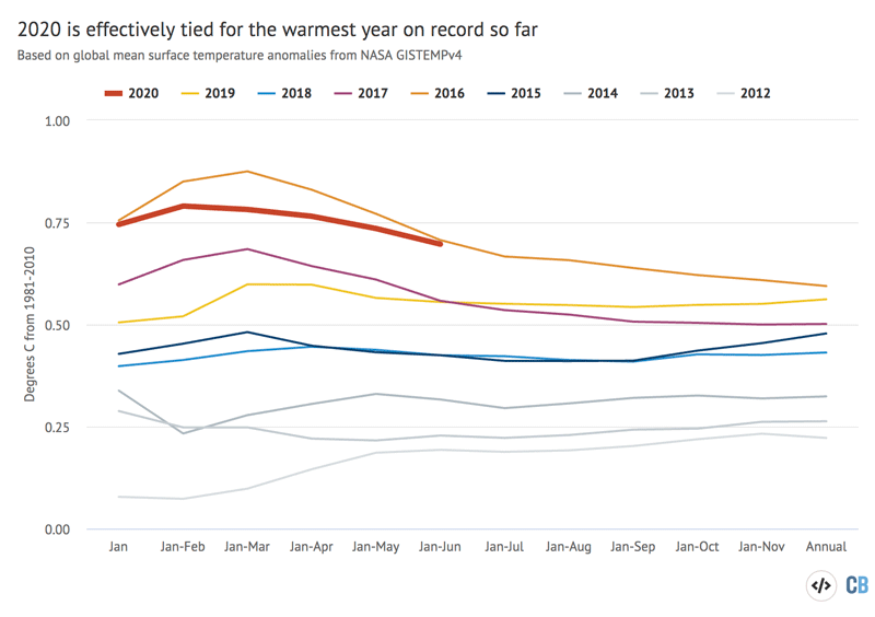
Year-to-date temperatures for each month from 2012 to 2020 from NASA GISTEMP. Anomalies plotted with respect to a 1981-2010 baseline. Chart by Carbon Brief using Highcharts.
In the NASA dataset, 2020 ties with 2016 for the warmest January-June average on record. However, 2016 had lower temperatures in the second half of the year, while 2020 has remained quite warm in the past few months. The last 12 months have tied for the warmest 12 months on record in a number of datasets.
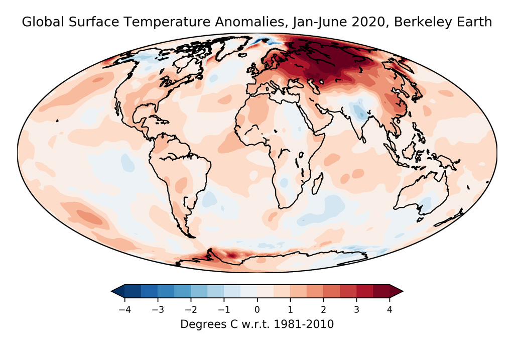
The map below shows the distribution of temperatures in the first six months of 2020 across the Earth’s surface. The Siberia region has been strikingly warm so far this year, with many areas 7C warmer than the global average. Europe has also experienced unusual warmth of about 2C above average. Other unusually warm locations include East Asia, Northern Europe and parts of Antarctica.
While human emissions of CO2 and other greenhouse gases are responsible for all of the Earth’s long-term warming, temperatures in any given year are strongly influenced by short-term variations in the Earth’s climate that are typically associated with El Niño and La Niña events. These are fluctuations in temperature between the ocean and atmosphere in the tropical Pacific which help to make some individual years warmer and some cooler.
The first half of 2020 saw neutral El Niño conditions, likely having little impact on temperatures, though there is evidence in the last two months of a mild La Niña developing. Prediction models suggest that the La Niña conditions will persist for the second half of the year, though most models predict only a relatively modest La Niña event through to the end of 2020.
The figure below shows a range of different El Niño forecast models produced by different scientific groups. The values shown are sea surface temperature variations in the tropical Pacific – the El Niño 3.4 region – for three-month periods. The dynamical model average is shown in red while that for statistical models in shown in green.
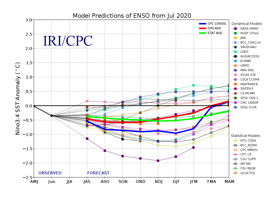
The warming from El Niño and cooling from La Niña tends to have their maximum impact on global temperatures around three months after conditions peak in the tropical Pacific. This means that even if a strong La Niña develops in the last few months of the year, its main effect would be on temperatures in 2021 rather than 2020.
Good chance 2020 will be warmest year on record
With half the year’s data recorded and forecasts of El Nino development over the next six months now published, it is possible to estimate with reasonable accuracy where 2020 annual temperatures will likely end up.
Carbon Brief has examined the global surface temperature data from all six groups. It has then projected temperatures for the full year of 2020 using the data available to-date for each dataset, along with projection of the El Niño Index for the remainder of 2020 (see methodological note at the end for details).
The results are shown in the figure below. Annual temperatures between 1979 and 2019 are shown in black for each record, while the likely range (95% confidence interval) of the 2020 annual temperature based on the first six months of the year is shown by the red bar.
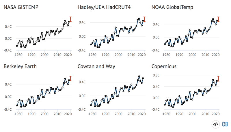
Annual global mean surface temperatures and 2020 estimates from NASA GISTemp, NOAA GlobalTemp, Hadley/UEA HadCRUT4, Berkeley Earth and Copernicus/ECMWF. Anomalies plotted with respect to a 1981-2010 baseline. See methodological note below for details. Chart by Carbon Brief using Highcharts.
For all surface temperature records, 2020 will most likely be either the warmest or second warmest on record. Carbon Brief estimates that two groups – NASA and Copernicus – will very likely have 2020 as the warmest year on record, while the Hadley, Berkeley Earth and NOAA records suggest at this point that it is equally likely to be the warmest or second warmest. Note that Cowtan and Way data was not available through June at the time of publication, and 2020 estimates are not included in these figures.
The probability of where 2020 will fall on the leaderboard of warmest years based temperatures so far this year is shown in the table below.
| NASA GISTEMP | Hadley/UEA HadCRUT4 | NOAA GlobalTemp | Berkeley Earth | Cowtan & Way | Copernicus/ECMWF | |
|---|---|---|---|---|---|---|
| 1st | 87% | 21% | 43% | 50% | 79% | |
| 2nd | 11% | 37% | 45% | 39% | 16% | |
| 3rd | 2% | 27% | 8% | 11% | 4% | |
| 4th | 0% | 14% | 3% | 0% | 0% |
There is very little chance that 2020 will not be either the warmest or second warmest year. A lot will depend on what happens to the growing La Nina event in the next three months.
Extreme heat events
The first half of 2020 saw extreme heat events in many parts of the world, with a record setting heatwave in Australia at the end of 2019 and start of 2020, as well as remarkably persistent high temperatures over Siberia. The figure below shows regions of the world in dark red where the first six months of the year set a record for the warmest first six months since 1850. This includes much of north-central Asia, parts of China, Mexico and South America.
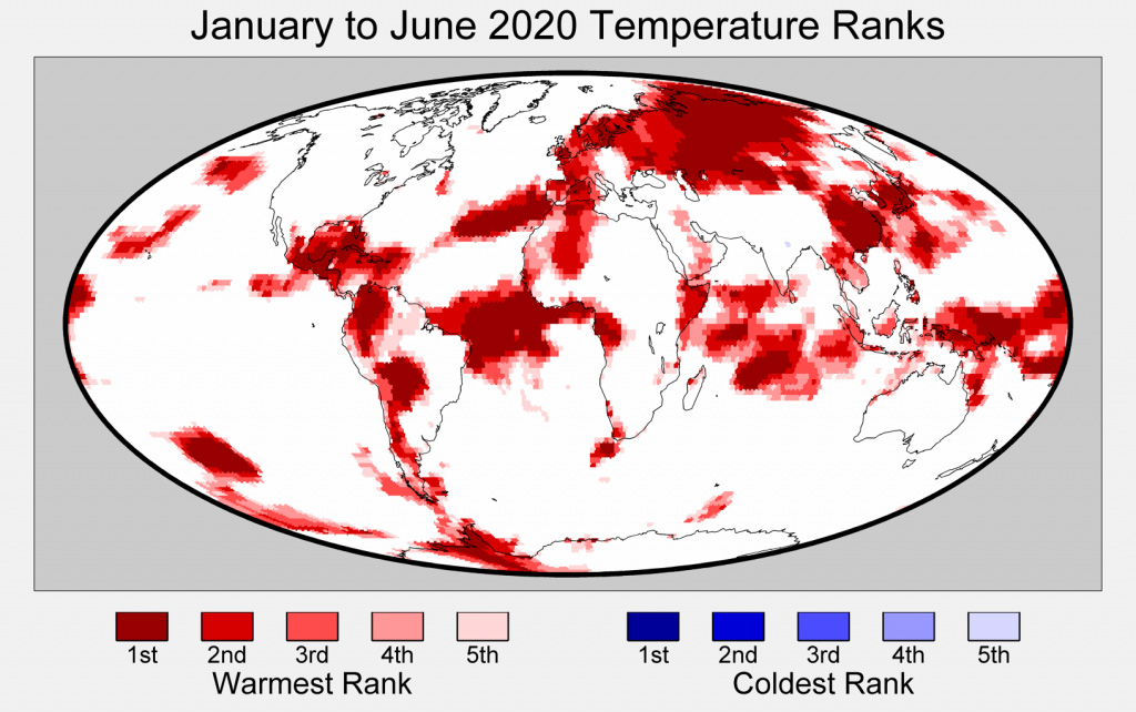
Siberia has experienced staggering heat for much of the first six months of the year – with northern Siberia around 7C warmer than the preindustrial period. This level of extreme heat would have been almost impossible in the absence of the long term warming the region has experienced.
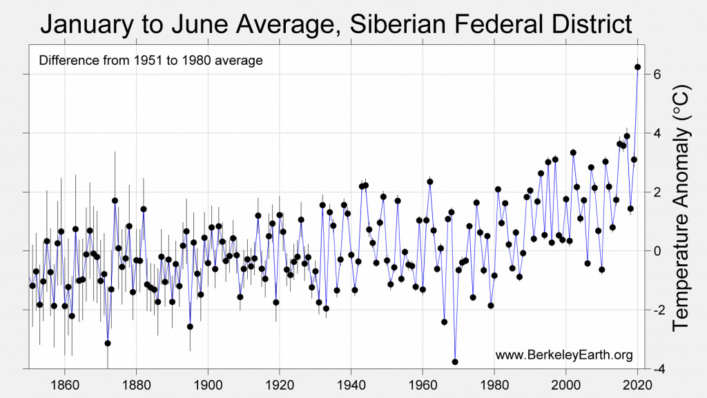
The figure below shows temperatures for the first six months of the year for the Siberia region from 1850 through present. The value for 2020 represents a remarkable departure from anything previously seen for the region. It reflects a combination of a long-term, human-caused warming trend – Siberia is one of the fastest warming regions on Earth – and an extremely rare heat event likely due to natural variability.
Warming well in-line with climate models projections
Climate models provide physics-based estimates of future warming given different assumptions about future emissions, greenhouse gas concentrations and other climate-influencing factors.
The figure below shows the range of individual models forecasts featured in the Intergovernmental Panel on Climate Change’s (IPCC) fifth assessment report – known collectively as the CMIP5 models – between 1970 and 2020 with grey shading and the average projection across all the models shown in black. Individual observational temperature records are represented by coloured lines.
In these models, estimates of temperatures prior to 2005 are a “hindcast” using known past climate influences, while temperatures projected after 2005 are a “forecast” based on an estimate of how things might change.
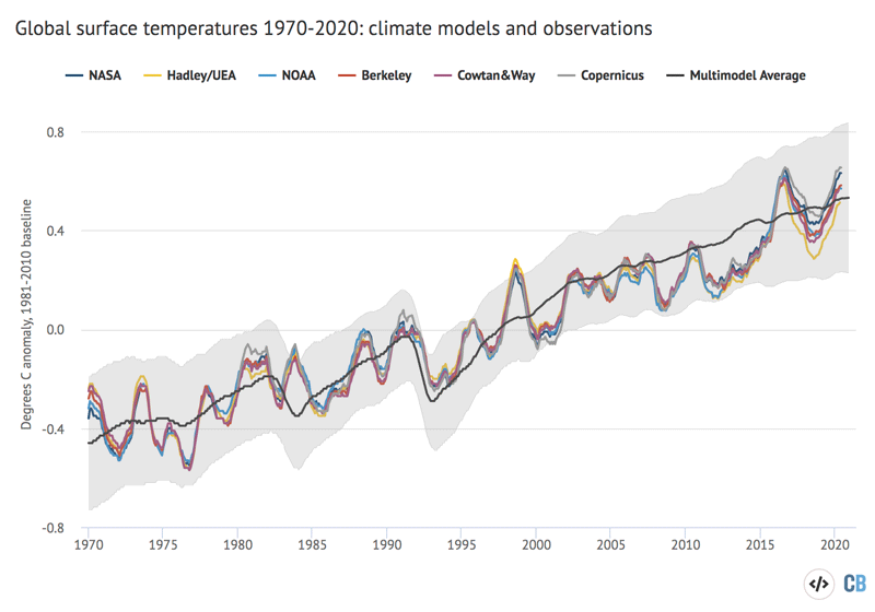
12-month average global average surface temperatures from CMIP5 models and observations between 1970 and 2020. Models use RCP4.5 forcings after 2005. They include sea surface temperatures over oceans and surface air temperatures over land to match what is measured by observations. Anomalies plotted with respect to a 1981-2010 baseline. Chart by Carbon Brief using Highcharts.
While global temperatures were running a bit below the pace of warming projected by climate models between 2005 and 2014, the last few years have been pretty close to the model average. This is particularly true for globally complete temperature records, such as NASA, Berkeley Earth and the Copernicus/ECMWF reanalysis, which include temperature estimates for the whole Arctic. In recent months, temperatures have been a bit above the model average.
Arctic sea ice at record lows
Arctic sea ice spent much of early 2020 at the low end of the historical 1979-2010 range, though over the past few weeks sea ice extent has dropped rapidly, setting new records over the month of July.
Antarctic sea ice was close to the long-term average over the first seven months of 2020. Reliable sea ice coverage data is only available since polar-observing satellites were launched in the late 1970s.
The figure below shows both Arctic and Antarctic sea ice extent in 2020 (solid red and blue lines), the historical range in the record between 1979 and 2010 (shaded areas) and the record lows (dotted black line). Unlike global temperature records, sea ice data is collected and updated on a daily basis, allowing sea ice extent to be viewed through to the present.
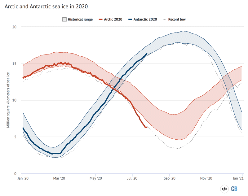
Arctic and Antarctic daily sea ice extent from the US National Snow and Ice Data Center. The bold lines show daily 2020 values, the shaded area indicates the two standard deviation range in historical values between 1979 and 2010. The dotted black lines show the record lows for each pole. Chart by Carbon Brief using Highcharts.
The summer Arctic sea ice minimum is a somewhat iconic figure and recent years have yet to surpass the record low set in 2012. While Arctic sea ice is currently at record lows for this time of year, it is unclear if these conditions will persist and it is still too early to know where the 2020 minimum will fall.
The chart below shows the average Arctic sea ice extent for each week of the year for every year between 1978 and 2020, with 2020 to-date highlighted with a thick black line.
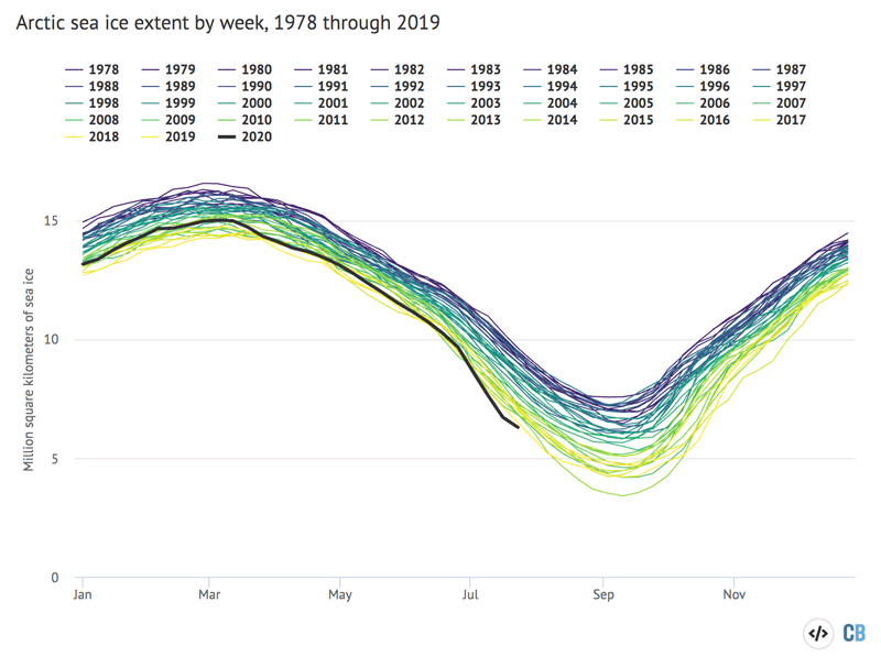
Arctic and Antarctic weekly sea ice extent from the US National Snow and Ice Data Center from 1979 through mid-July 2020.
The figure shows a clear and steady decline in Arctic sea ice since the late 1970s, with darker colours (earlier years) at the top and lighter colors (more recent years) much lower. A typical summer now has nearly half as much sea ice in the Arctic as it had in the 1970s and 1980s.
Methodological note
A statistical multivariate regression model was used to estimate the range of likely 2020 annual temperatures for each group that provides a temperature record. This model used the average temperature over first six months of the year, the latest monthly temperature value (June 2020), the average ENSO 3.4 region value during the first six months of the year and the average predicted ENSO 3.4 value during the last six months of the year to estimate the annual temperatures. The model was trained on the relationship between these variables and annual temperatures over the period from 1950 through 2019 (or 1979 through 2019 for the Copernicus/ECMWF reanalysis dataset). The model then uses this fit to predict both the most likely 2020 annual value for each group, as well as the 95% confidence interval. The predicted ENSO 3.4 region values for the last six months of 2020 are taken from the NMME model mean forecast.
The percent likelihood of different year ranks for 2020 is estimated by using the output of the regression model, assuming a normal distribution of results. This allows us to estimate what percent of possible 2020 annual values fall above and below the temperatures of prior years for each group.
-
State of the climate: 2020 set to be first or second warmest year on record
-
State of the climate: First half of 2020 sees record heat