State of the climate: How the world warmed in 2021
Zeke Hausfather
01.17.22Zeke Hausfather
17.01.2022 | 8:00amThe climate data for 2021 is now mostly in, and it has proved to be another noteworthy year across the oceans, atmosphere, cryosphere and surface temperature of the planet.
In this article, Carbon Brief unpacks the different datasets, remarkable records and extreme events of last year. Use the links below to navigate between sections:
- Ocean heat content: It was the warmest year on record for ocean heat content, which increased markedly between 2020 and 2021.
- Surface temperature: It was between the fifth and seventh warmest year on record for surface temperature for the world as a whole, the fifth warmest for the world’s land regions, and the seventh warmest for the oceans.
- Warming over land: It was the warmest year on record in 25 countries, and in areas where 1.8 billion people live.
- Extreme weather: 2021 saw the warmest northern-hemisphere summer (June, July, and August) on record over the world’s land, along with extreme heatwaves, wildfires, and rainfall events.
- Comparison with climate model data: Observations fall well within the range of CMIP5 climate model projections over the past 70 years.
- Warming of the atmosphere: It was the sixth or eighth warmest year in the lower troposphere – the lower part of the atmosphere – depending on which dataset is used.
- Sea level rise: Sea levels reached new record-highs, with notable acceleration over the past three decades.
- Greenhouse gases: Concentrations reached record levels for CO2, methane and nitrous oxide.
- Sea ice extent: Arctic sea ice was well below the long-term average for most of the year, though relatively few daily records were set. The summer Arctic sea ice minimum was the 12th lowest since records began in the late 1970s.
- Looking ahead to 2022: Carbon Brief predicts that global average temperature in 2022 will be similar to 2021.
Record ocean heat content
Last year was the warmest on record for the heat content of the world’s oceans. Ocean heat content (OHC) has increased by around 417 zettajoules – a billion trillion joules – since the 1940s. The heat increase in 2021 alone compared to 2020 – about 14 zettajoules – is around 23 times more than the total energy used by everyone on Earth in 2019 (the latest year in which global primary energy statistics are available).
Human-emitted greenhouse gases trap extra heat in the atmosphere. While some of this warms the Earth’s surface, the vast majority – around of 93% – goes into the oceans. About two thirds of this accumulates in the top 700 metres, but some also ends up in the deep oceans. Annual OHC estimates between 1950 and present for both the upper 700m and 700m-2000m depths of the ocean are shown in the figure below.
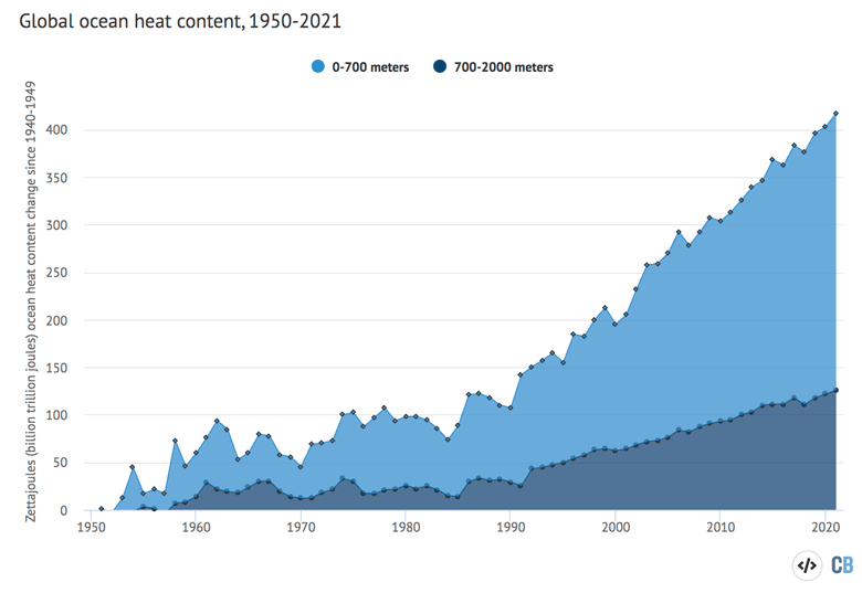
In many ways, OHC represents a much better measure of climate change than global average surface temperatures. It is where most of the extra heat ends up and is much less variable on a year-to-year basis than surface temperatures.
Changes in the amount or rate of warming are much easier to detect in the OHC record than on the surface. For example, OHC shows little evidence of the modest slowdown in warming at the surface in the mid-2000s that got so much attention at the time. It also shows a distinct acceleration after 1991, matching the increased rate of greenhouse gas emissions over the past few decades.
Just about every year since 1991 has set a new OHC record, showing that heat has continued to accumulate in the Earth system as concentrations of atmospheric greenhouse gases have increased.
Fifth-to-seventh warmest year on the surface
Global surface temperatures in 2021 were among the warmest measured since records began in the mid-1800s. Data from NASA, NOAA and Berkeley Earth show it was the sixth warmest year on record, while data from Copernicus ERA5 has it as the fifth warmest. The release of the Hadley Centre/UEA HadCRUT5 record has been delayed due to data reporting problems, but it will likely show a similar ranking for 2021.
In all cases, the records are effectively tied with 2015 and 2018, making 2021 anywhere between the fifth and seventh warmest on record within the bounds of measurement uncertainties.
Global surface temperature records can be calculated back to 1850, though some groups choose to start their records in 1880 when more data was available. Prior to 1850, records exist for some specific regions, but are not sufficiently widespread to calculate global temperatures with any reasonable accuracy. These records are created by combining ship- and buoy-based measurements of ocean sea surface temperatures with temperature readings of the surface air temperature from weather stations on land (Copernicus ERA5 is an exception, as it uses weather model-based reanalysis).
The chart below shows global temperature records since 1850, with temperatures shown relative to the 1880-99 period to highlight warming since the pre-industrial period.
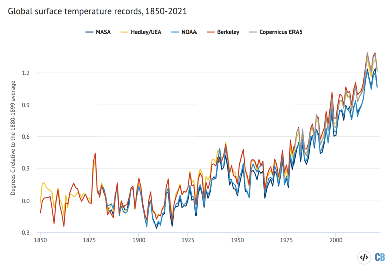
Temperatures in 2021 were between 1.1C and 1.2C warmer than temperatures in the late 19th century (between 1880 and 1900), depending on the temperature record chosen. Last year represented between the seventh and tenth consecutive year that global temperatures have exceeded 1C above pre-industrial levels across the different datasets.
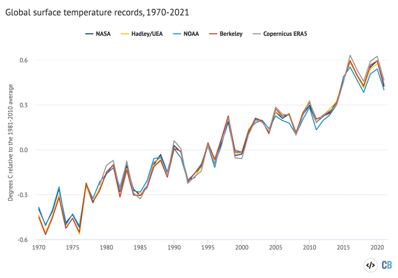
The figure below shows surface temperatures since 1970, a period during which atmospheric greenhouse gas concentrations have been rapidly increasing. While 2021 is not quite as warm as the past two years, it is well in-line with the longer-term warming trend seen in the data.
The past seven years of the record really stand out as much warmer than anything that has come before. This can be seen in the figure below from Berkeley Earth. Each shaded curve represents the annual average temperature for that year. The further that curve is to the right, the warmer it was.
The width of each year’s curve reflects the uncertainty in the annual temperature values (caused by factors such as changes in measurement techniques and the fact that some parts of the world have fewer measurement locations than others).
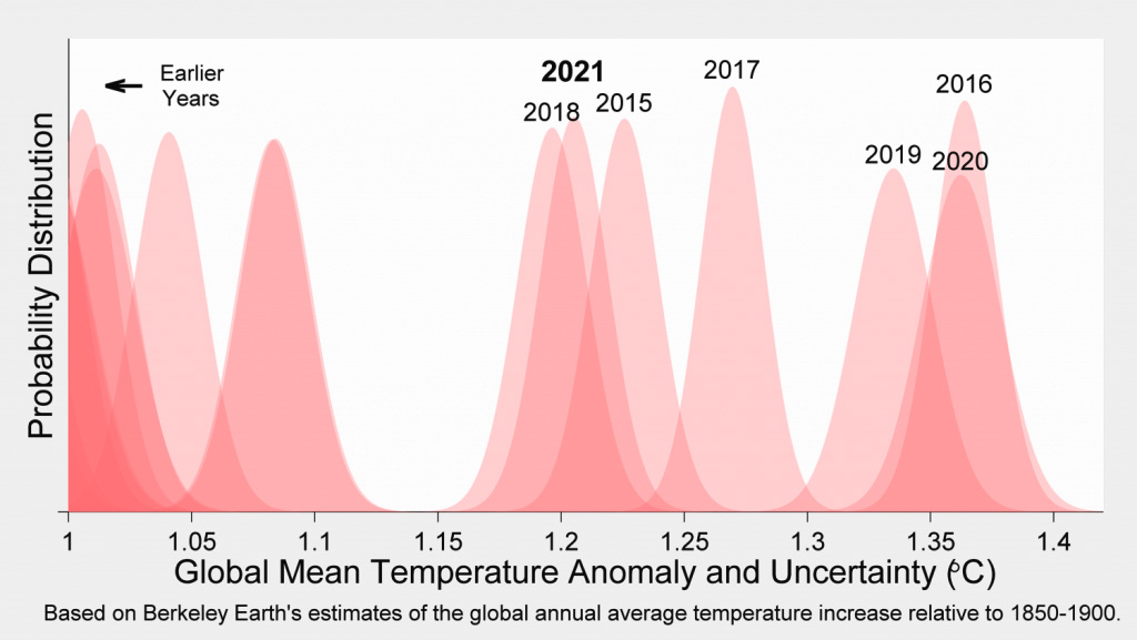
Year-to-year variability in temperature records is mostly due to the influence of El Niño and La Niña events, which have a short-term warming or cooling impact on the climate. Other dips are associated with large volcanic eruptions. The longer-term warming of the climate is due to increases in atmospheric CO2 and other greenhouse gases emitted from human activity.
Last year’s temperatures were dragged down a bit by a modest La Niña event in the early part of the year, which reemerged in the last few months of the year (creating an uncommon “double dip” La Niña event). However, due to a lag of a few months between La Niña conditions in the Pacific and their peak effect on global temperatures, the La Niña conditions at the end of 2021 will likely result in a larger effect in 2022.
To assess the effects of El Niño and La Niña on the surface temperature record, Carbon Brief has produced an estimate of what temperatures would be in the absence of these events. The figure below shows estimated temperatures with El Niño removed (see the methods section at the end of the article for details on the approach used). The Copernicus record is not included in the figure as it does not have data available prior to 1979.
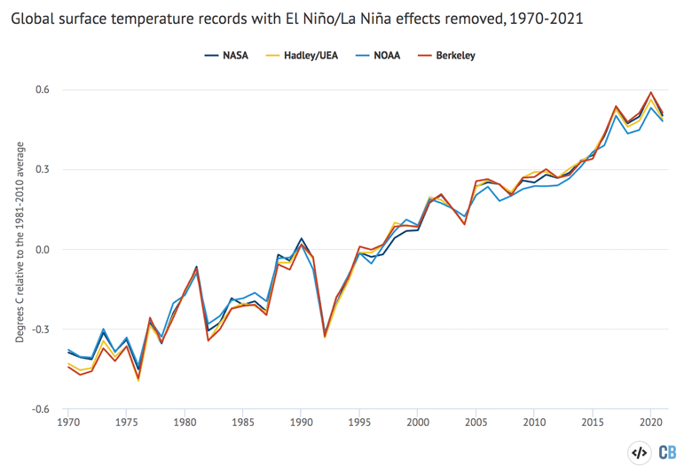
Removing the effects of El Niño and La Niña from the temperature record makes 2020 rather than 2016 the warmest year on record for all the temperature datasets, as 2016 temperatures benefited from a large El Niño event. It also generally reduces the difference between years over the 2015-21 period, though 2021 remains the sixth warmest year on record.
Temperatures for 2021 are bumped up modestly – by around 0.07C – with the cooling effects of the early-2021 La Niña event removed. Once El Niño effects are removed, the impact of major volcanic eruptions – such as those in 1982 and 1991 – are also much easier to spot in the temperature record.
Much more rapid warming over land
The focus on global surface temperature as a key metric of climate change is important, but can obscure very different rates of change across the planet.
For example, while most of the Earth’s surface is covered by oceans, nearly all human settlements and activities are in land areas. The land has been warming around 70% faster than the oceans – and 40% faster than the global average – in the years since 1970.
The figure below breaks down the Berkeley Earth temperature dataset into land-only (red) and ocean-only (blue) temperatures.
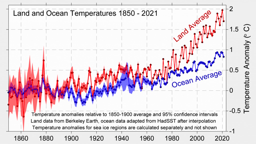
While the world as a whole has warmed by around 1.3C since the pre-industrial period (1850-1900) in the Berkeley Earth dataset, land areas have warmed a much larger amount – by 1.8C on average. In contrast, the oceans have warmed more slowly – by around 0.8C since pre-industrial times. (See Carbon Brief’s guest post on why the land and ocean warm at different rates.)
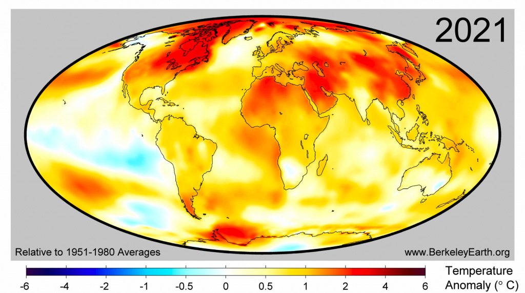
Different parts of the land and ocean are also warming at different rates. The warmth in 2021 covered large regions of the world, with particularly anomalously high temperatures in northeast Canada, China, North and South Korea, the Middle East, and northern Africa. The figure below, from Berkeley Earth, shows the average annual temperatures, relative to 1951-80, across the world for the year.
A year of extremes
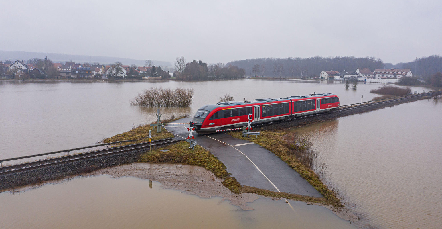
In addition to being one of the top-seven warmest years on record, 2021 saw many climate extremes around the world – including record-breaking extreme heat events, heavy rainfall and flooding, catastrophic wildfires, storms and drought.
Areas home to 1.8 billion people saw their warmest year on record during 2021, with 25 countries – including China, South Korea, Bangladesh and Nigeria – setting all-time annual temperature records. The figure below, also from Berkeley Earth, shows the regions of the world where either warm or cold records were set in 2021.
It is noteworthy that while large parts of the planet set new warm records, there was no location on Earth where annual average temperatures were among the coldest on record.
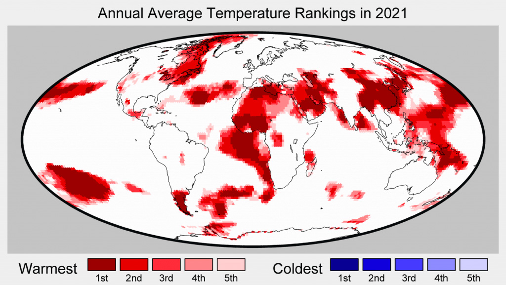
China in particular saw exceptionally high temperatures in 2021, with annual average warmth exceeding 2C above pre-industrial levels for the first time.
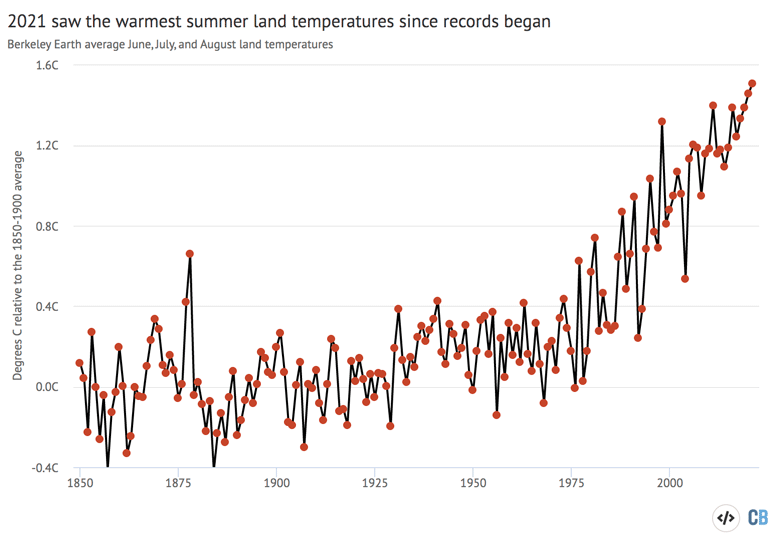
The northern-hemisphere summer months (June, July and August) were particularly warm, with the year seeing the hottest summer on record over the world’s land regions. The figure below shows summer temperatures from the Berkeley Earth dataset between 1850 and 2021. Each red dot represents the average temperature over the three months.
A few extreme events in 2021 stand out as truly exceptional. In particular, a summer heatwave in northwestern North America in late June saw temperatures reach 49.6C (121F) in Canada, shattering the previous record of 45C (113F) set in 1937. The town in which this record was set was largely destroyed by a wildfire the following day.
An attribution study by the World Weather Attribution team found that the heatwave would have been “virtually impossible” without human-caused global warming. In a pre-industrial climate, the event would only be expected to occur once in every 150,000 years. Climate change to-date has made it 150 times more likely to occur, but it likely remains a relatively rare one-in-one-thousand year event, the scientists found.
However, in a scenario of 2C warming by the end of the century relative to pre-industrial (that is, 0.8C warming above current levels), such an extreme heatwave would “occur roughly every five to 10 years” in the region.
The authors cautioned that there is a risk that even the 150 times more likely finding may underestimate the prevalence of these sorts of extremes in a warming world. They suggested that there is the possibility of “a non-linear threshold where a small amount of overall global warming is now causing a faster rise in extreme temperatures than has been observed so far”.
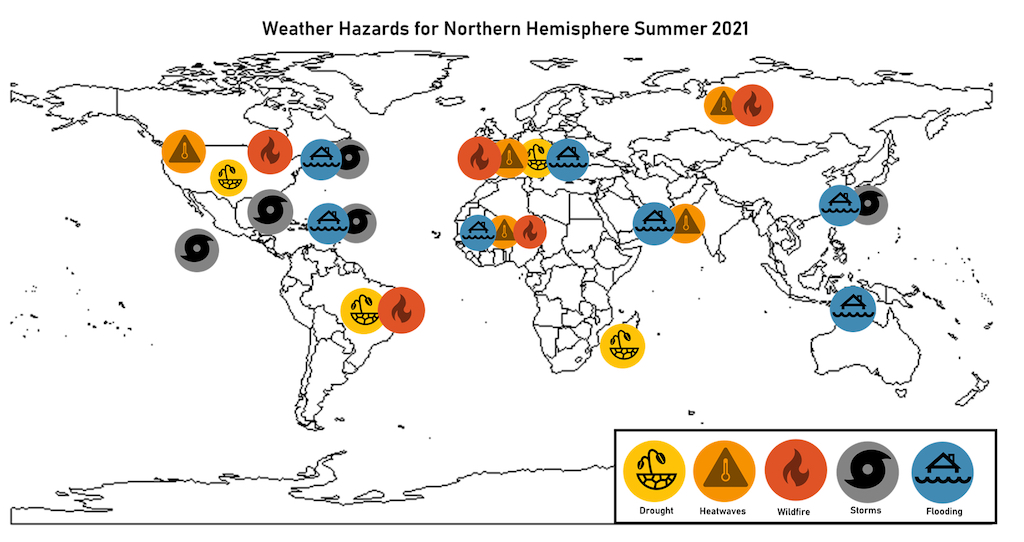
Last year also saw more than 50 hurricanes, cyclones and extratropical storms. There was deadly flooding in Nigeria, Ghana, India, Turkey, Germany, Belgium, the Netherlands and China, as well as, extreme heatwaves in Siberia, Pakistan, northern India, parts of the Middle East, North Africa and Europe, and catastrophic wildfires in the western US, the Mediterranean and Israel.
The figure below, from a Carbon Brief guest post on summer extreme weather events, shows the location of different types of climate extremes experienced in 2021.
Observed temperatures close to climate model projections
Climate models provide physics-based estimates of future warming given different assumptions about future emissions, greenhouse gas concentrations and other climate-influencing factors.
Here, Carbon Brief examines a collection of climate models – known as CMIP5 – used in the 2013 fifth assessment report (AR5) from the Intergovernmental Panel on Climate Change (IPCC). In CMIP5, model estimates of temperatures prior to 2005 are a “hindcast” using known past climate influences, while temperatures projected after 2005 are a “forecast” based on an estimate of how things might change.
The figure below shows the range of individual CMIP5 models projections since 1950, as well as future projections through to 2100 under the middle-of-the-road RCP4.5 emissions scenario. The black line shows the average of 38 different models, while the grey area shows the 95% (two sigma) range of the model projections. Observational temperatures are plotted on top of the climate model data, with individual observational records represented by coloured lines.
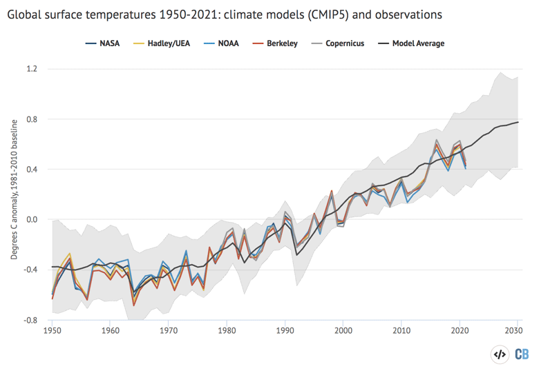
Observations fall well within the range of CMIP5 climate model projections over the past 70 years. Temperatures in 2021 are quite close to the model average. The climate model outputs shown here are blended – that is, they combine surface air temperature over the land with sea surface temperatures over the ocean in the same way they are measured in the observational climate record. This allows for a more accurate comparison of the two.
The latest generation of models – CMIP6 – are not compared to observations in this state of the climate report. The most recent report from the IPCC’s sixth assessment report (AR6) has changed the way that the ensemble of models is used. Rather than simply taking the average of all the models (and their range) – as was the case in previous IPCC reports – the IPCC decided to use a weighted subset of models that agreed well with historical observations. This also reflected a narrowing of climate sensitivity in the most recent IPCC report – such that a number of new models fall outside the “very likely” sensitivity range.
While the IPCC AR6 provided a new set of future “assessed warming” projections, these start in the year 2015, which makes comparisons with observations over such a short period not very informative.
Warming of the atmosphere
In addition to surface measurements over the world’s land and oceans, satellite microwave sounding units have been providing estimates of temperatures at various layers of the atmosphere since 1979.
The lowest layer they estimate – the lower troposphere – reflects temperatures a few kilometres above the surface and roughly corresponds to surface temperature changes. The record produced by Remote Sensing Systems (RSS) shows 2021 as the sixth warmest year on record in the lower troposphere, while the record from the University of Alabama, Huntsville (UAH) shows it as the eighth warmest. The chart below shows the two records – RSS in red and UAH in blue – for the lower troposphere (TLT).
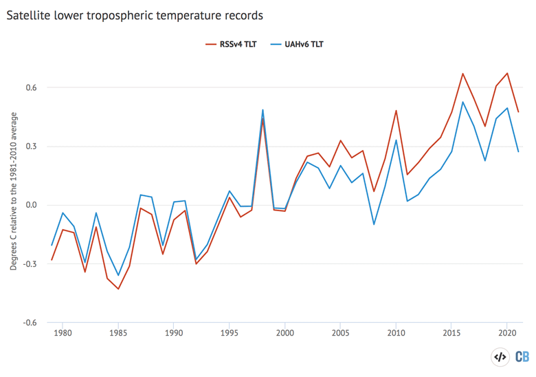
The lower troposphere tends to be influenced more strongly by El Niño and La Niña events than the surface and satellite records show correspondingly larger warming or cooling spikes during these events. This is why, for example, 1998 shows up as one of the warmest years in satellites, but not in surface records.
The two lower tropospheric temperature records show large differences after the early 2000s. RSS shows an overall rate of warming quite similar to surface temperature records, while UAH shows considerably slower warming in recent years than has been observed on the surface. Both have seen large adjustments in recent years that have warmed RSS and cooled UAH compared to prior versions of each record.
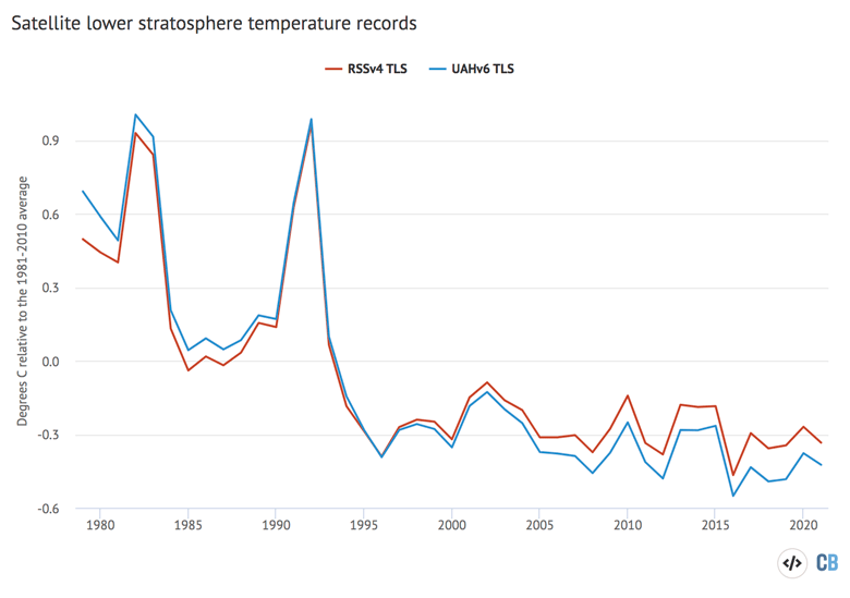
In addition to a temperature record of the lower troposphere, RSS and UAH also provide measurements of the lower stratosphere – a region of the upper atmosphere around 18km above the surface. The lower stratosphere has been cooling for the last few decades in a clear fingerprint of human greenhouse gases, which warm the lower part of the atmosphere by trapping heat while cooling the upper atmosphere as less heat escapes. If other factors – such as changing solar output – were causing climate change, both the stratosphere and troposphere would be warming.
The figure below shows lower stratospheric temperatures (TLS) records for both RSS (red) and UAH (blue) from 1979 through 2021.
Accelerating sea level rise
Modern-day sea levels have risen to a new high, due to a combination of melting land ice (such as glaciers and ice sheets), the thermal expansion of water as it warms, and changes in land water storage. In recent years, there have been larger contributions to sea level rise from melting ice sheets and glaciers, as warmer temperatures accelerate ice sheet losses in Greenland and Antarctica.
Since the early 1990s, the increase in global sea level has been estimated using altimeter data from satellites. Earlier global sea levels have been reconstructed from a network of global tide gauge measurements. This allows researchers to estimate how sea level has changed since the late 1800s.
The chart below shows seven different sea level rise datasets (coloured lines), along with satellite altimeter measurements from NASA satellites as assessed by the University of Colorado (in black) after 1993. (As sea level rise data has not yet been released for the whole year, the 2021 value is estimated based on data through July.)
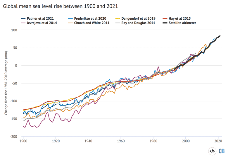
Sea levels have risen by around 0.2 metres (200mm) since 1900. While sea level rise estimates mostly agree in recent decades, larger divergences are evident before 1980. There is also evidence of accelerating sea level rise over the post-1993 period when high-quality satellite altimetry data is available. (See Carbon Brief’s explainer on how climate change is accelerating sea level rise.)
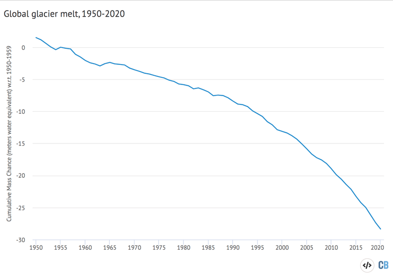
A portion of this sea level rise is being driven by melting land glaciers. Scientists measure the mass of glaciers around the world using a variety of remote sensing techniques, as well as through GRACE measurements of the Earth’s gravitational field. The balance between snow falling on a glacier and ice loss through melting and the breaking off – or “calving” – of icebergs determines if glaciers grow or shrink over time.
An international consortium called the World Glacier Monitoring Service tracks 164 different glaciers in 19 different regions around the world. The figure below shows the change in global average glacier mass from 1950 through to the end of 2020 (2021 values are not yet available). Note that glacier melt is reported in metres of water equivalent, which is a measure of how much mass has been lost on average.
Atmospheric greenhouse gases concentrations reach new highs
Greenhouse gas concentrations reached a new high in 2021, driven by human emissions from fossil fuels, land use and agriculture.
Three greenhouse gases – CO2, methane (CH4) and nitrous oxide (N2O) – are responsible for the bulk of additional heat trapped by human activities. CO2 is by far the largest factor, accounting for roughly 50% of the increase in “radiative forcing” since the year 1750.
Methane accounts for 29%, while nitrous oxide accounts for around 5%. The remaining 16% comes from other factors including carbon monoxide, black carbon and halocarbons, such as CFCs.
Human emissions of greenhouse gases have increased atmospheric concentrations of CO2, methane and nitrous oxide to their highest levels in at least a few million years – if not longer.
The figure below shows concentrations of these greenhouse gases – in parts per million (ppm) for CO2 (blue line) and parts per billion (ppb) for methane (orange) and nitrous oxide (red) – from the early 1980s through to October 2021 for CO2 and September 2021 for CH4 and N2O (the most recent data currently available).
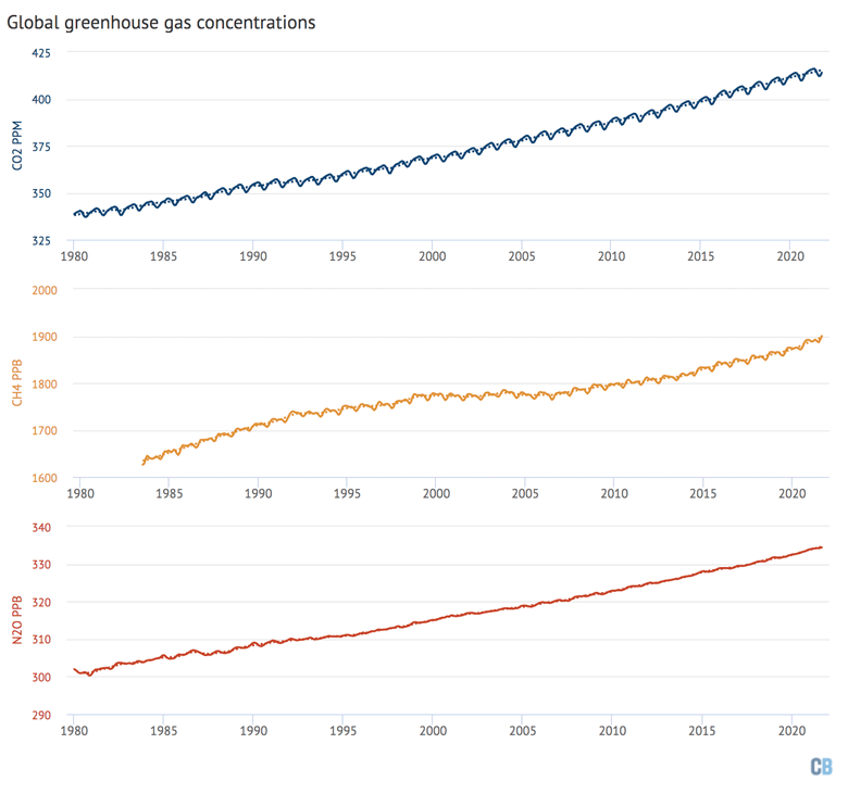
Methane concentrations in particular have seen a sharp rise over the past decade after a plateau in the 2000s. This appears to be driven by both increased emissions from agriculture and fossil fuels, in roughly equal measure. To date there is limited evidence of methane from permafrost thaw meaningfully contributing to atmospheric concentrations according to the 2020 Global Methane Budget, though this may become a larger source in the future.
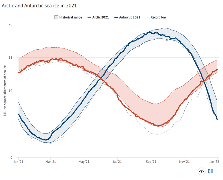
Twelfth lowest Arctic sea ice on record
Arctic sea ice was at the low end of the historical (1979-2010) range for most of 2021, but saw few new all-time daily low records set outside of brief periods in February and July. The summer minimum extent – the lowest recorded level for the year – was the 12th lowest since records began in the late 1970s.
Antarctic sea ice was normal for the first half of the year, but fell to the low end of the historical range after October. (For more on how Antarctic sea ice extent has changed over recent decades, see the guest post that Carbon Brief published last year.)
The figure below shows both Arctic (red line) and Antarctic (blue line) sea ice extent for each day of the year, along with how it compares to the historical range (corresponding shading).
Looking ahead to 2022
With a “double dip” La Niña event in the latter part of 2021, La Niña conditions are expected to persist for at least the first three months of 2022. Because there is a lag of a few months between when El Niño or La Niña conditions peak in the tropical Pacific and their impact on global temperatures, these La Niña conditions will likely have a cooling influence on 2022 temperatures.
So far, there are already three predictions – from the UK Met Office, NASA’s Dr Gavin Schmidt and Berkeley Earth – of what temperatures might look like in 2022.
For the first time, Carbon Brief provides its own prediction of likely 2022 temperatures – based on a model using the prior year (2021), temperatures over past three months, the El Niño/La Niño conditions over the past six months, and projections of El Niño/La Niño conditions over the next six months.
There are notable differences between four predictions of likely 2022 temperatures. The Met Office and the new Carbon Brief estimate have 2022 quite similar to 2021, with it very unlikely to be among the top 2 warmest years on record. Berkeley Earth predicts that 2022 will be a bit warmer, similar to 2017 which is the fourth warmest year on record, while Schmidt predicts that 2022 might end up tieing with 2016 and 2020 as the warmest year on record.
The figure below shows the four different 2022 predictions compared to the NASA GISTEMP temperature record. These have been “normalised” to show 2022 warming relative to the 2001-20 period in the NASA dataset. This is to remove any differences in predictions due to divergences between datasets in earlier parts of the temperature record.
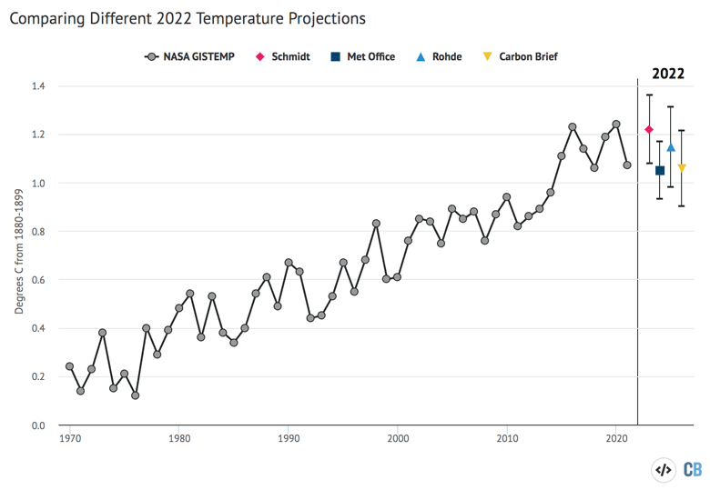
While it is too early to predict with any certainty where 2022 will end up, it would be nothing out of the ordinary to have a year either similar to 2021 or 2020.
What matters for the climate is not the leaderboard of individual years. Rather, it is the long-term upward trend in global temperatures driven by human emissions of greenhouse gases. Until the world reduces emissions down to net-zero, the planet will continue to warm.